A southwestern breakfast identity designed to franchise before the first door opened, for the team that already built First Watch.
Client
First Watch Founders
Role
Brand Design Lead
Scope
Identity Design
Brand Guidelines
Menu Design
Year
2025 2026
THE
Situation
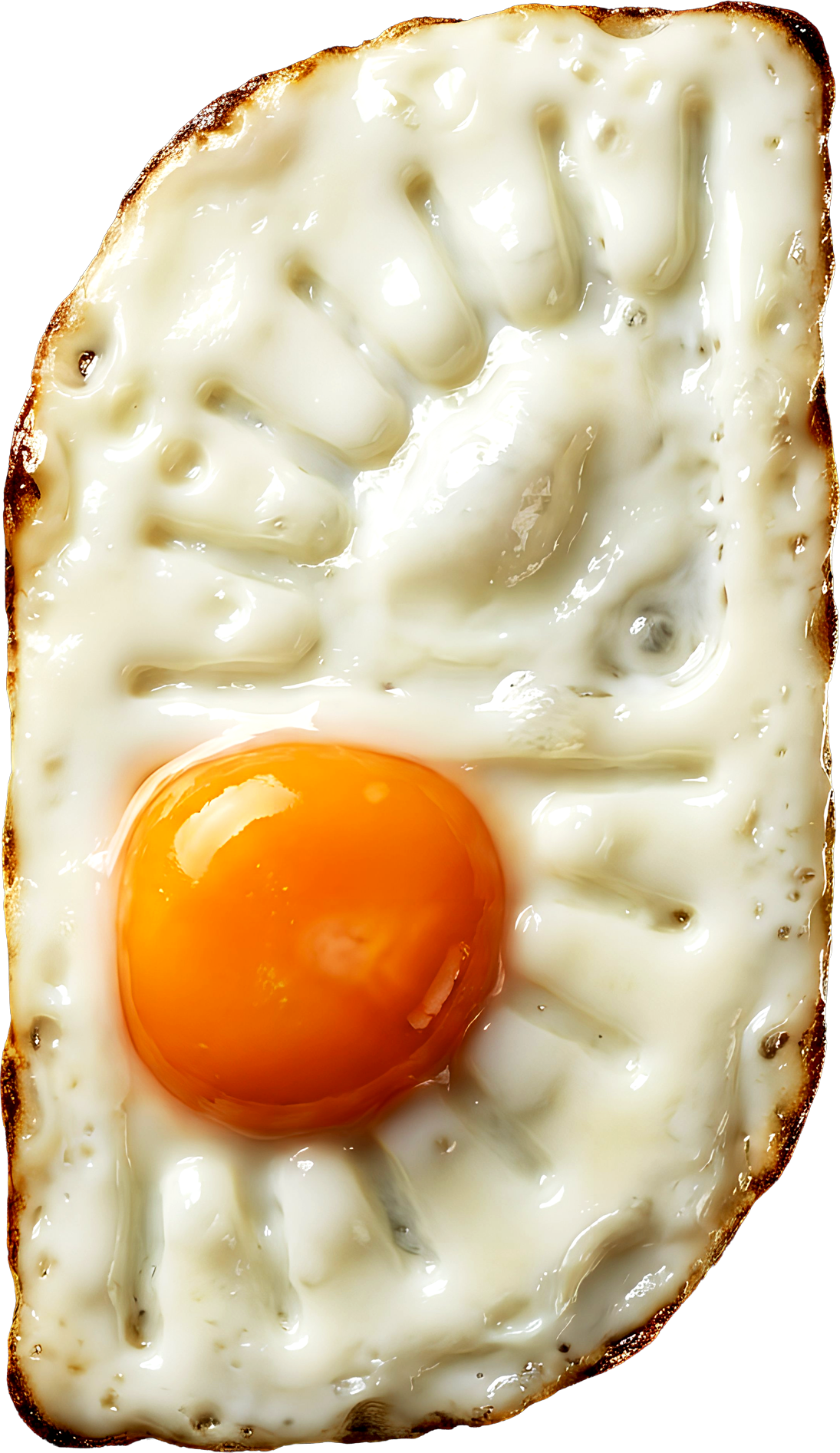
Sunrise Kitchen is a savory southwestern breakfast concept focusing on crepe eggs, chilaquiles, huevos rancheros, and hospitality. The team is building its first location in Arizona.
The founders previously built First Watch. They plan to open seven locations nation-wide over the next seven years, with the funding already in place.
the
Problem
A single neighborhood restaurant can have a charming one-off mark. A seven-location national rollout can't. It needs a system that holds up across markets, formats, and a decade, applied by people who won't be in the room. But on opening day in Arizona, it still has to feel like a local place that's always been there.
The brief made the tension explicit. The four words the founders gave me were disruptive, cozy, quality, family.
Disruptive and cozy don't naturally coexist. Most brands pick one, either it's a warm neighborhood diner or it's a loud modern concept. Sunrise Kitchen had to be both, and had to stay both at seven locations.
Approach
Design the system, not the storefront.
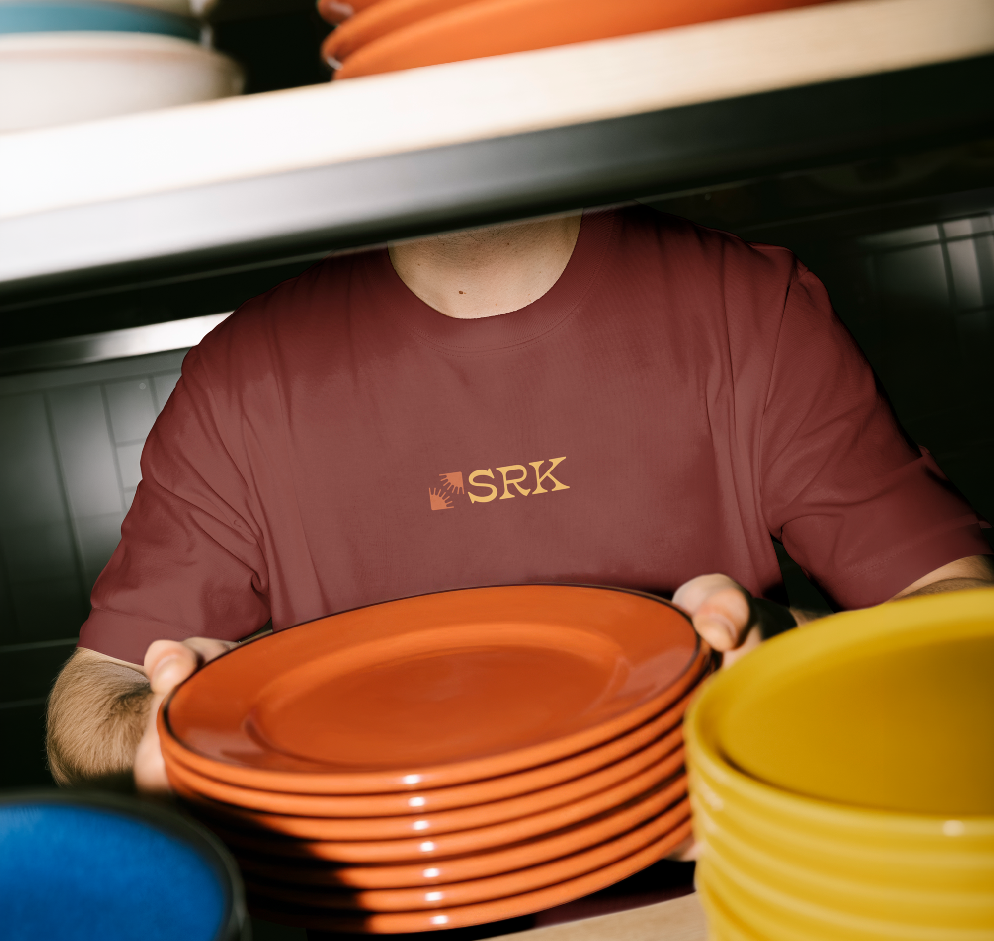
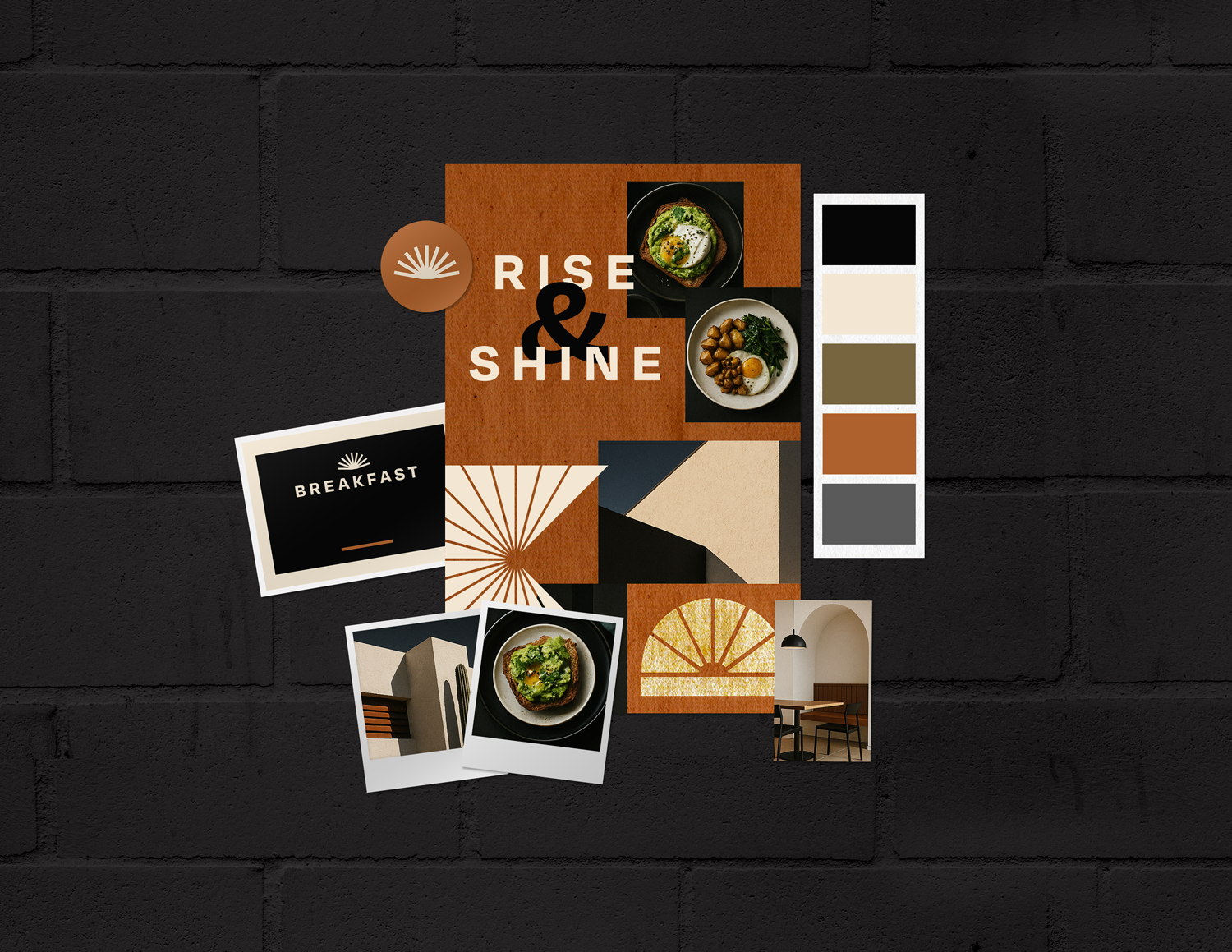
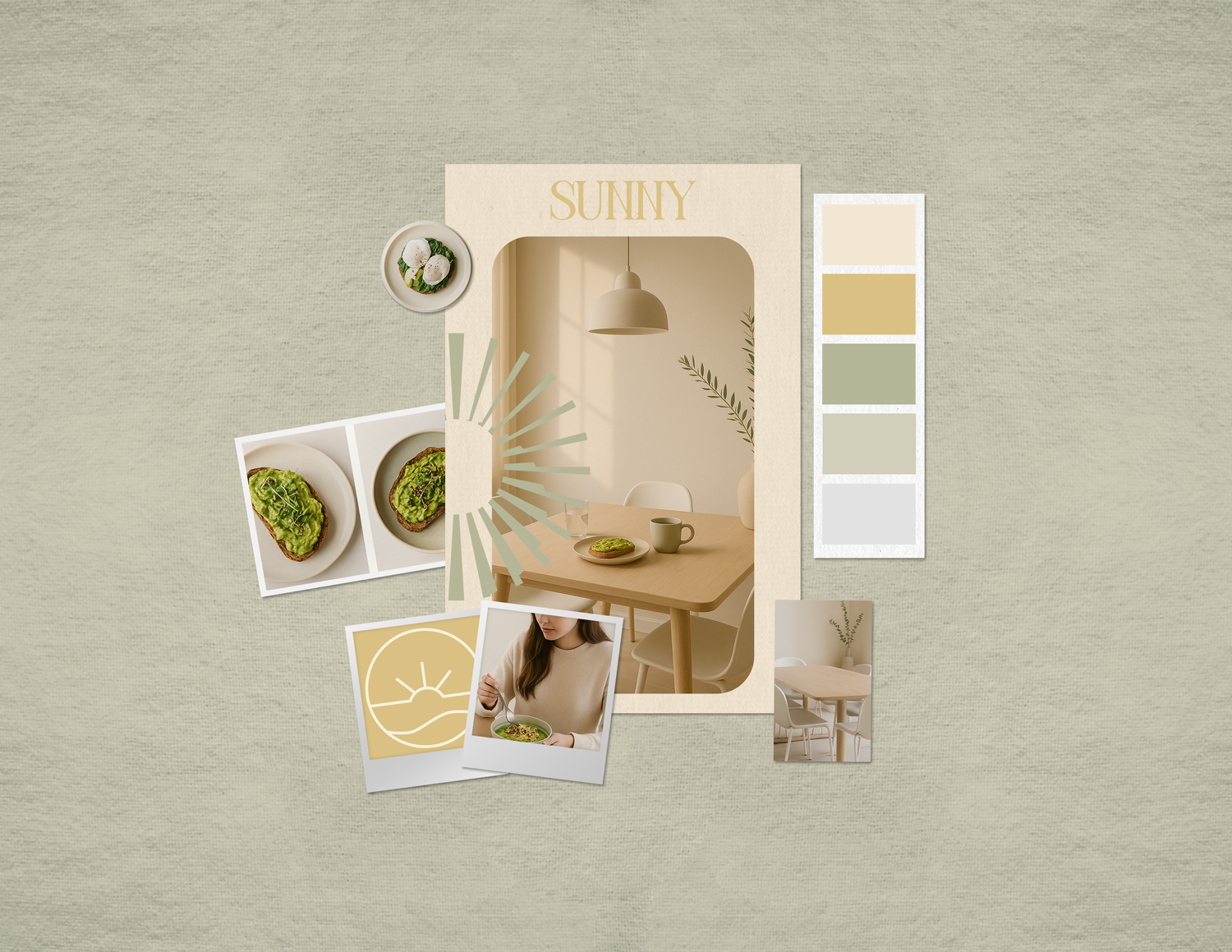
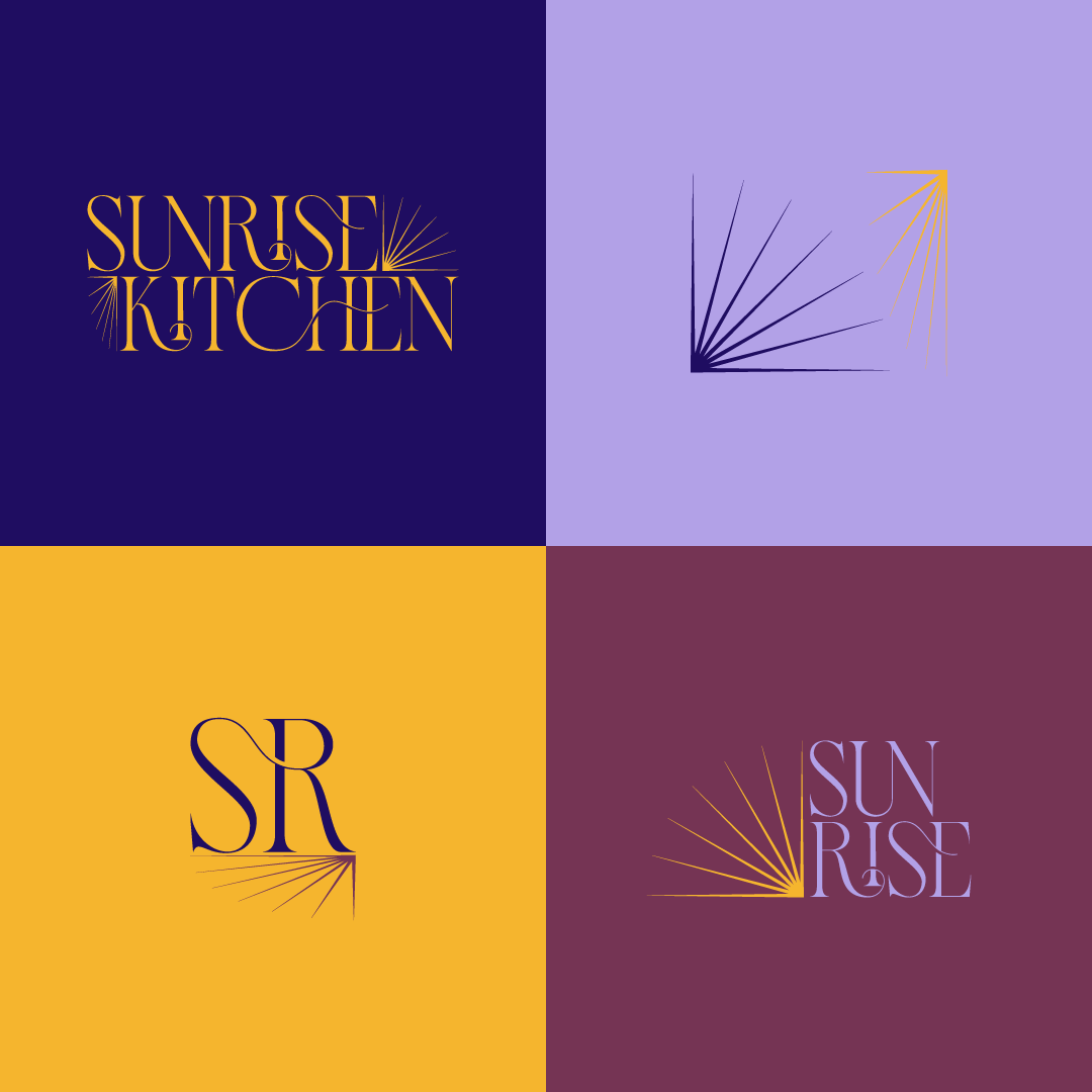
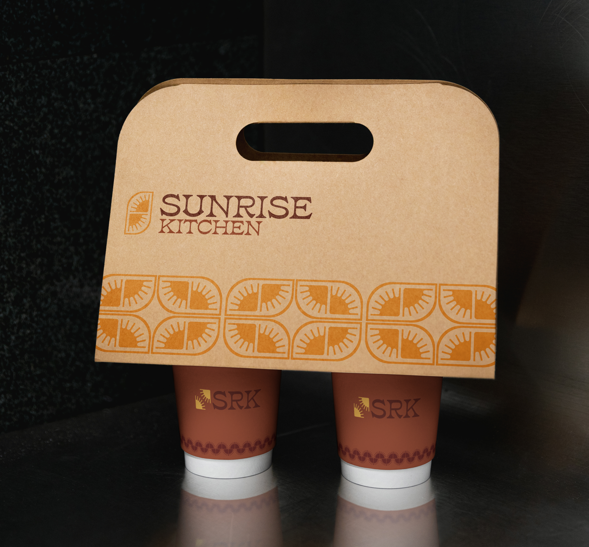
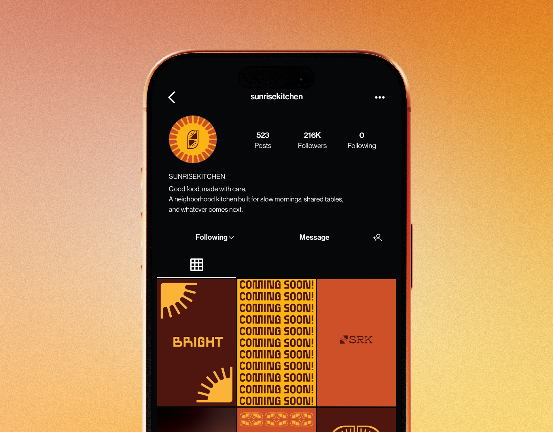
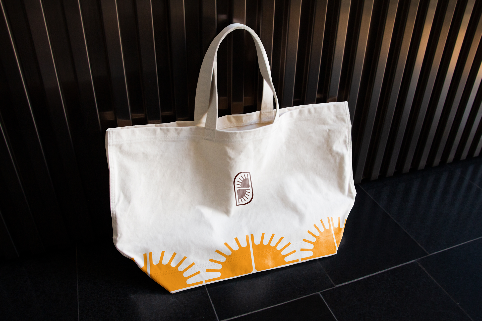
I built the identity as a system from the first sketch, not a logo with applications bolted on afterward. First we presented mood boards and received feedback. From there, every decision was made to embody the right tone while building constraints around it. We tested our marks and fonts against the hardest surfaces before the easy ones: a to-go box, a building facade, an embroidered tee, a phone screen.
Resolve the tension systematically.
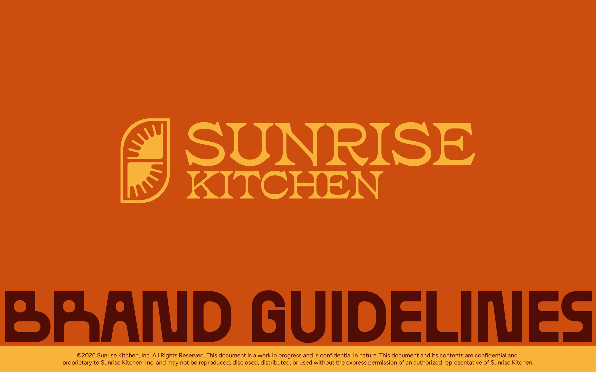
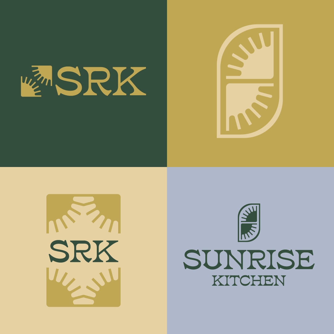
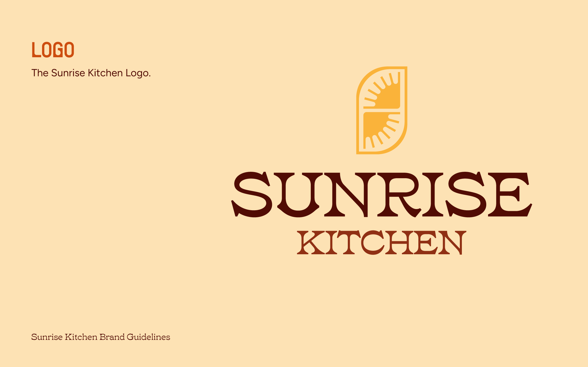
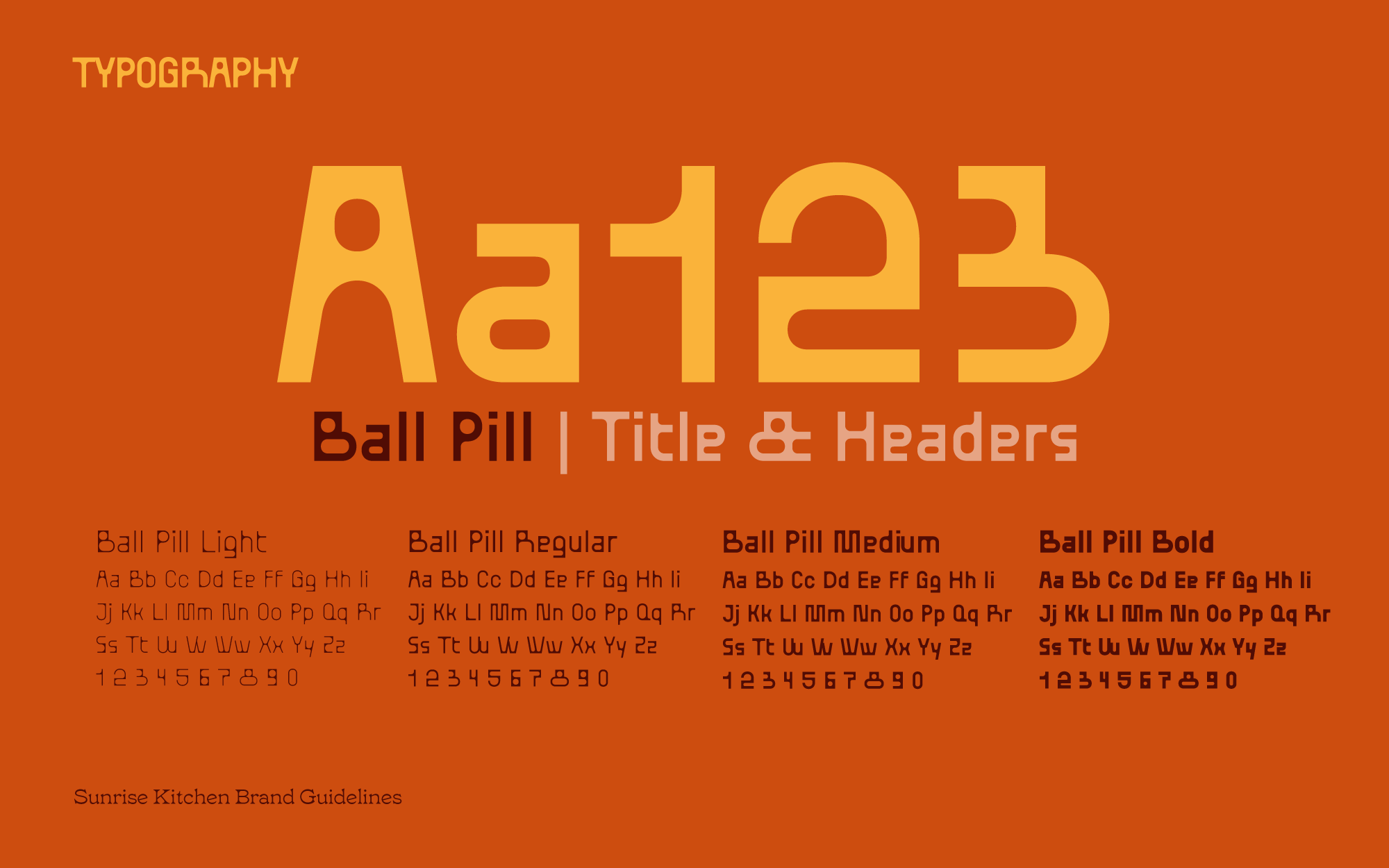
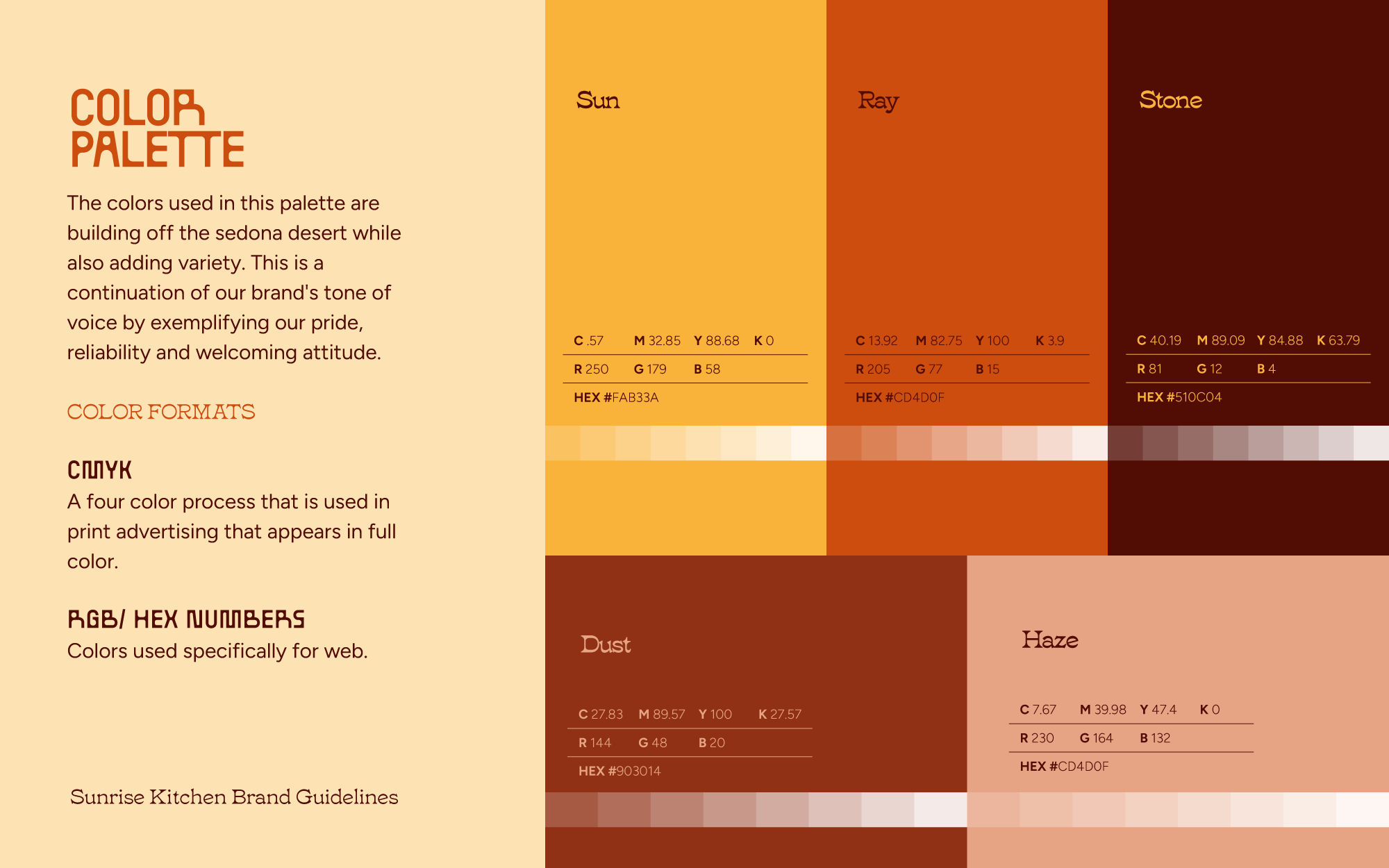
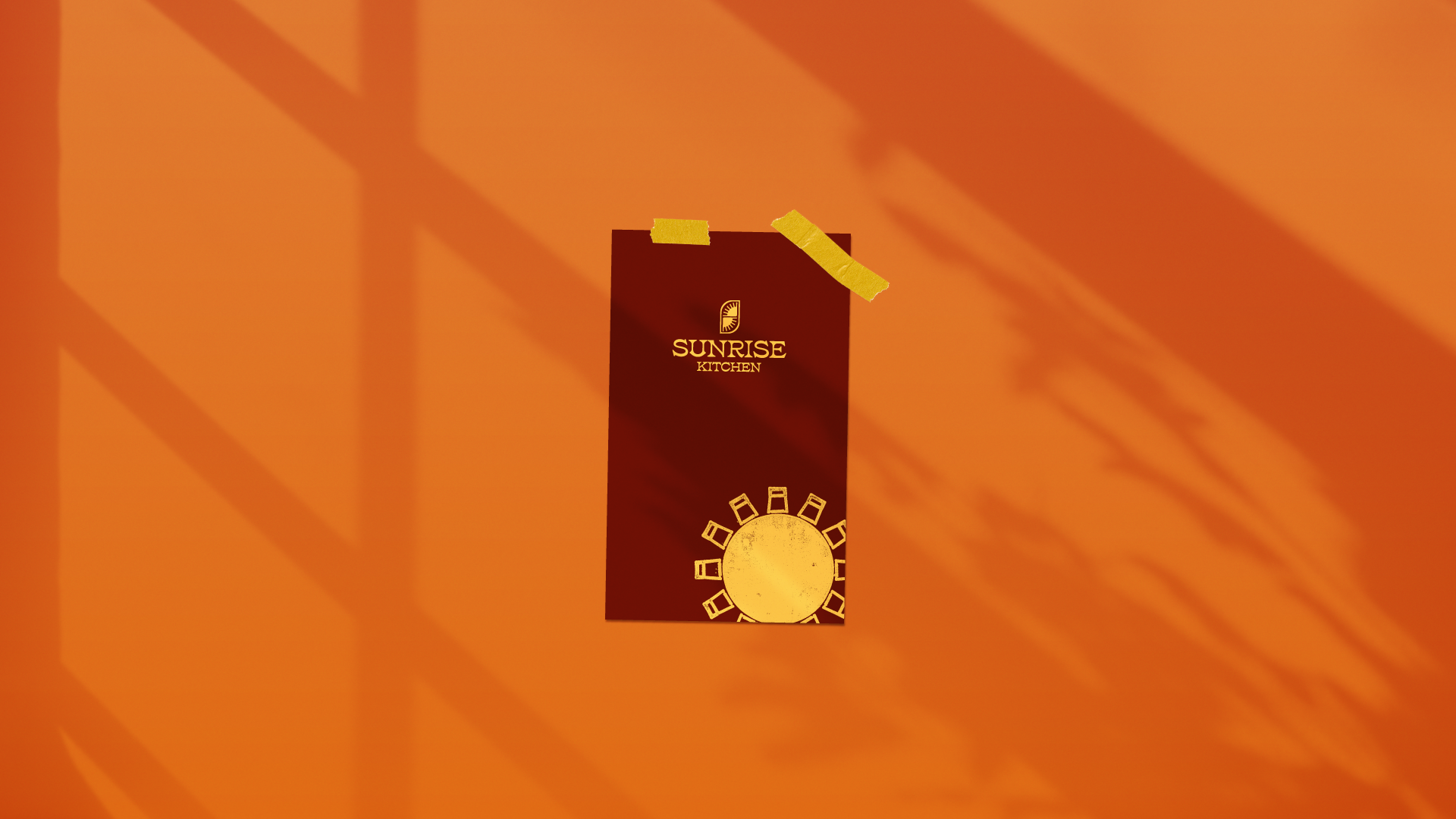
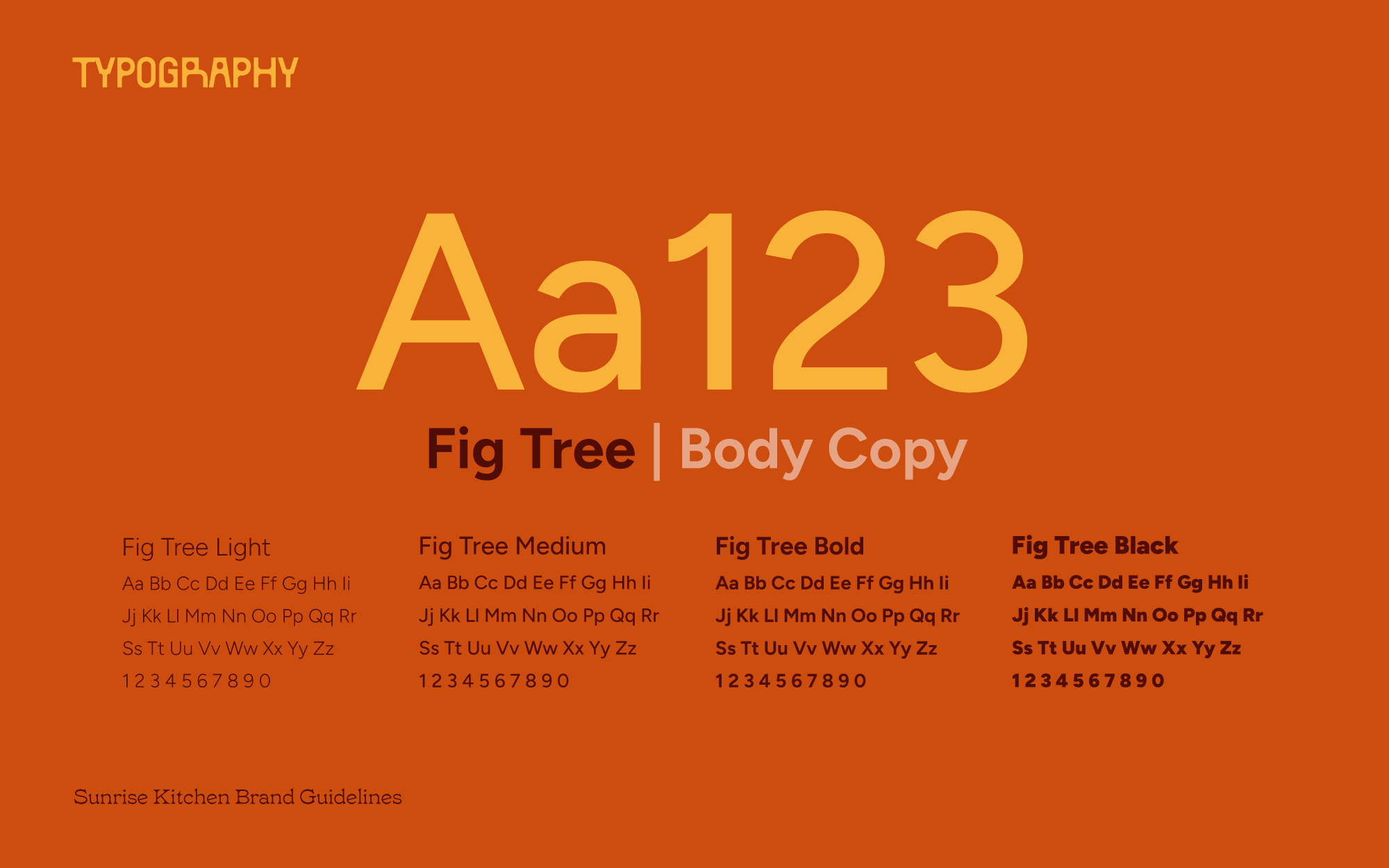
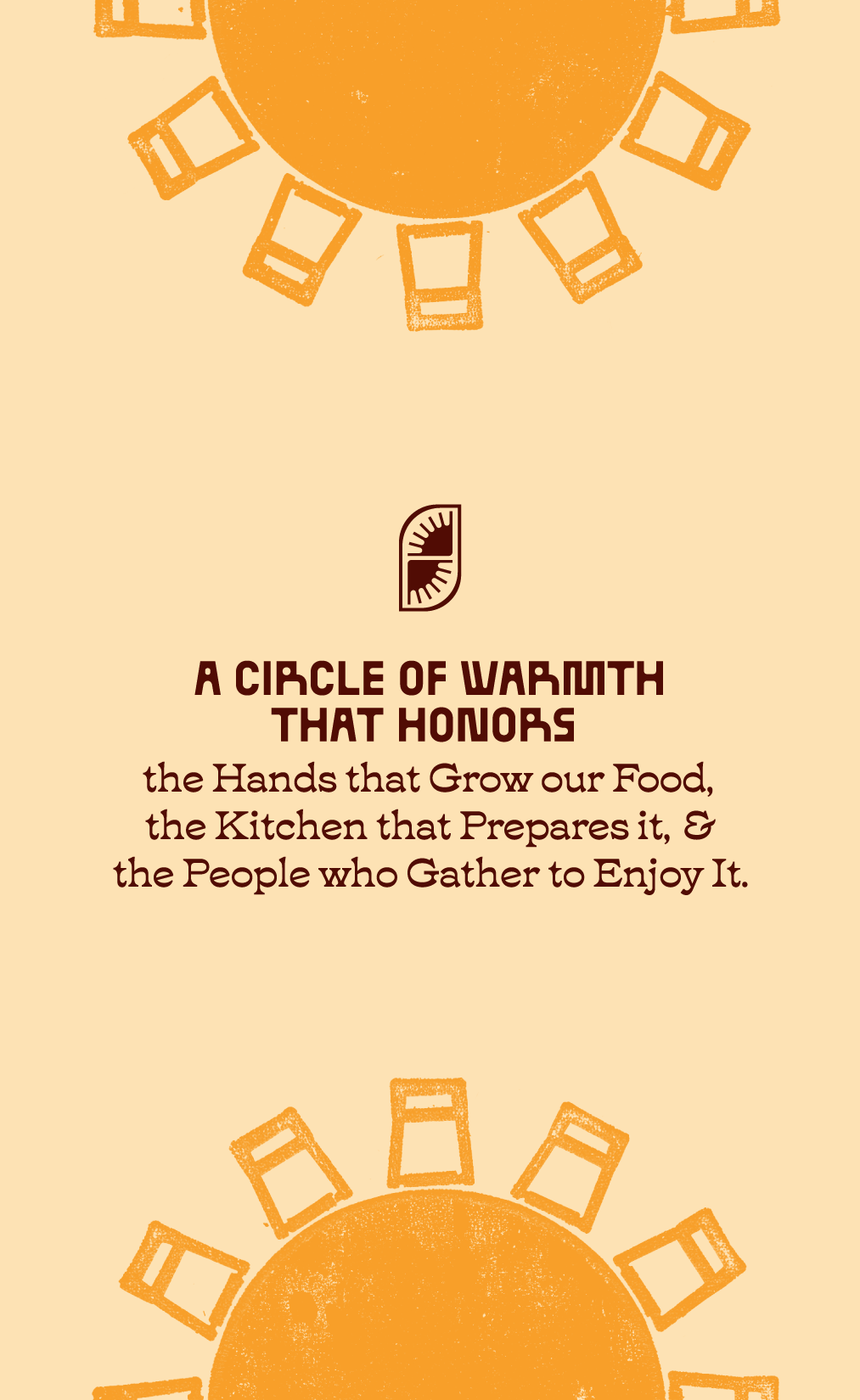
The mark carries the quality: refined, reaching for the horizon, the sense of a place that opens early. The palette carries the cozy: rustic warm brights rather than the muted creams and browns that breakfast branding defaults to. The font carries the disruption: BallPill brings a deliberately unconventional structure to the system, while Tuppence turns heritage into something contemporary and expressive.
the Sunrise mark
Quality at first sight.
Color & type
rustic brights instead of breakfast-category defaults.
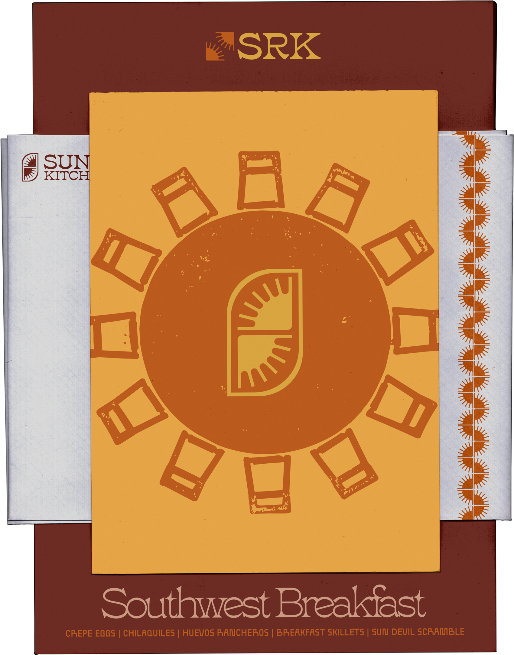
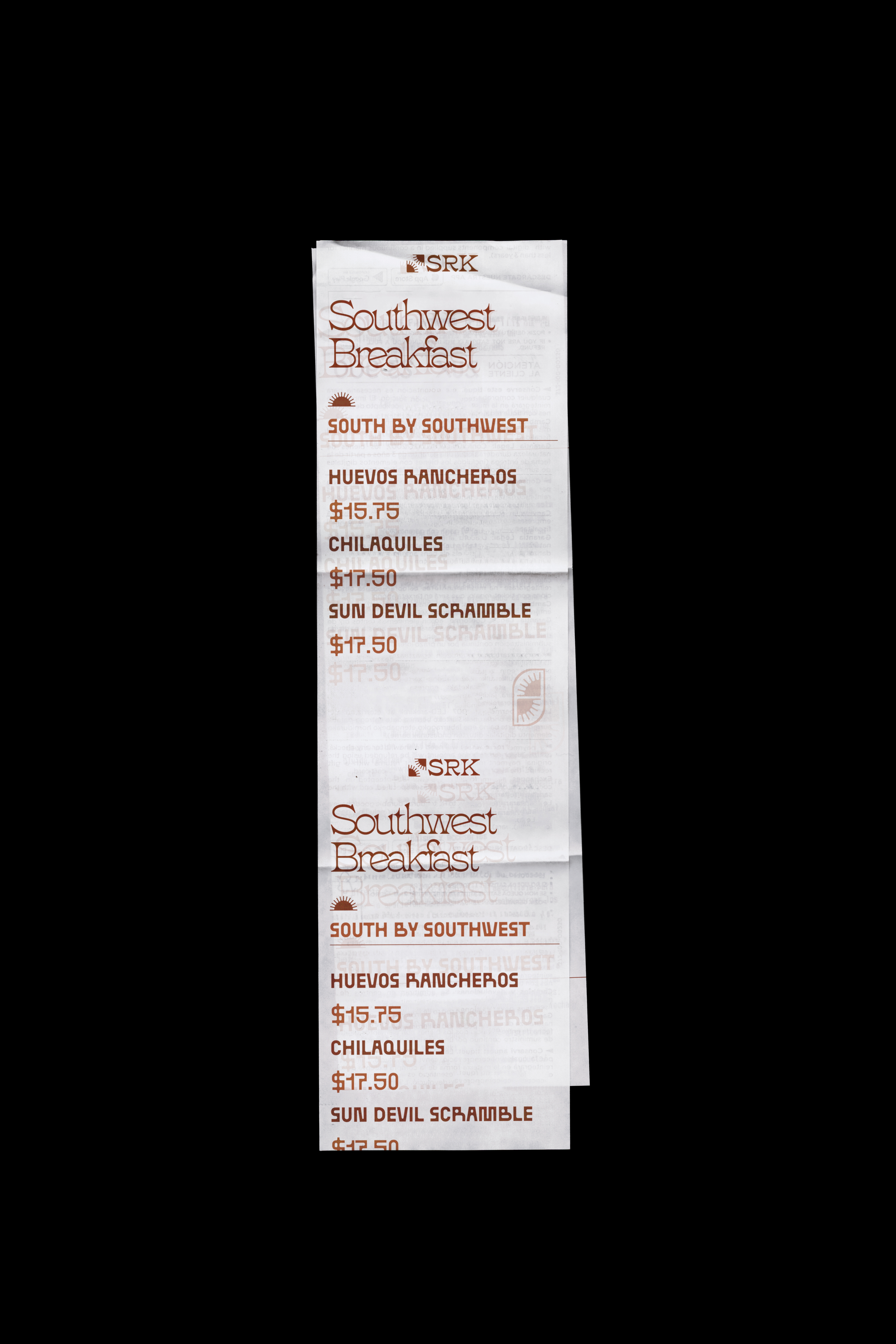
The Menu
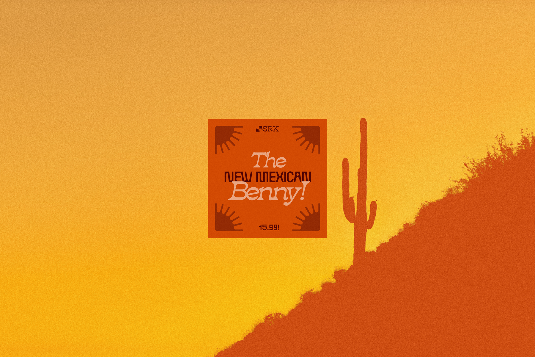
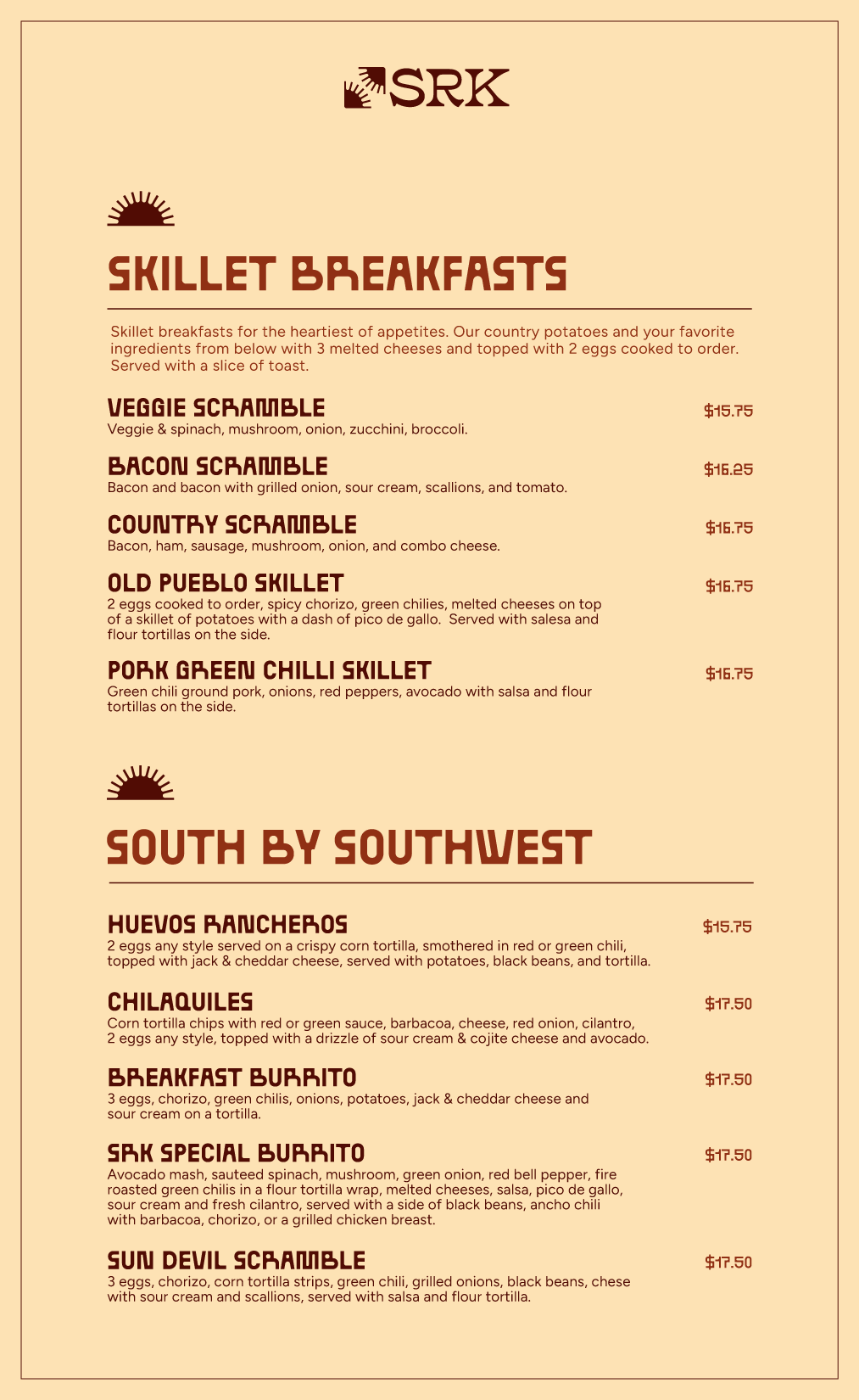
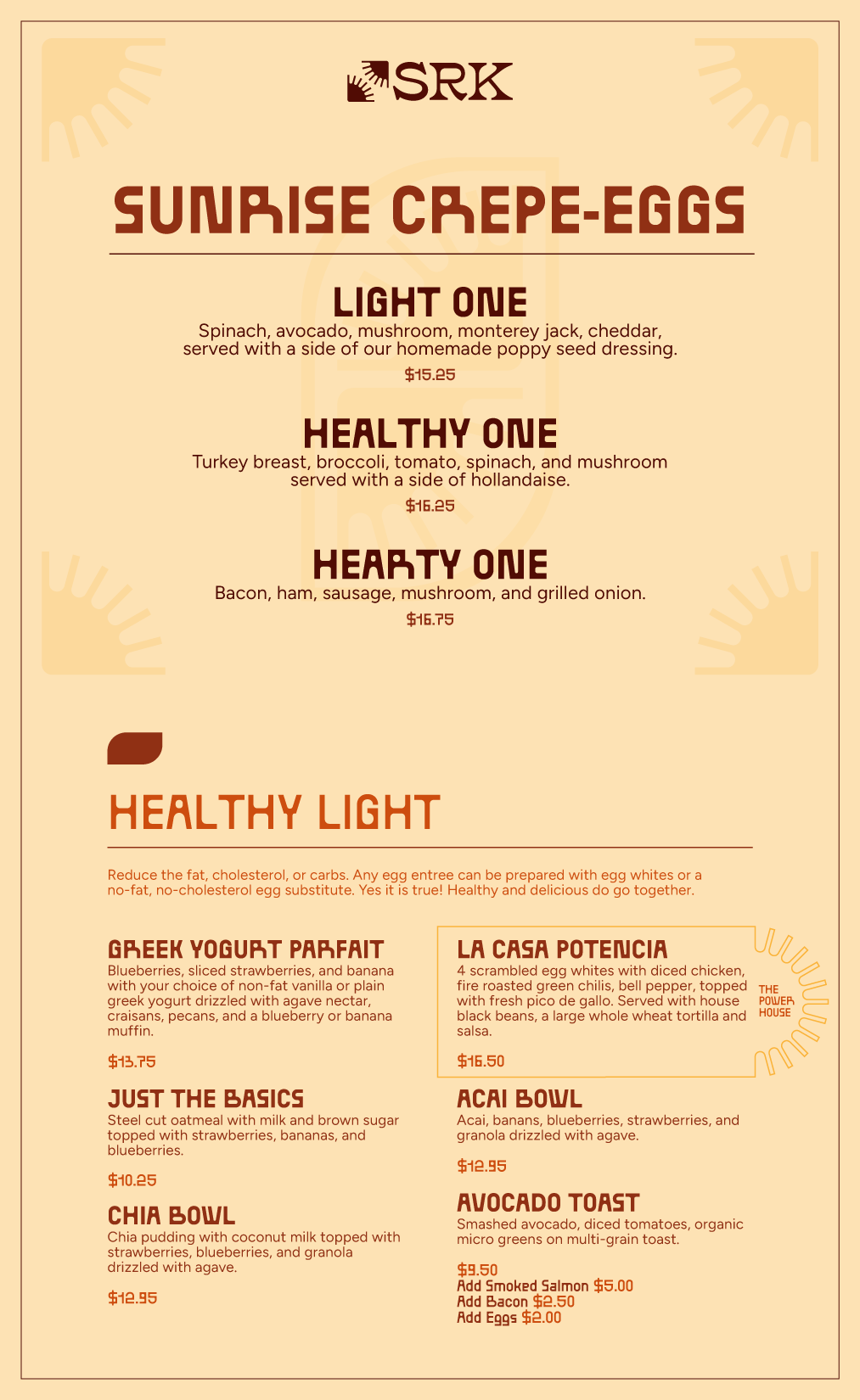
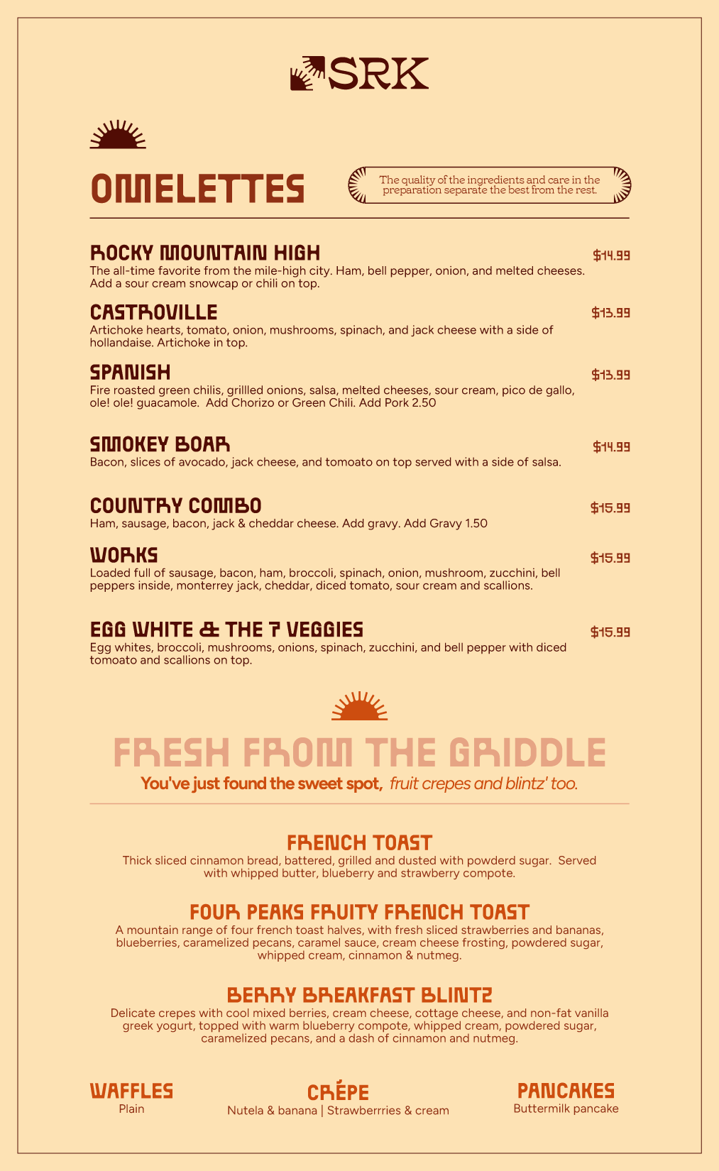
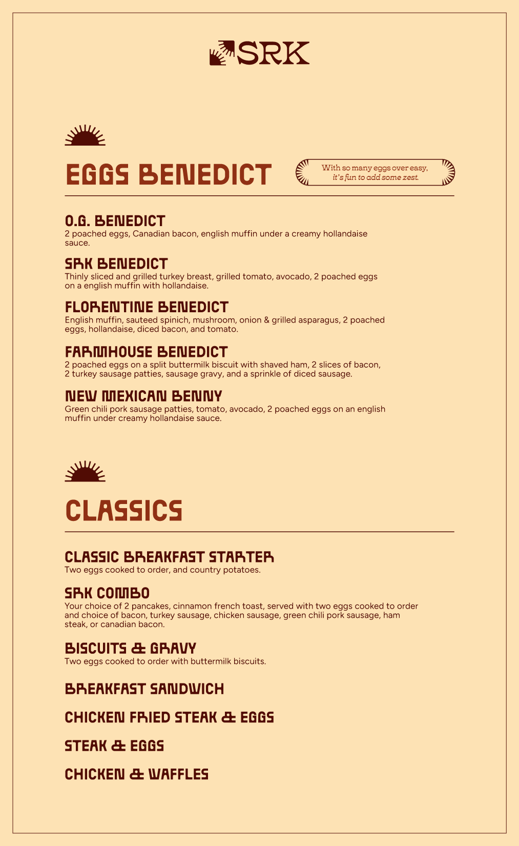
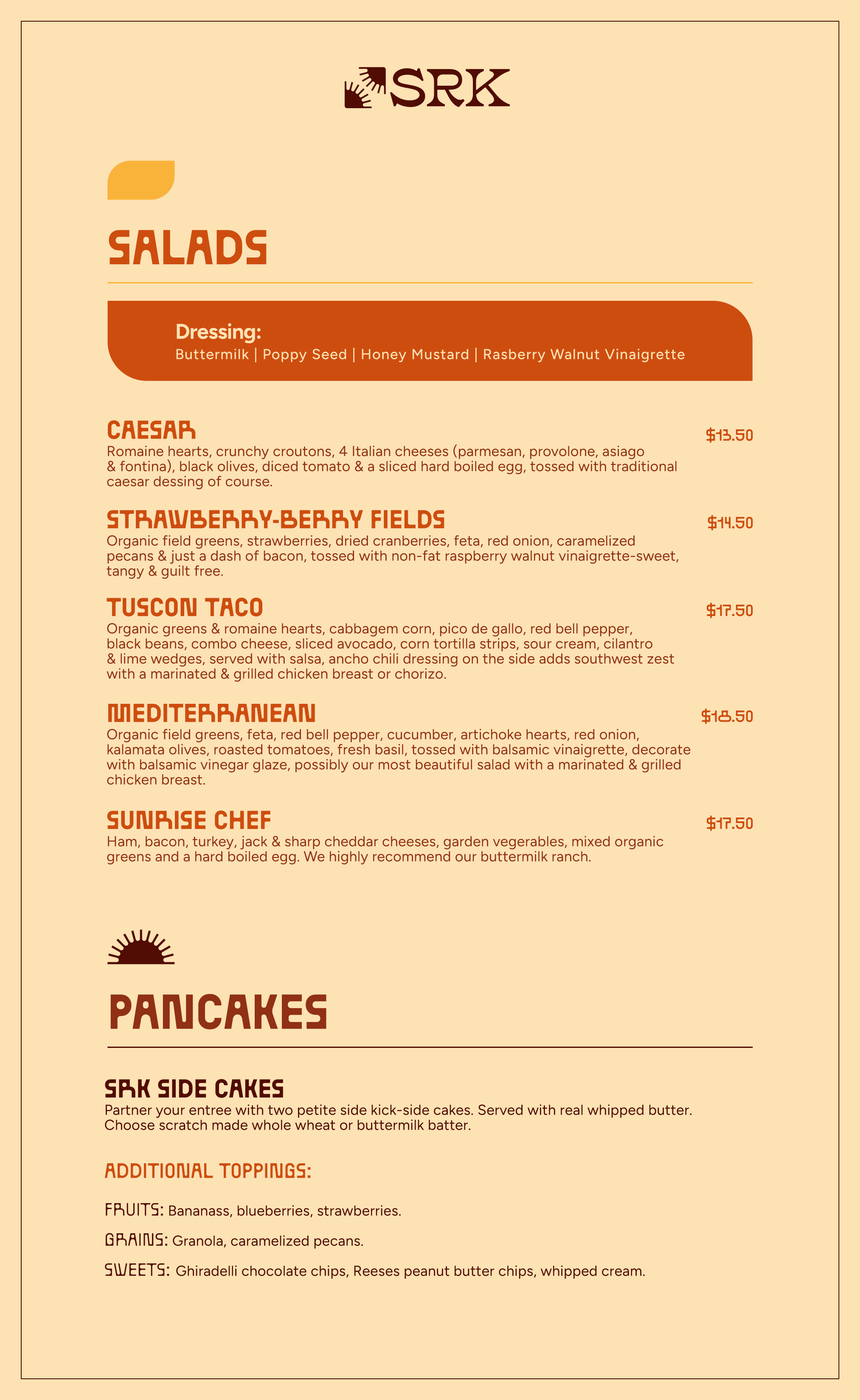
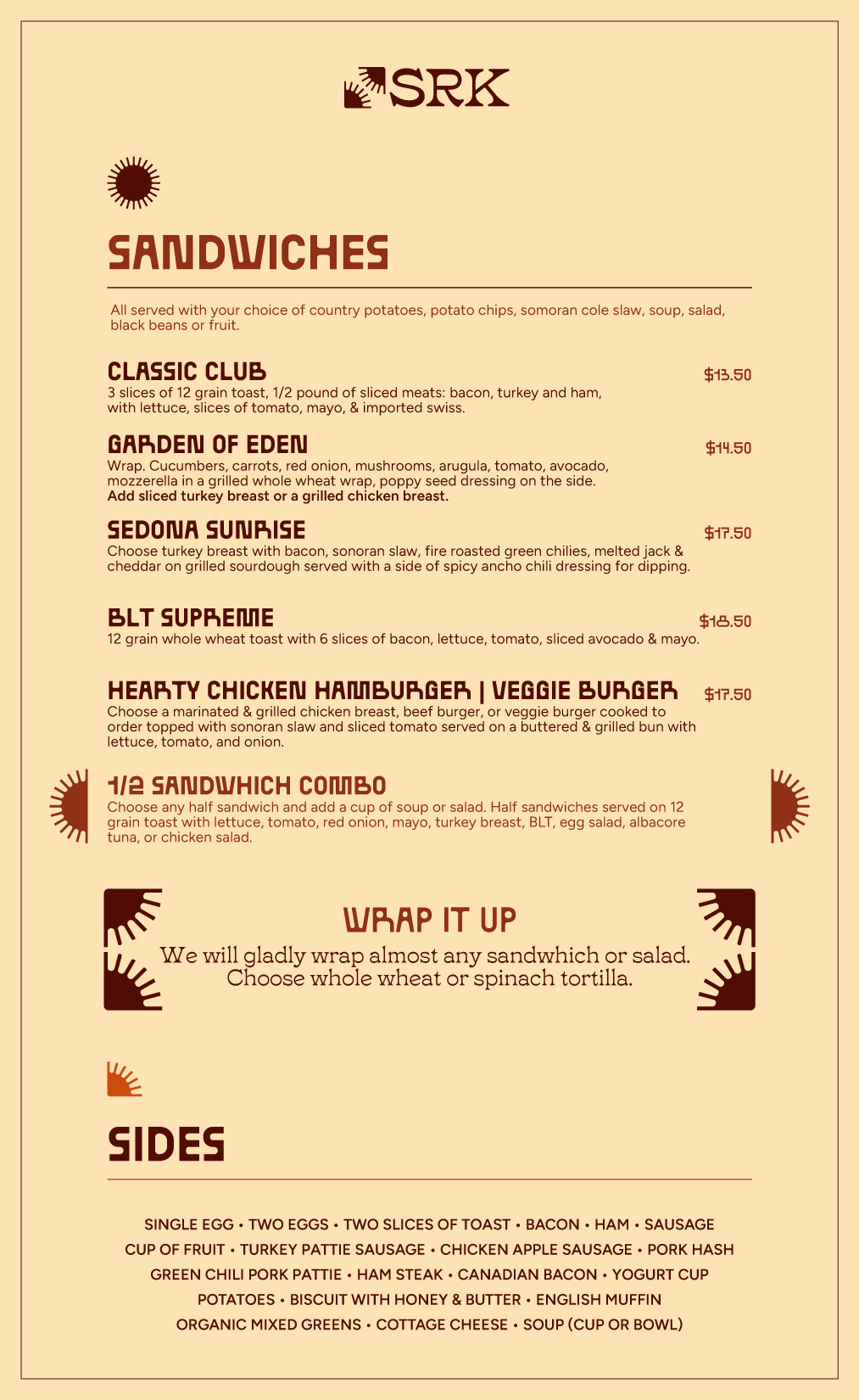
A brand can look great on a coffee cup. The menu is the stress test. (a preview of what's to come)
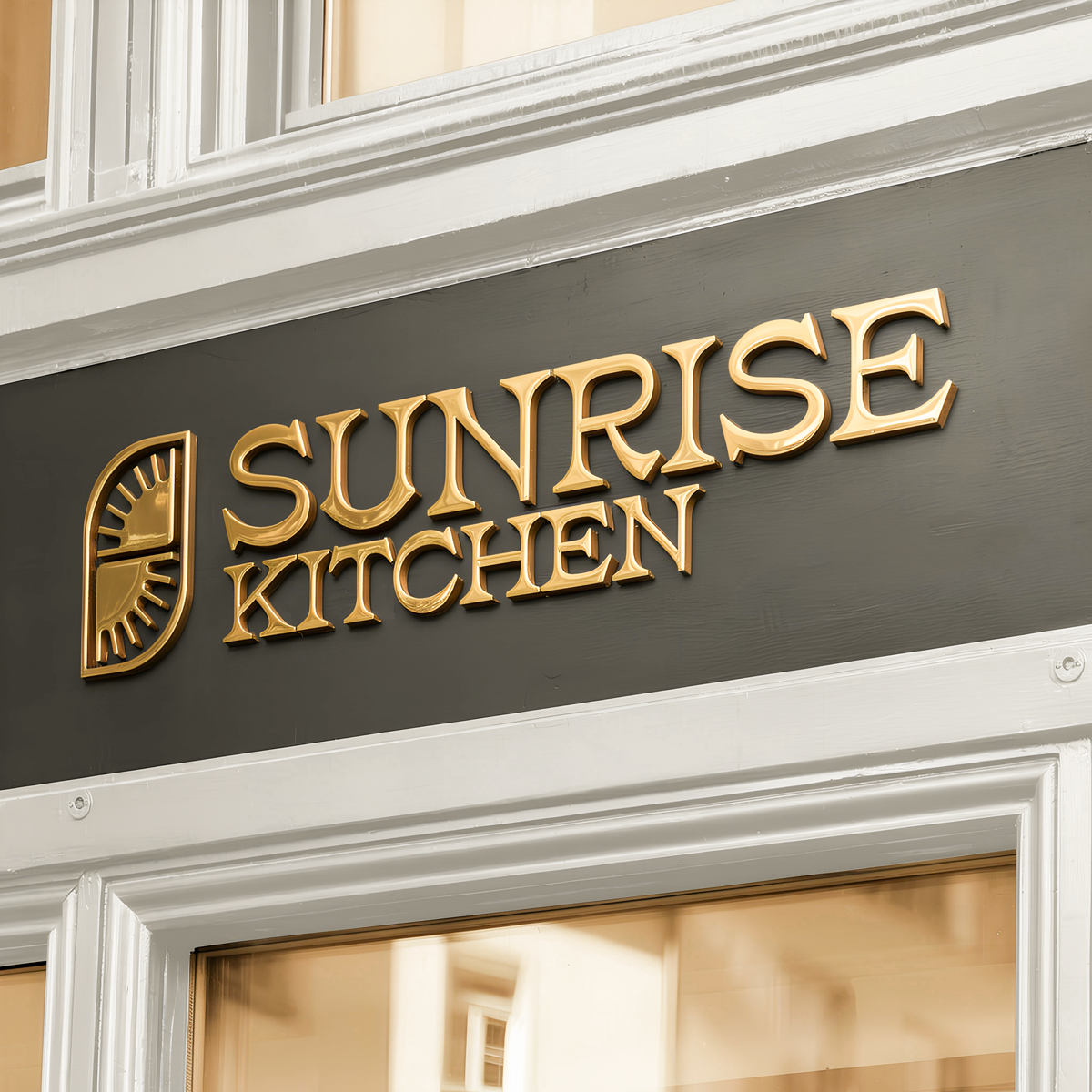
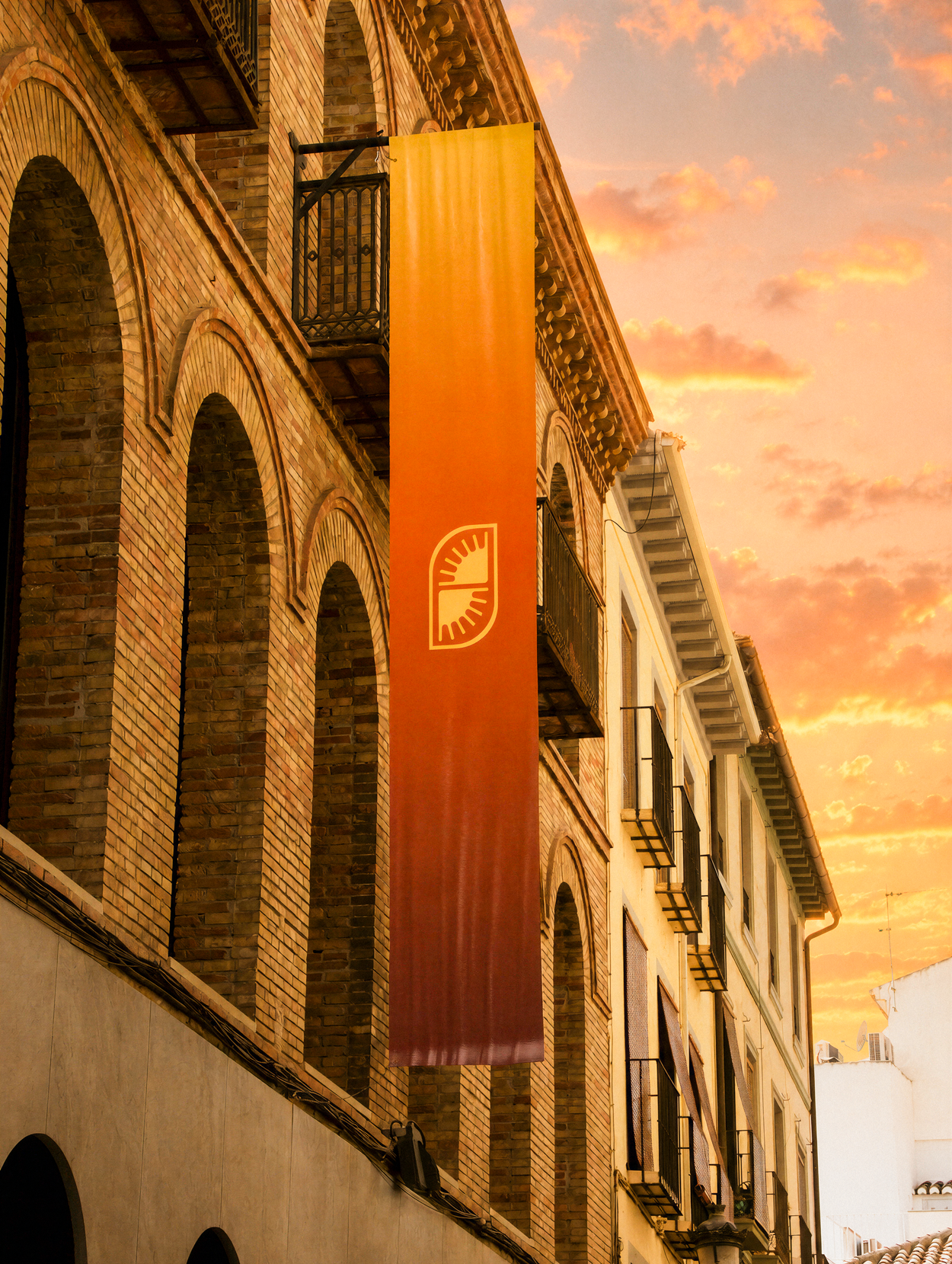
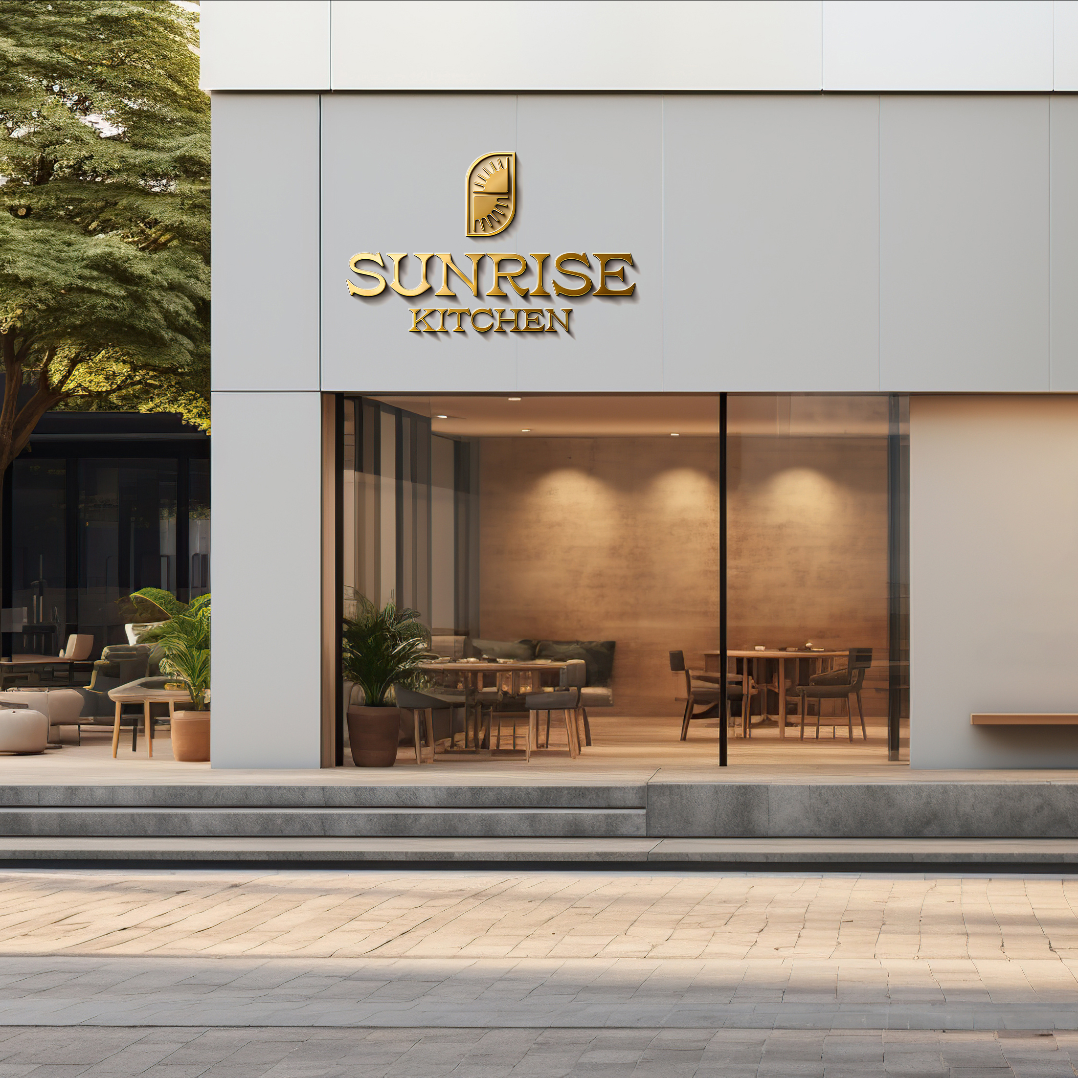
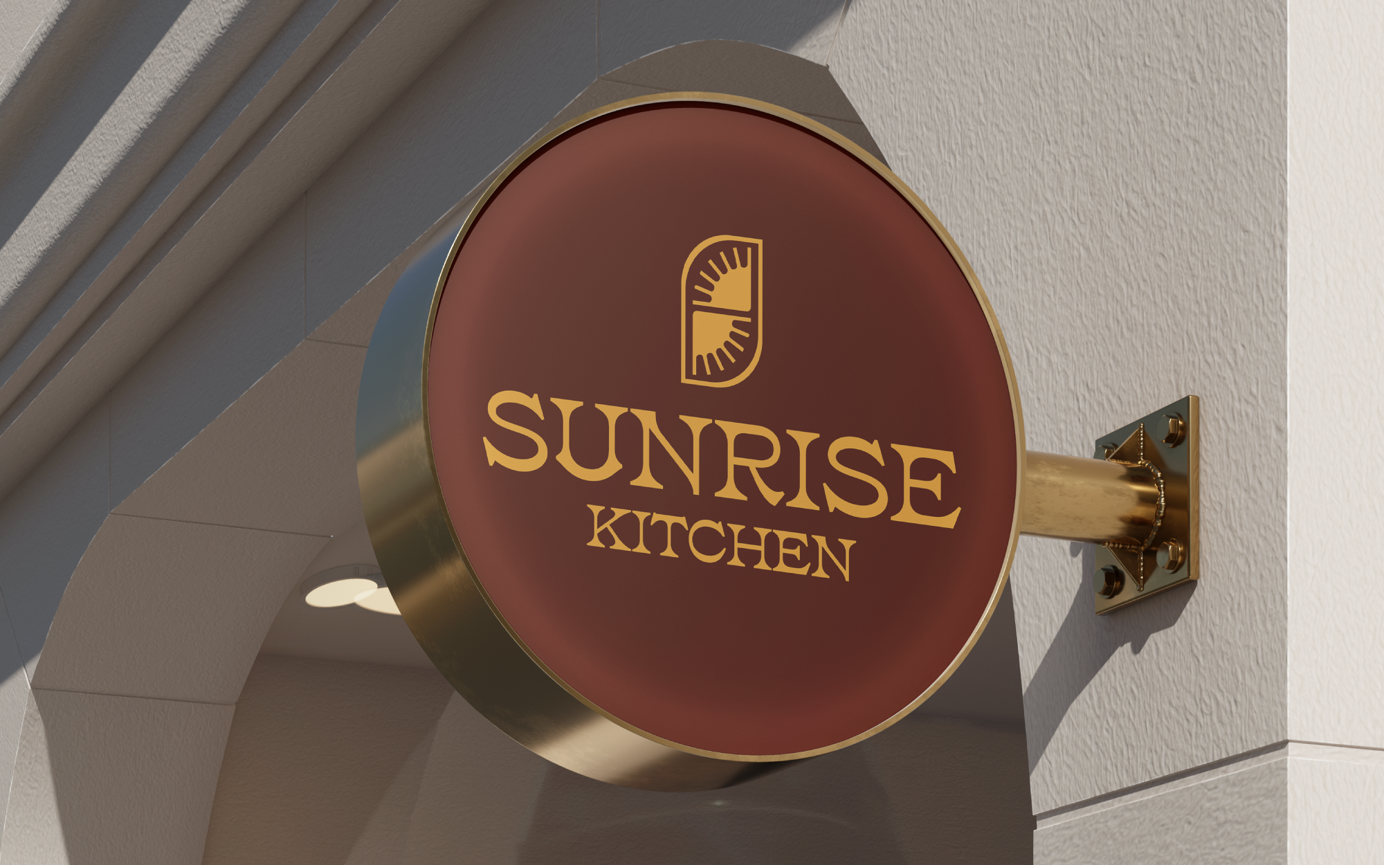
Gold signage
Sunlight is the most precious gold found on earth. For some, the sunrise is the only gold they will ever possess, here we cherish each dawn.
Built to
Perform
The founders paid their full marketing contract the day after seeing the mark.
Operators who had already built and scaled a national breakfast brand committed the entire budget within 24 hours of the first presentation.
Delivered a complete identity system pre-opening.
Logo, palette, typography, menu, packaging, signage, and an 18-page guidelines document. Ready to execute across seven planned locations before the first one opened.
Built to outlive the first location.
The system was designed for a franchise team to apply without the original designer in the room.