Eight years owning every layer of a salon brand. The mark, the photography, the website, and the booking system that turns all of it into revenue.
Client
Tease Me Hair Salon
Role
Creative DIrector
Scope
Identity Design
Photography
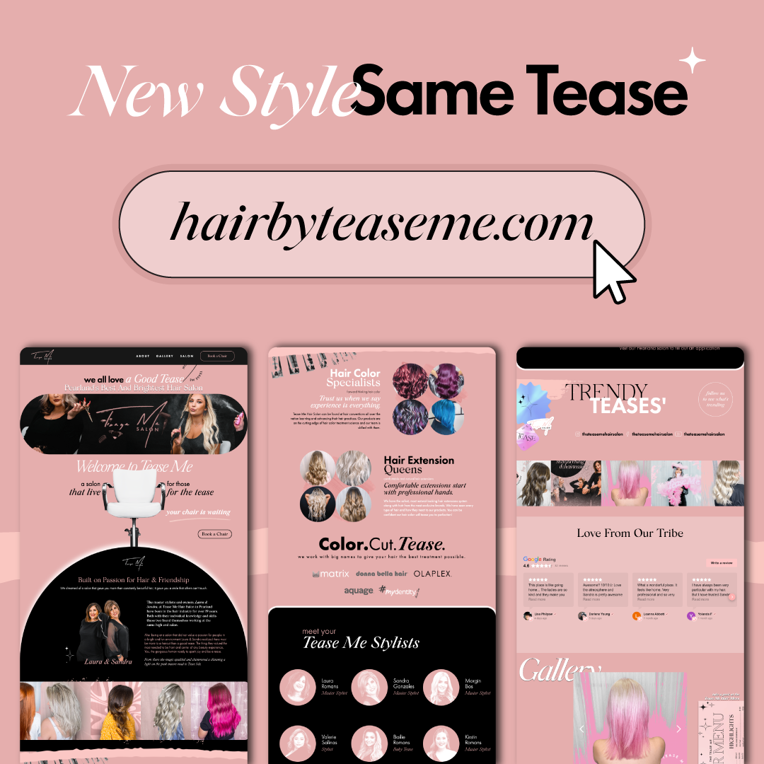
Website Design
Year
2018 2026
THE
Situation
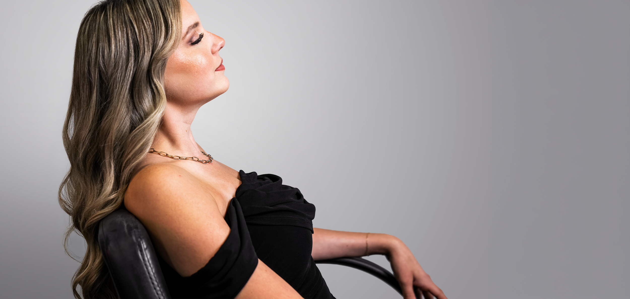
Tease Me is a hair salon twenty years into a growing clientele. A genuine local powerhouse whose reputation lived entirely in its stylists and its word of mouth.
None of that reputation existed visually. There was no brand to match the business.
the
Problem
The salon's equity was in relationships, not identity. Twenty years of regulars had a version of Tease Me in their heads, and a rebrand that felt like a different business would cost more than it gained. The new brand had to raise the ceiling without moving the floor.
Rebranding something that already works is riskier than branding something new.
Then there's the category. Salon branding is a cliche minefield. Scissors, swooshes, script type, black-and-gold luxury signaling. Every obvious move is overdone.
The brand had to work, not just look right. A salon doesn't monetize impressions. It monetizes booked chairs.
Approach
Make the mark with the medium.
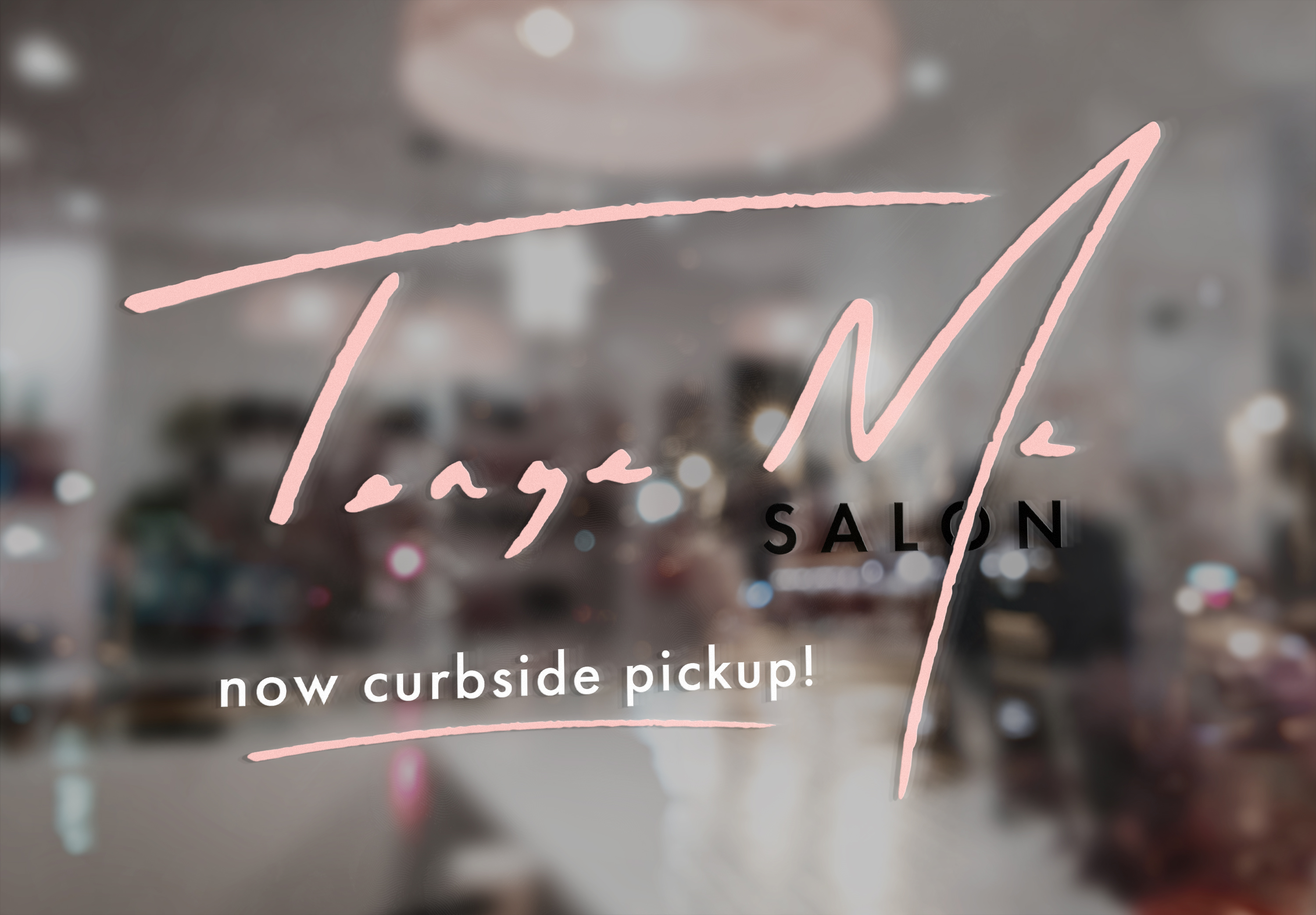
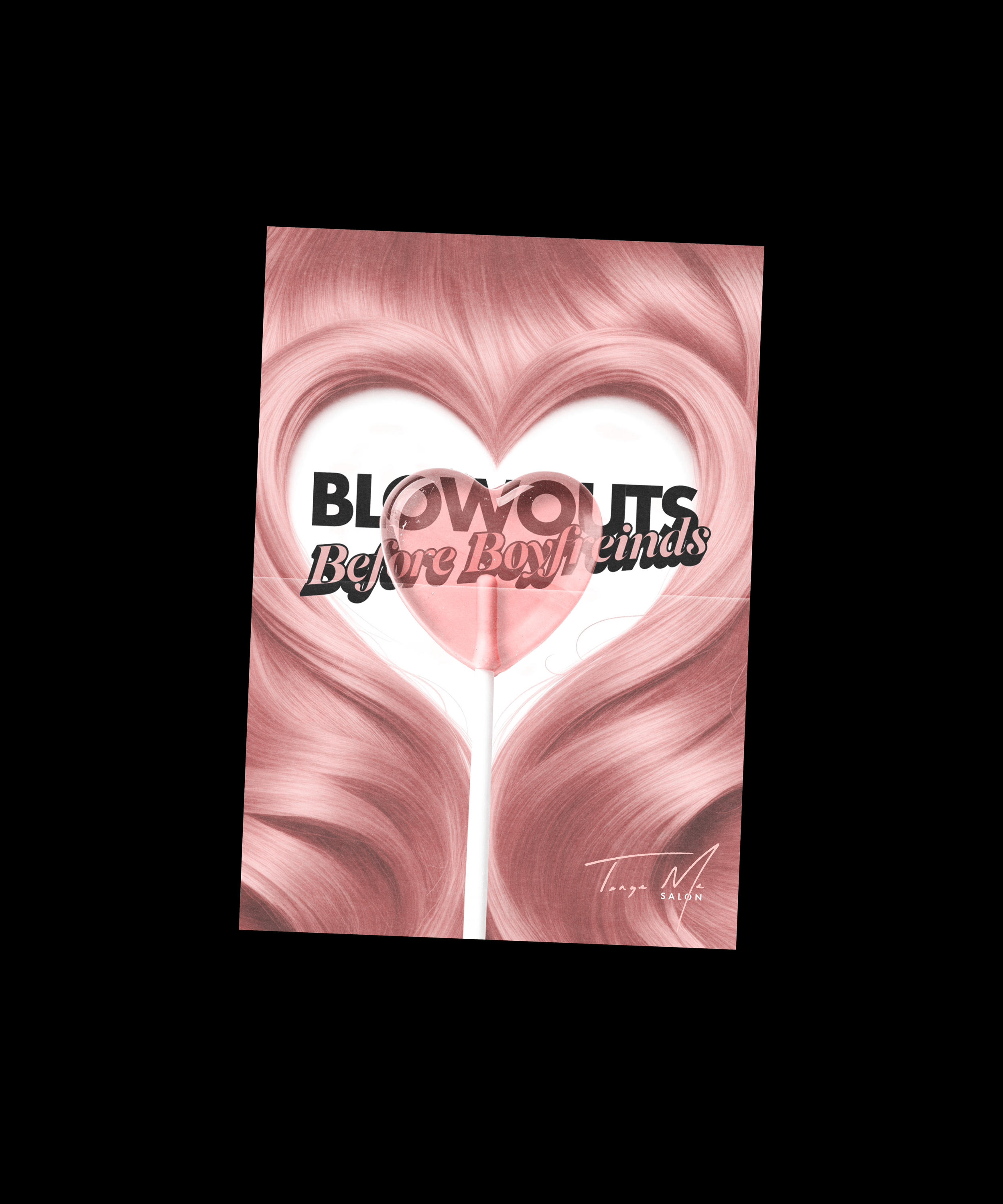
Rather than drawing a salon logo, we drew it with eyeliner. The mark came out of an actual makeup gesture. Which gave it glam and precision without a single scissor, hair strand, or script flourish. The category cliches got solved by changing the tool, not the concept.
Own the image, own the brand
Most identity work starts dying the day the client shoots their own content. Starting with the first photoshoot in 2018, I directed the photography. The brand's entire visual library was built inside the system rather than layered on top of it. Eight years later the brand still looks like itself, all because I was behind the camera for ever photoshoot.
the brand
Quality at first sight.
Color & type
Quality at first sight.
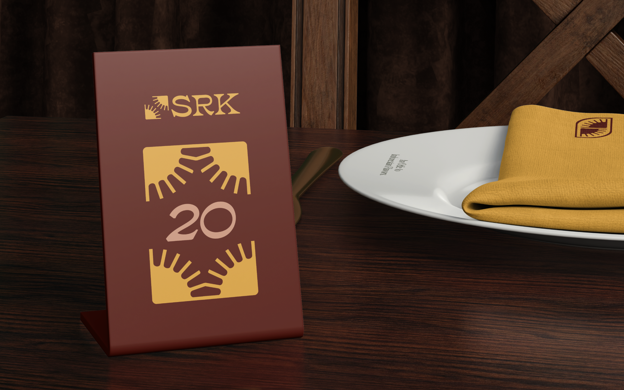
The Menu
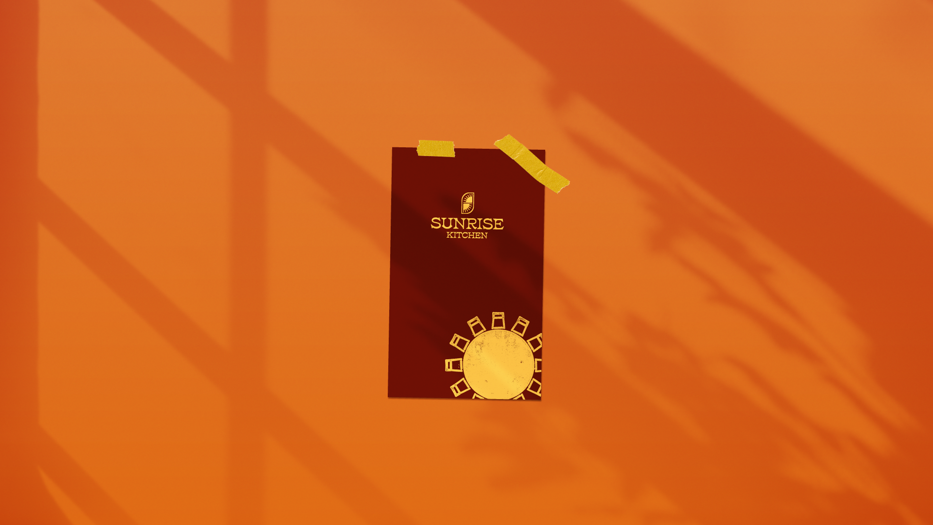
A brand can look great on a coffee cup. The menu is the stress test. (not current menu, but a preview of what's to come)
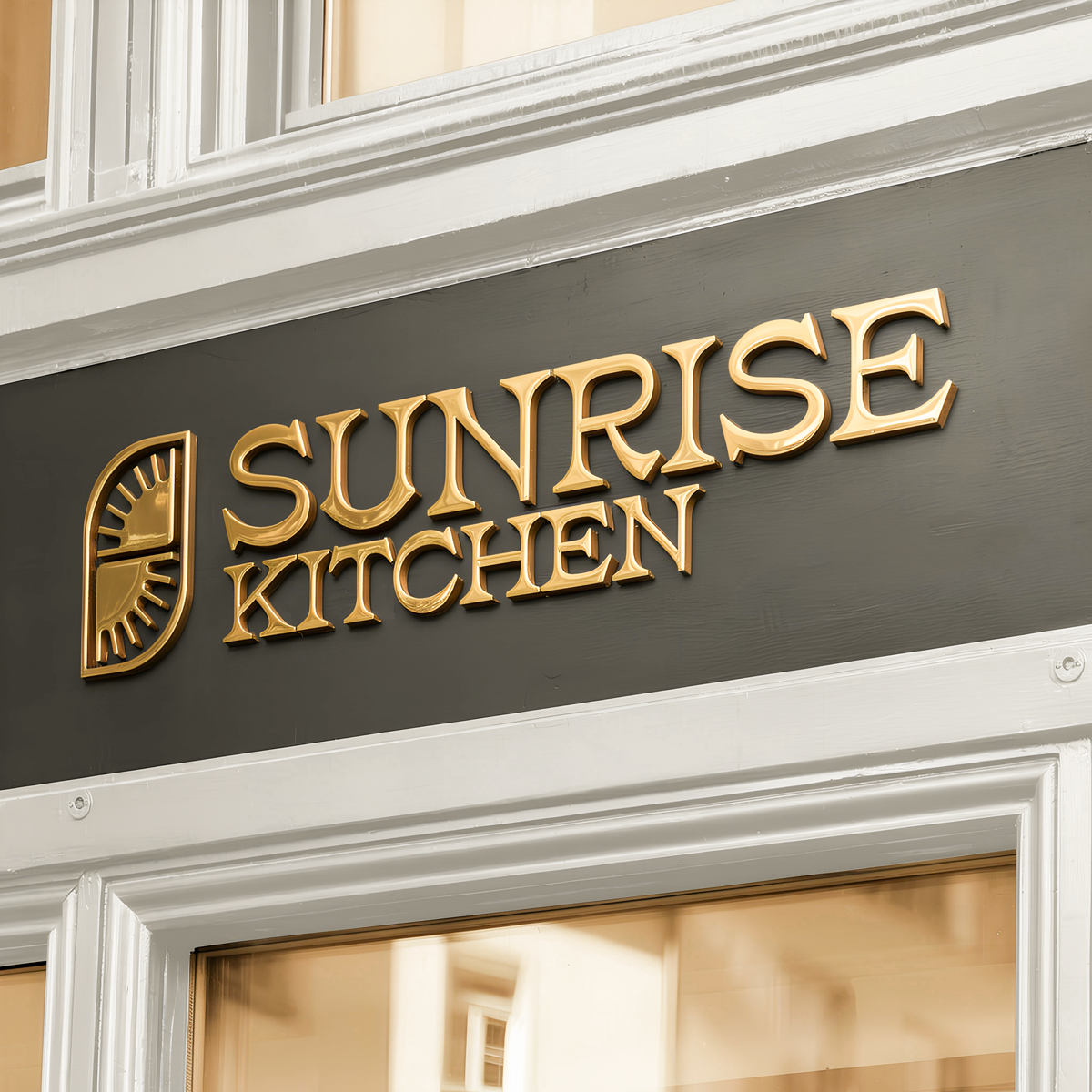
Gold signage
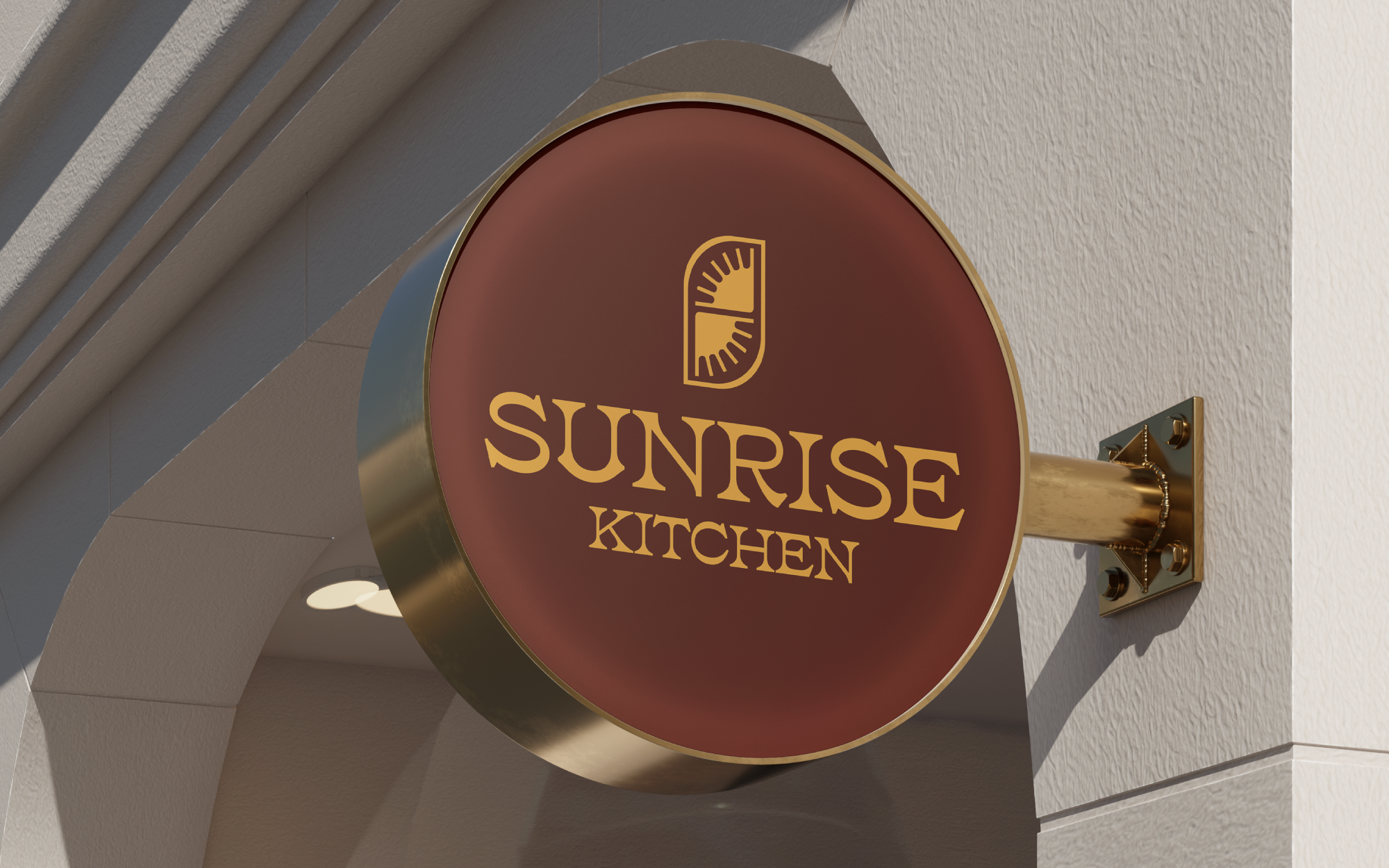
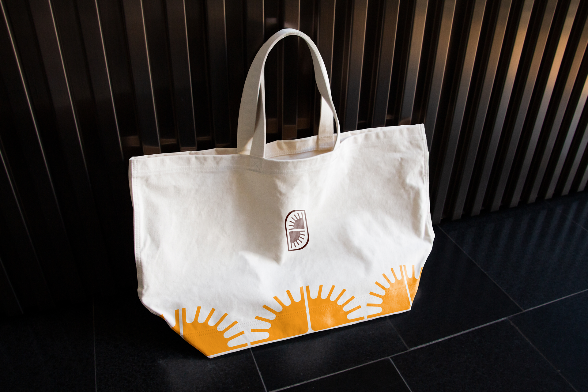
Sunlight is the most precious gold found on earth. For some the sunrise is the only gold they will ever possess, here we cherish each dawn.
Built to
Perform
The founders paid their full marketing contract the day after seeing the mark.
Operators who had already built and scaled a national breakfast brand committed the entire budget within 24 hours of the first presentation.
Delivered a complete identity system pre-opening.
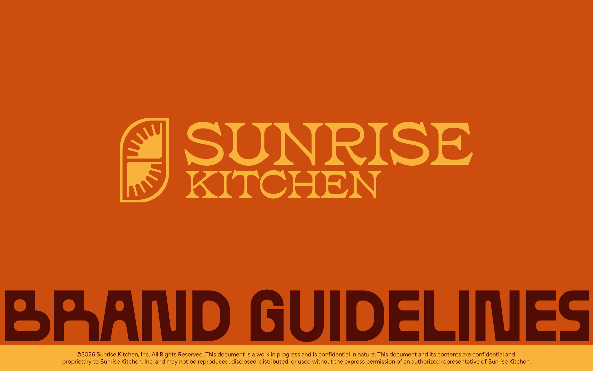
Logo, palette, typography, menu, packaging, signage, and an 18-page guidelines document. Ready to execute across seven planned locations before the first one opened.
Built to outlive the first location.
The system was designed for a franchise team to apply without the original designer in the room.
A southwestern breakfast identity designed to franchise before the first door opened, for the team that already built First Watch.
Client
First Watch Founders
Role
Brand Design Lead
Scope
Identity Design
Brand Guidelines
Menu Design
Year
2025 2026
THE
Situation
Sunrise Kitchen is a savory southwestern breakfast concept focusing on crepe eggs, chilaquiles, huevos rancheros, and hospitality. Building its first location in Arizona.
The founders previously built First Watch. They plan on opening the first of seven, targeted across the next seven years, with the funding already in place.
the
Problem
A single neighborhood restaurant can have a charming one-off mark. A seven-location national rollout can't. It needs a system that holds up across markets, formats, and a decade, applied by people who won't be in the room. But on opening day in Arizona, it still has to feel like a local place that's always been there.
The brief made the tension explicit. The four words the founders gave me were disruptive, cozy, quality, family.
Disruptive and cozy don't naturally coexist. Most brands pick one, either it's a warm neighborhood diner or it's a loud modern concept. Sunrise Kitchen had to be both, and had to stay both at seven locations.
Approach
Design the system, not the storefront.
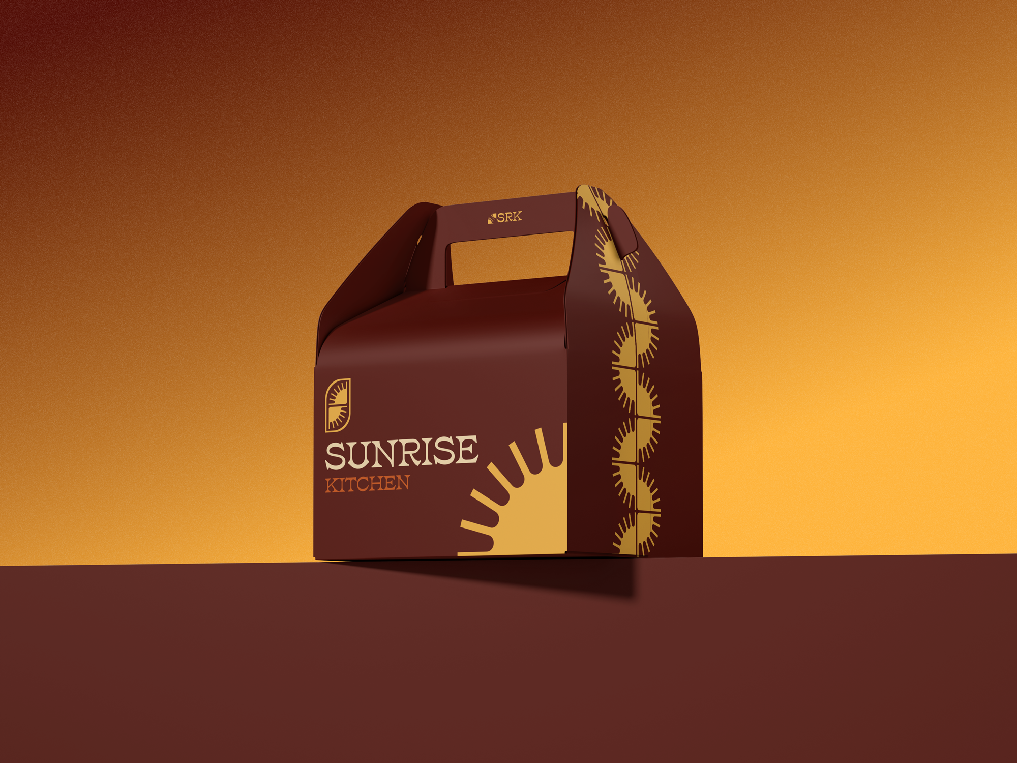
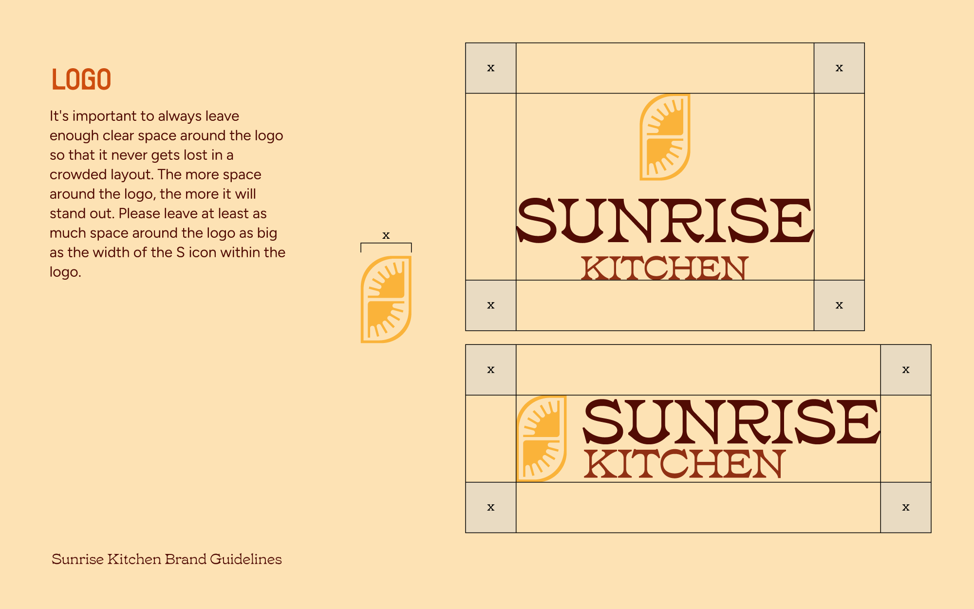
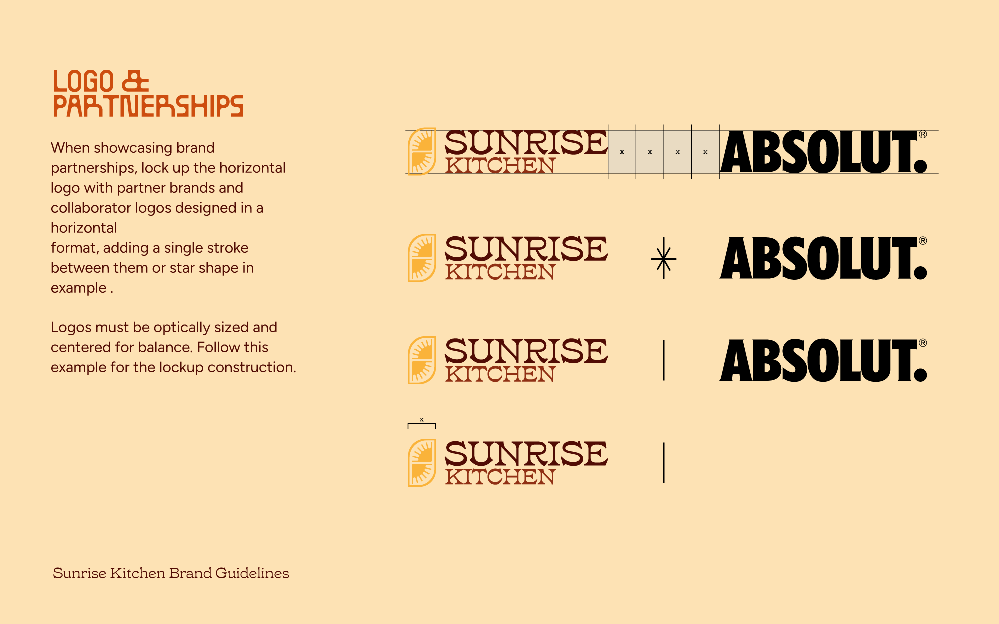
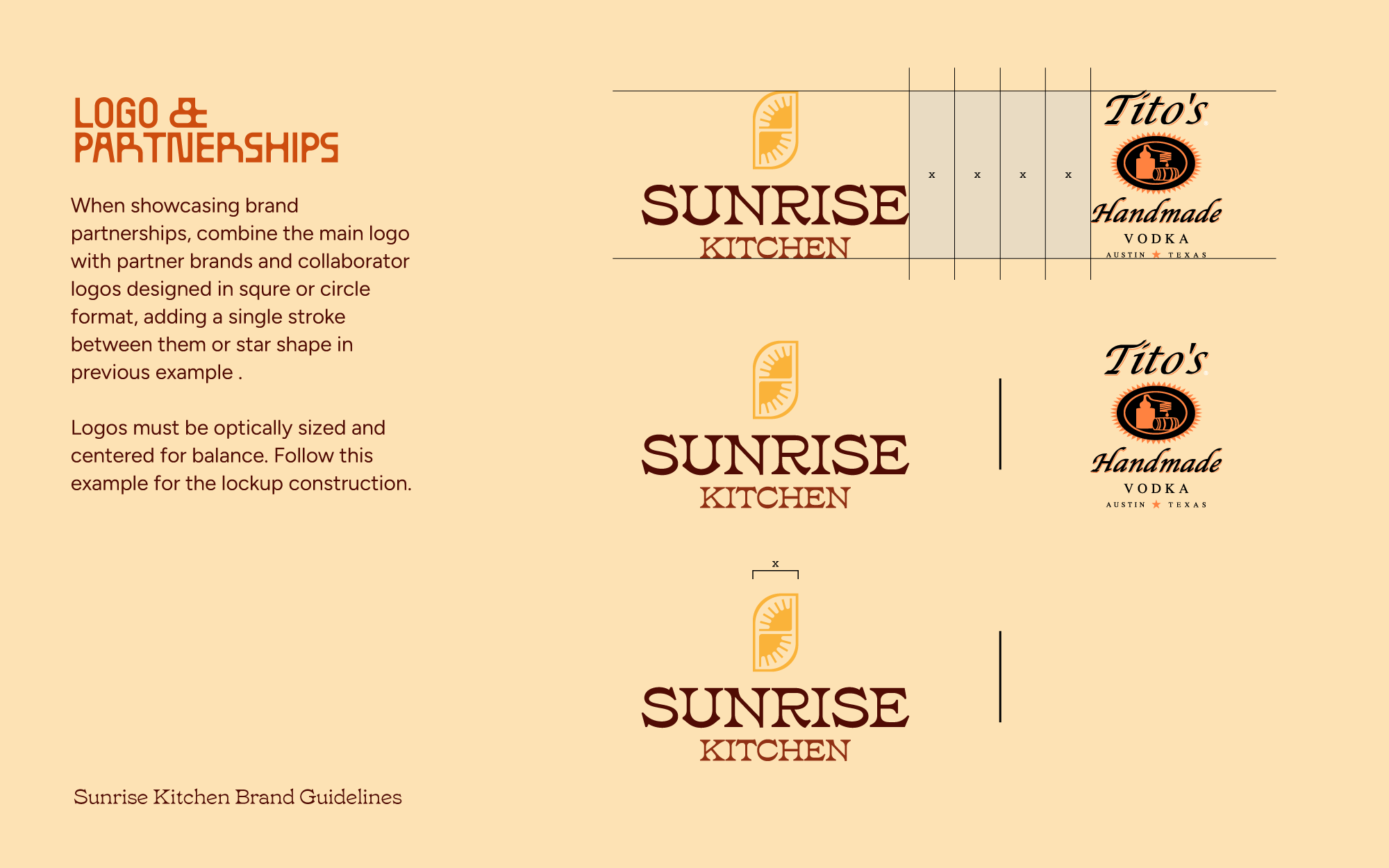
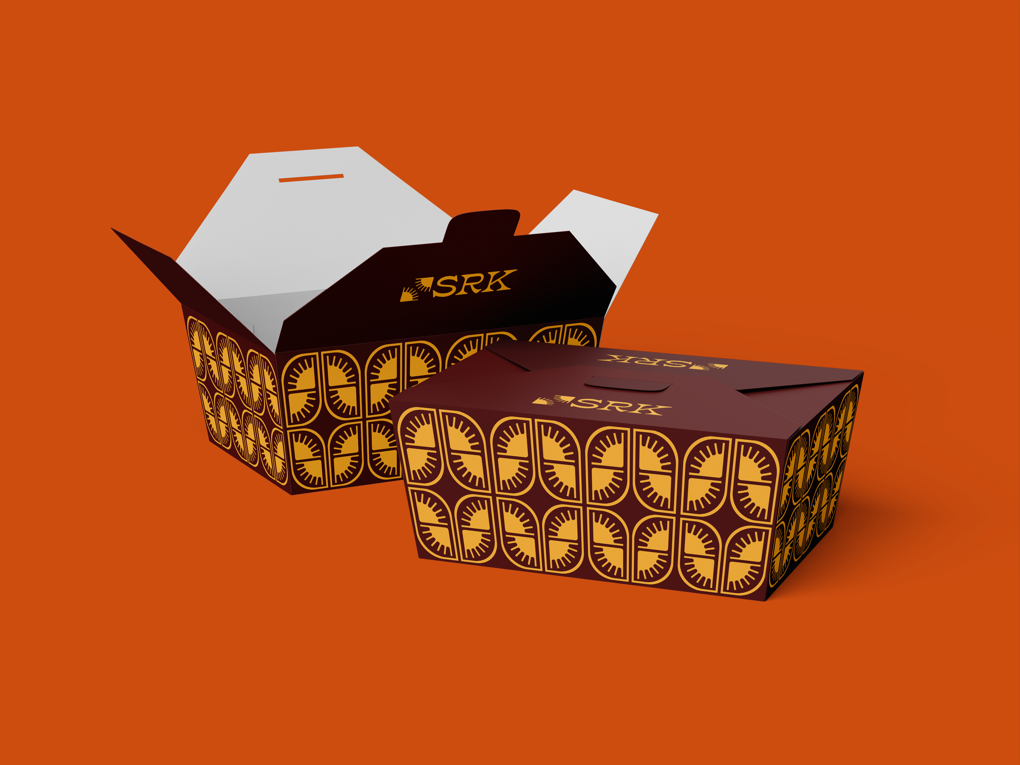
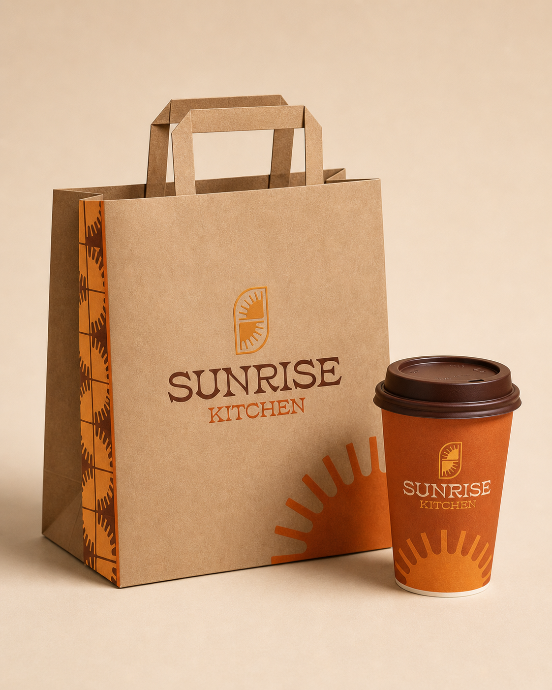
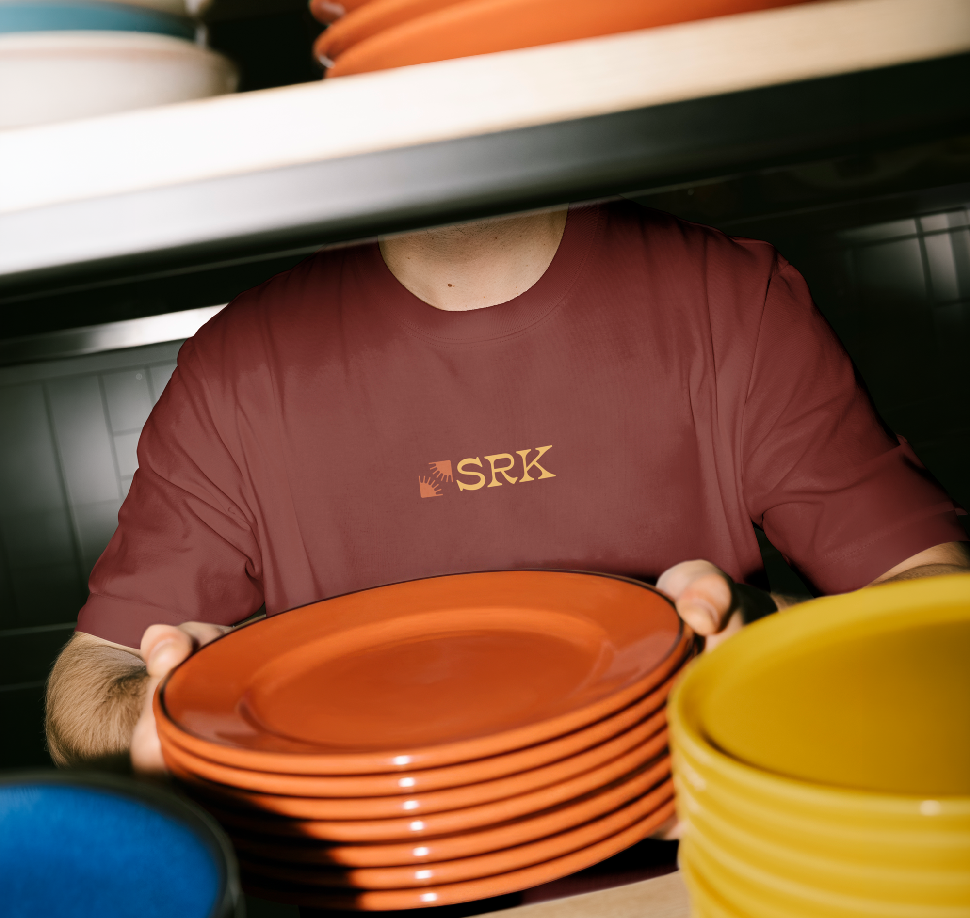
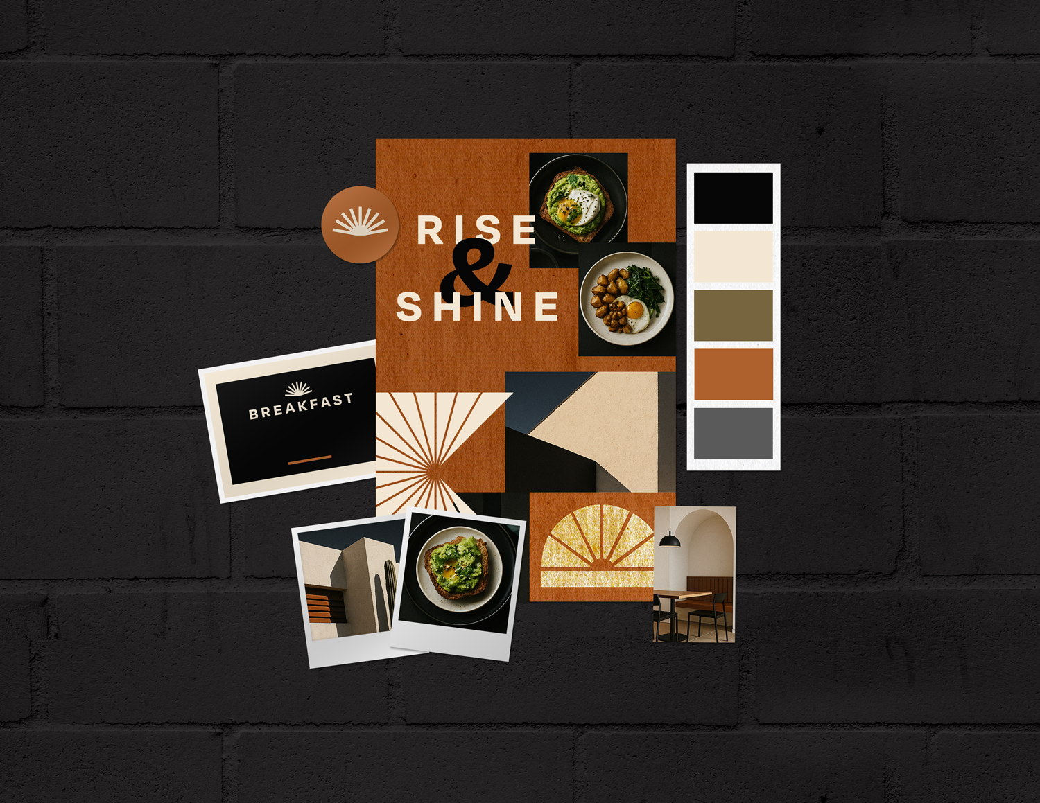
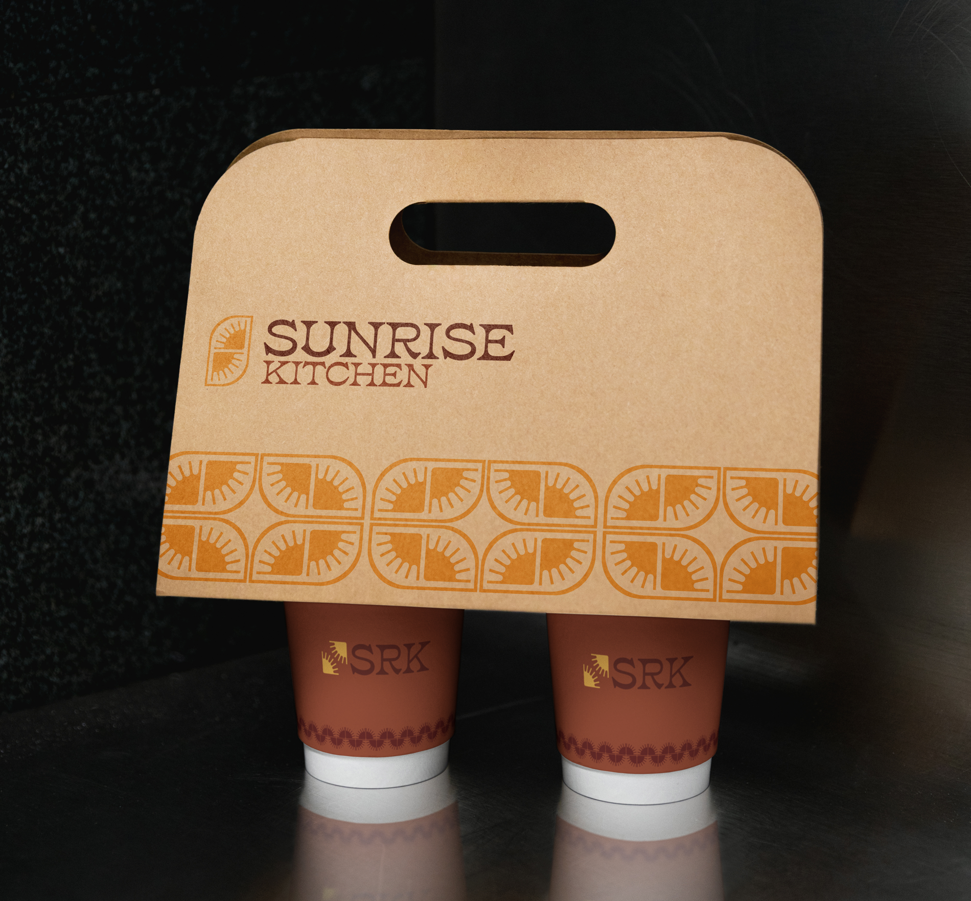
I built the identity as a system from the first sketch, not a logo with applications bolted on afterward. First we presented mood boards and recived feedback. Then every decision after was to embody the right tone and building contraints around it. We tested our marks and fonts against the hardest surfaces before the easy ones: a to-go box, a building facade, an embroidered tee, a phone screen.
Resolve the tension systematically.
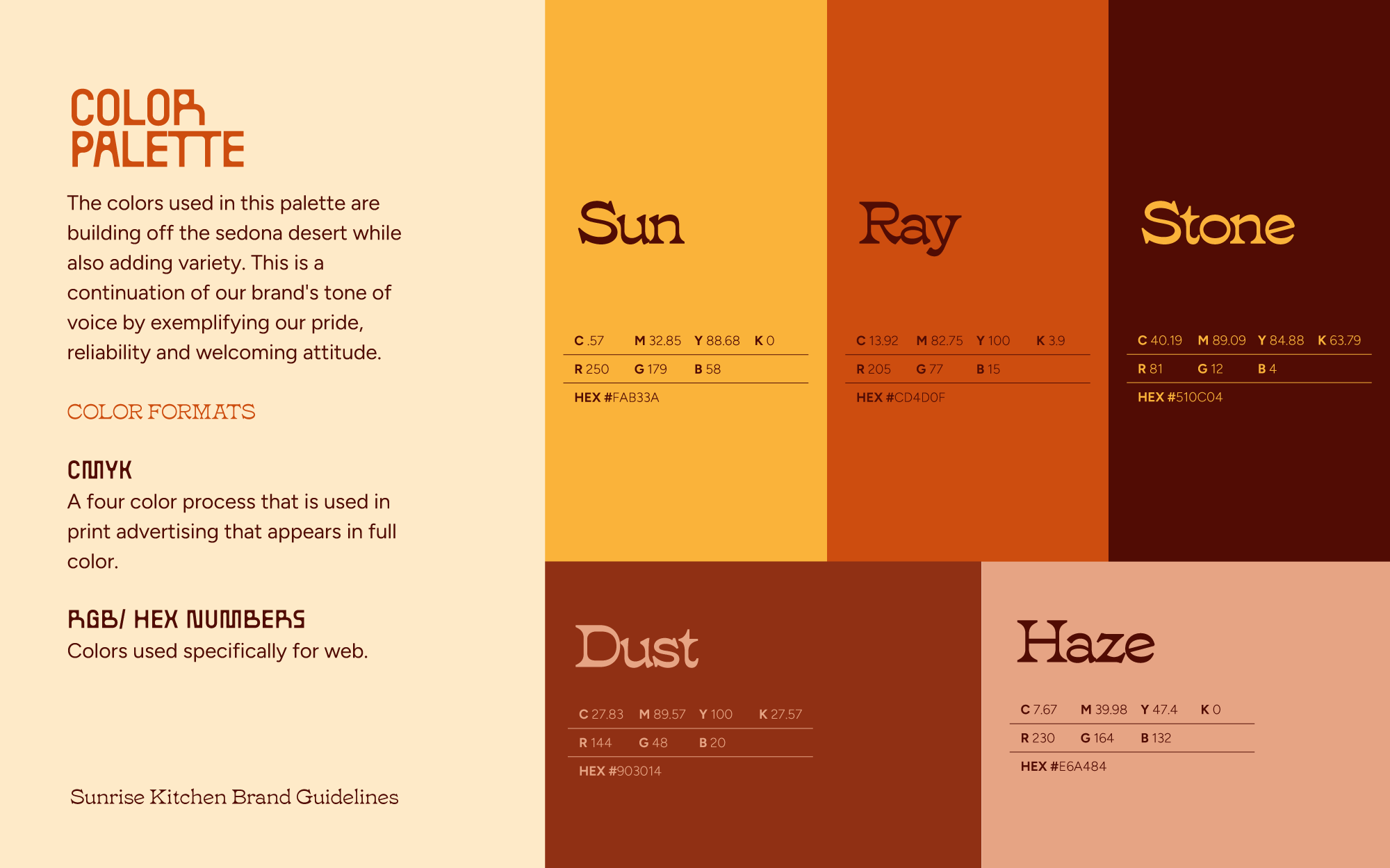
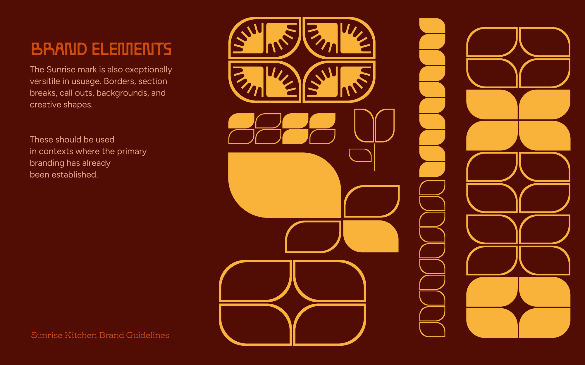
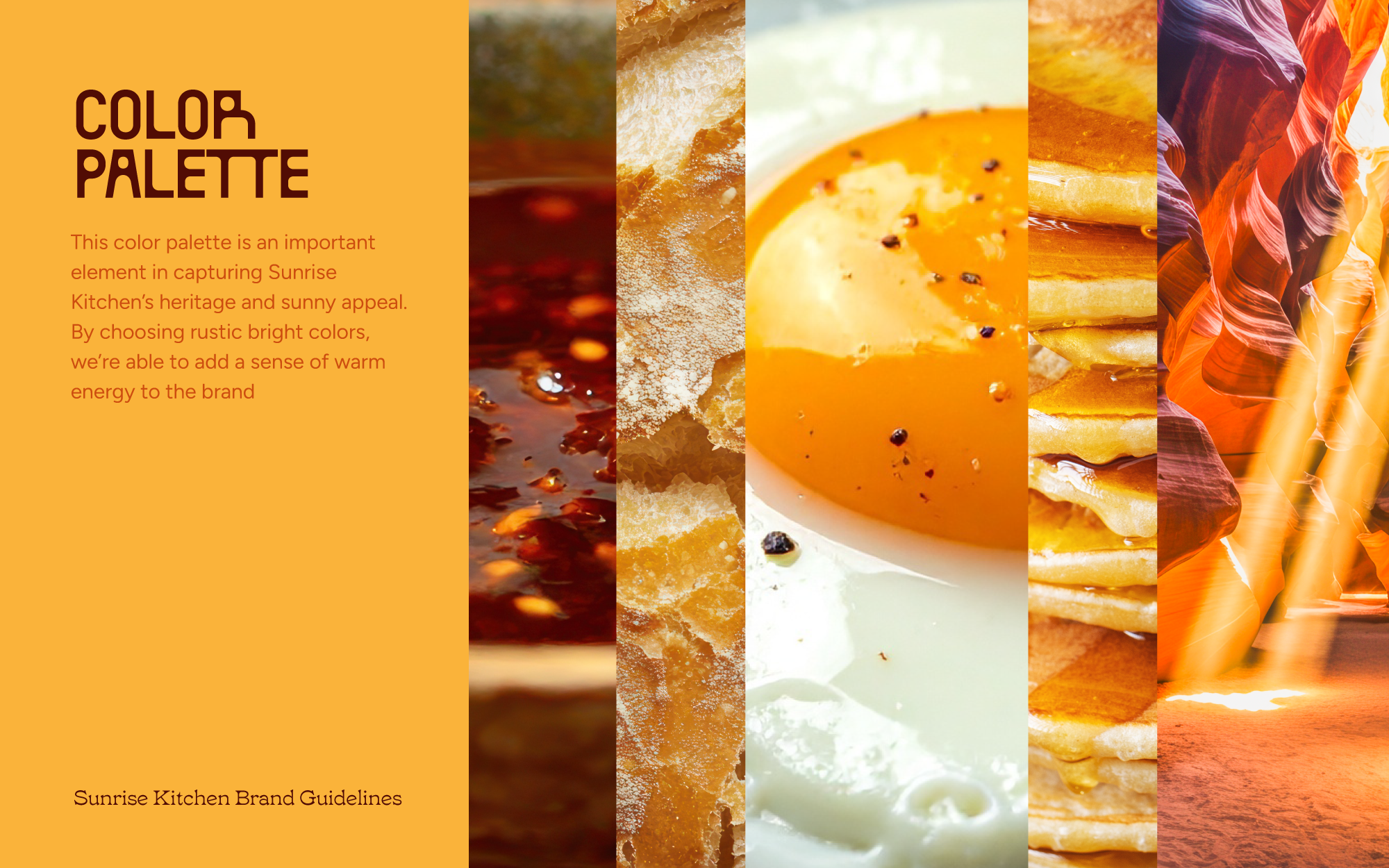
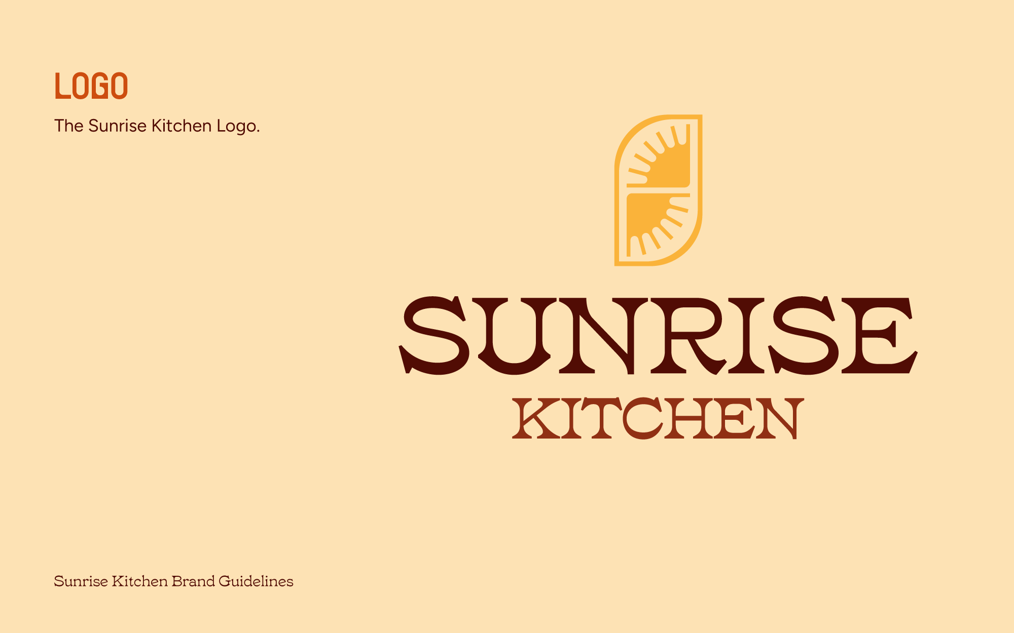
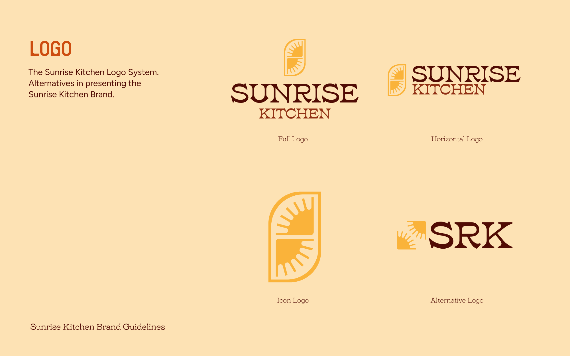
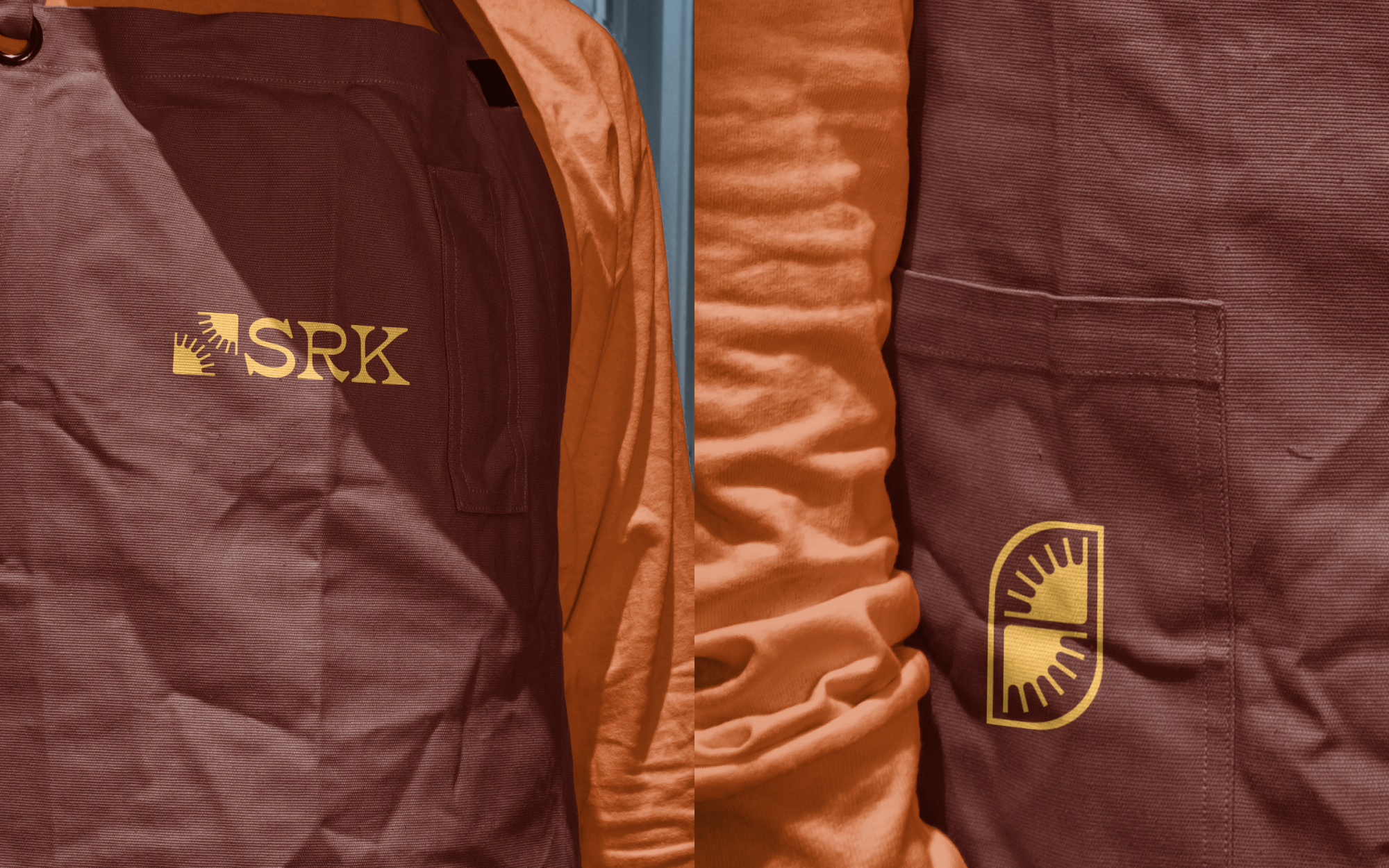
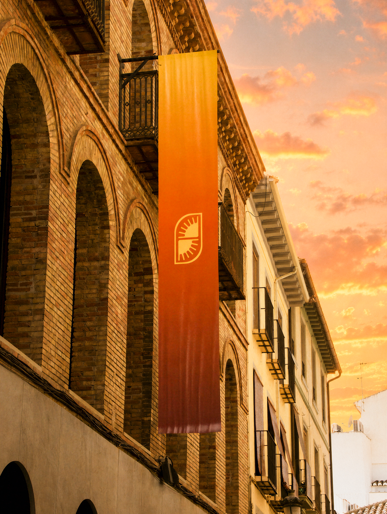
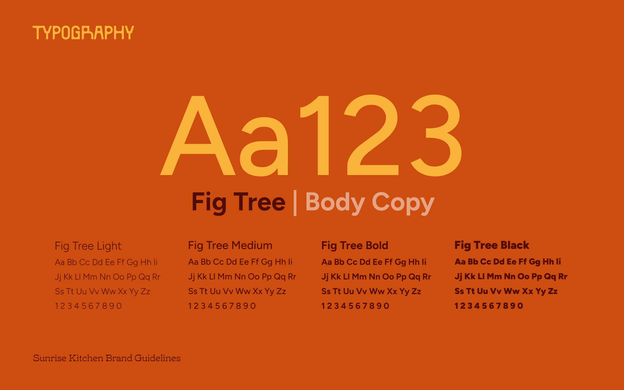
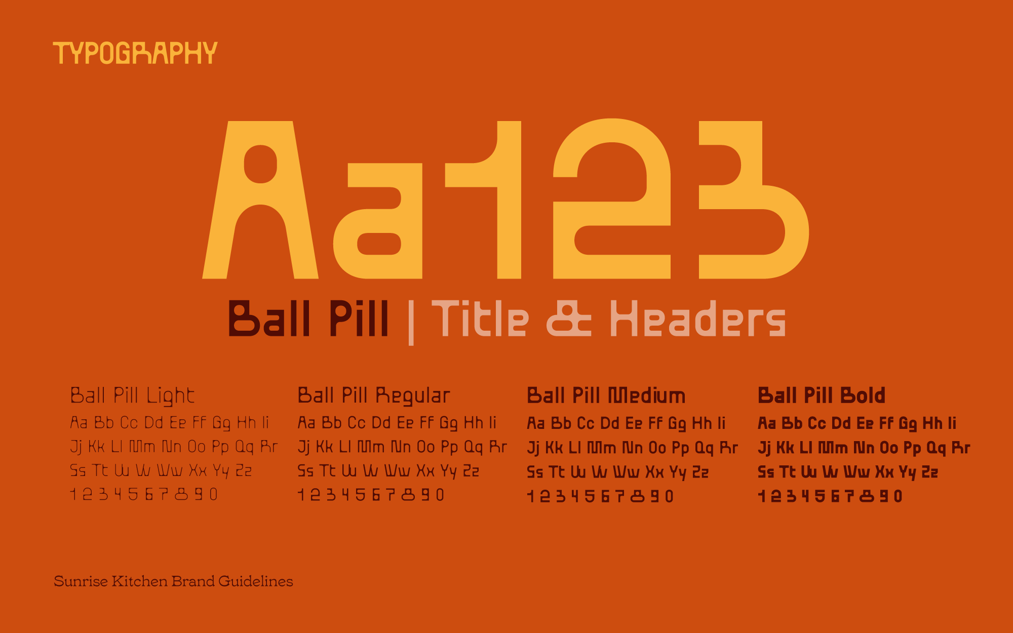
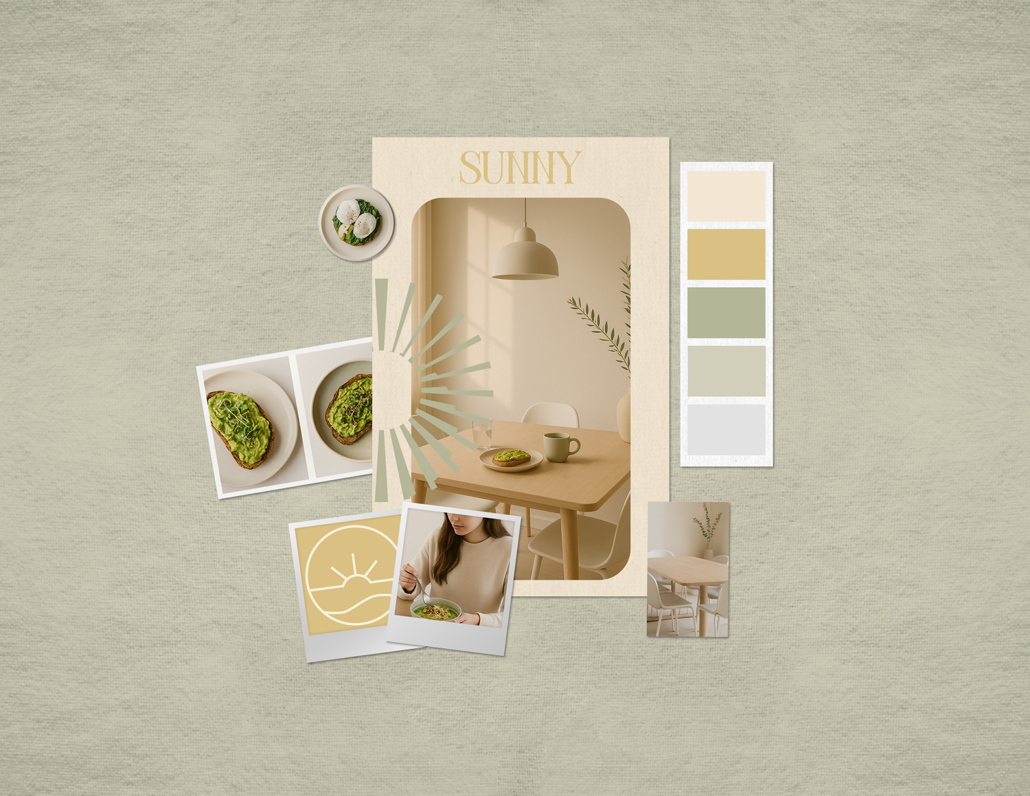
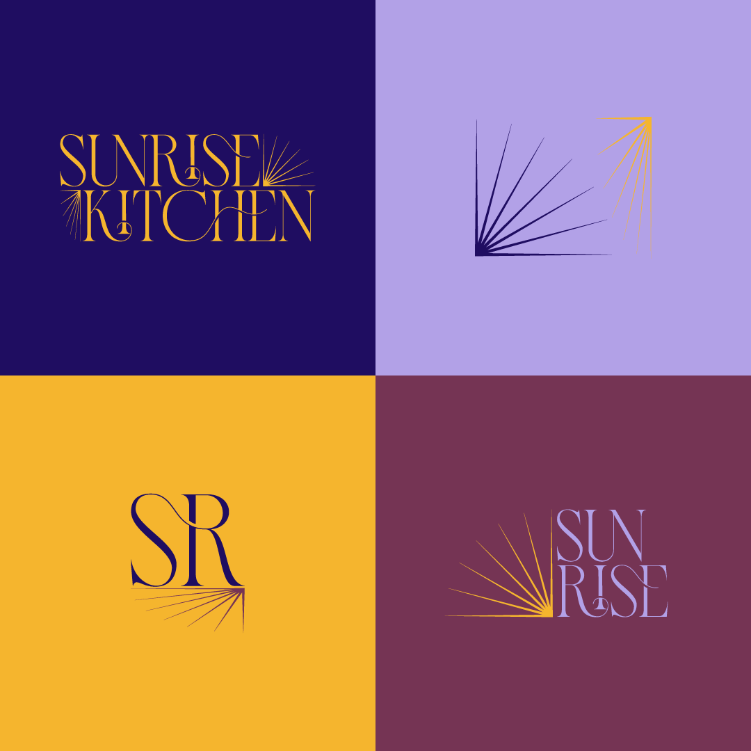
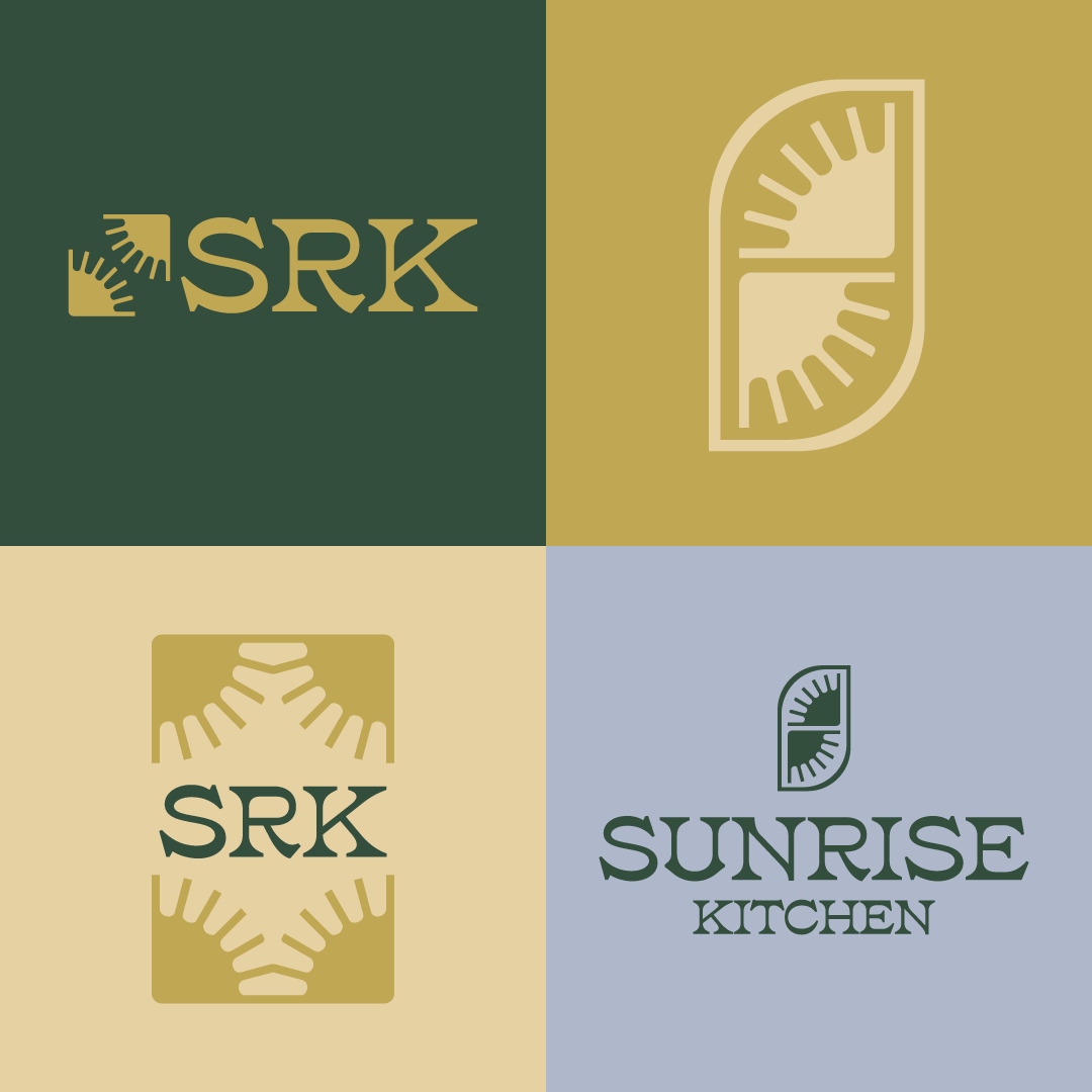
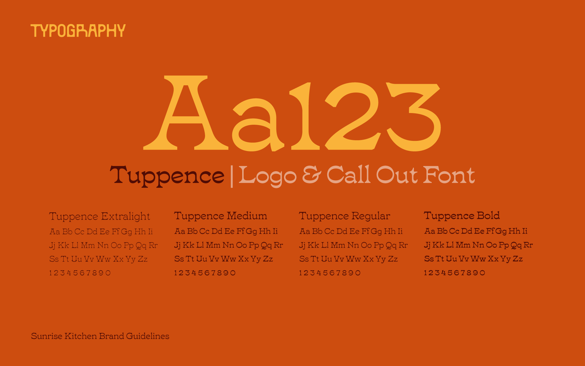
The mark carries the quality: refined, reaching for the horizon, the sense of a place that opens early. The palette carries the cozy: rustic warm brights rather than the muted creams and browns that breakfast branding defaults to. The font carries the disruption: BallPill brings a deliberately unconventional structure to the system, while Tuppence turns heritage into something contemporary and expressive.
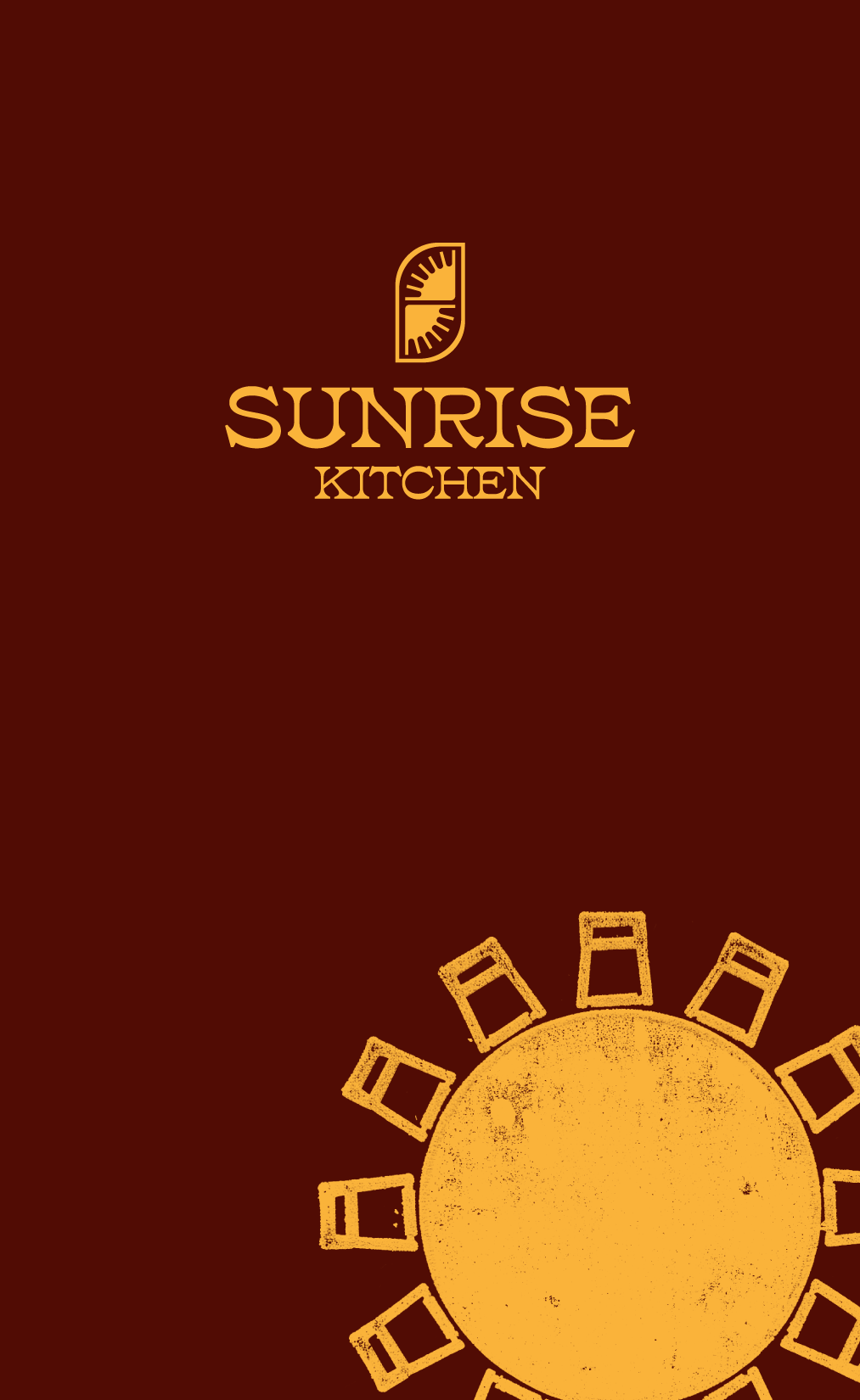
the Sunrise mark
Quality at first sight.
Color & type
Quality at first sight.
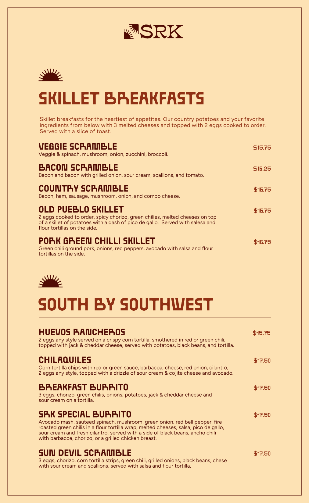
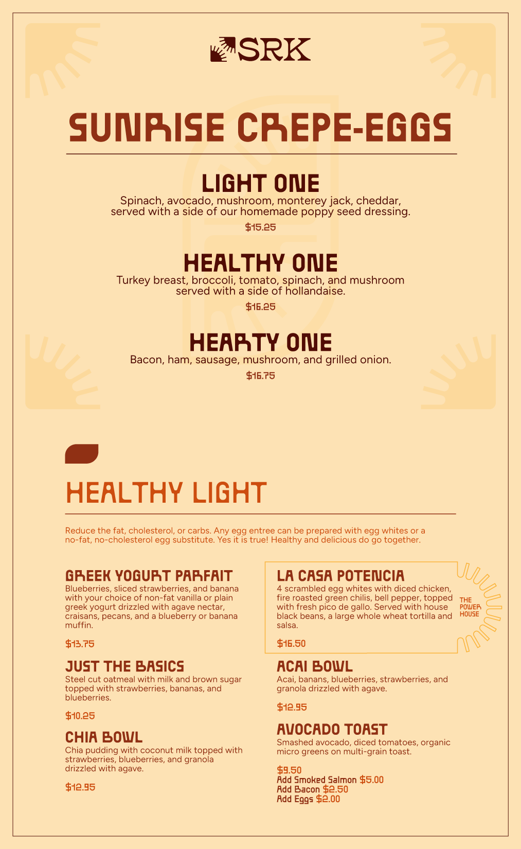
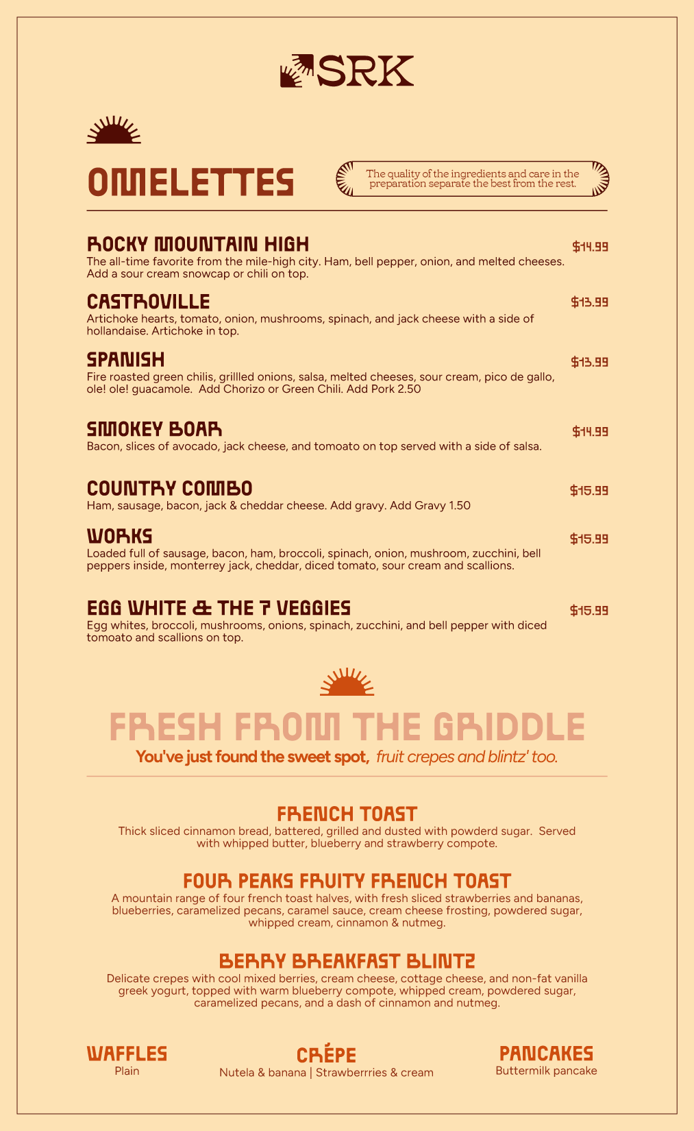
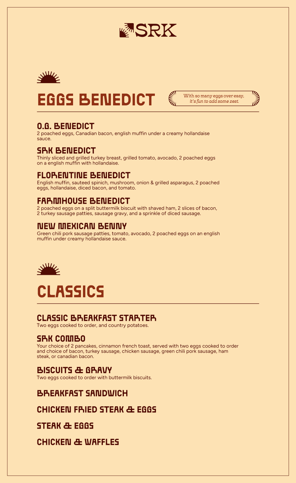
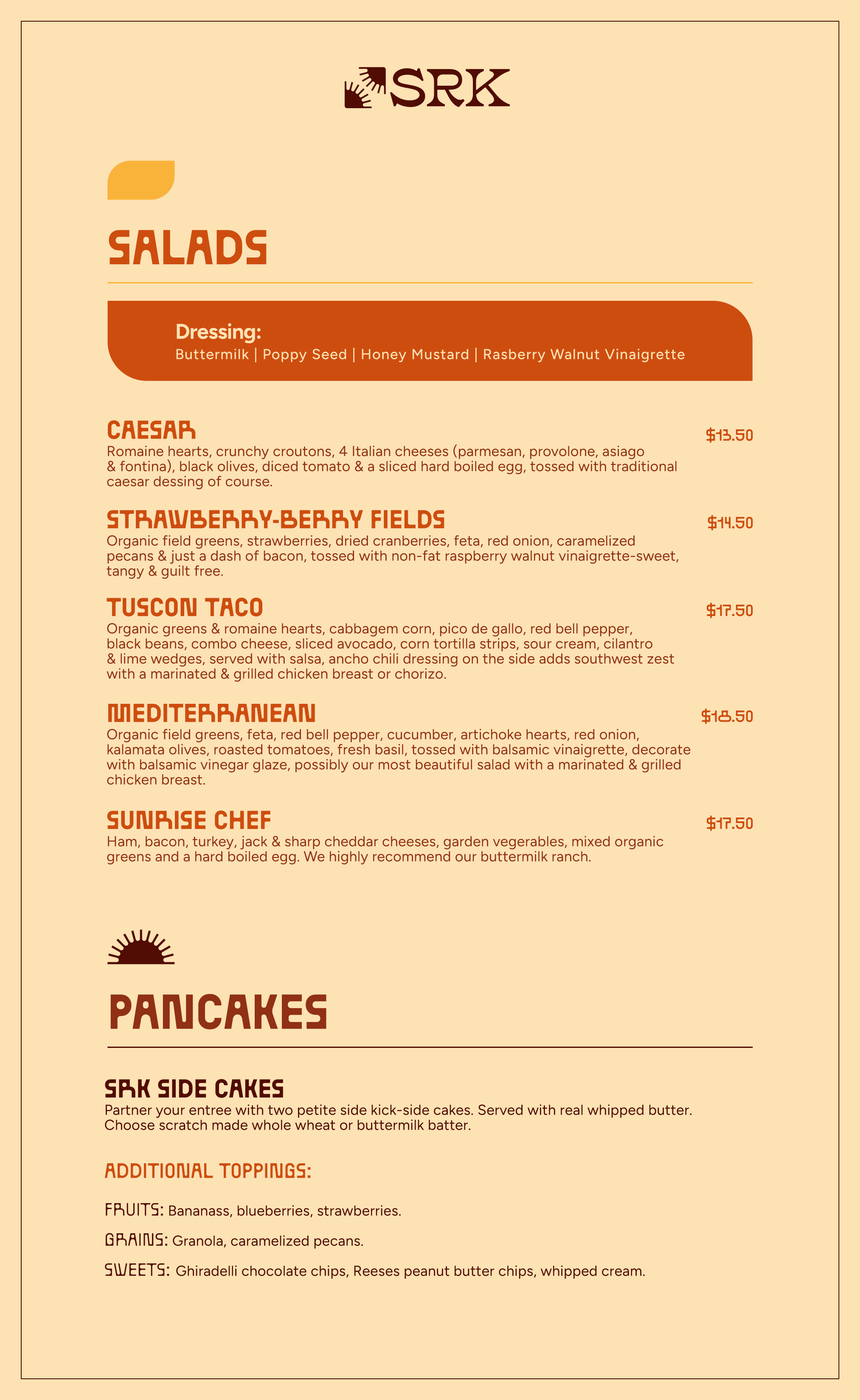
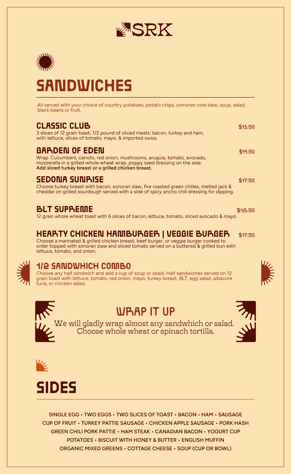
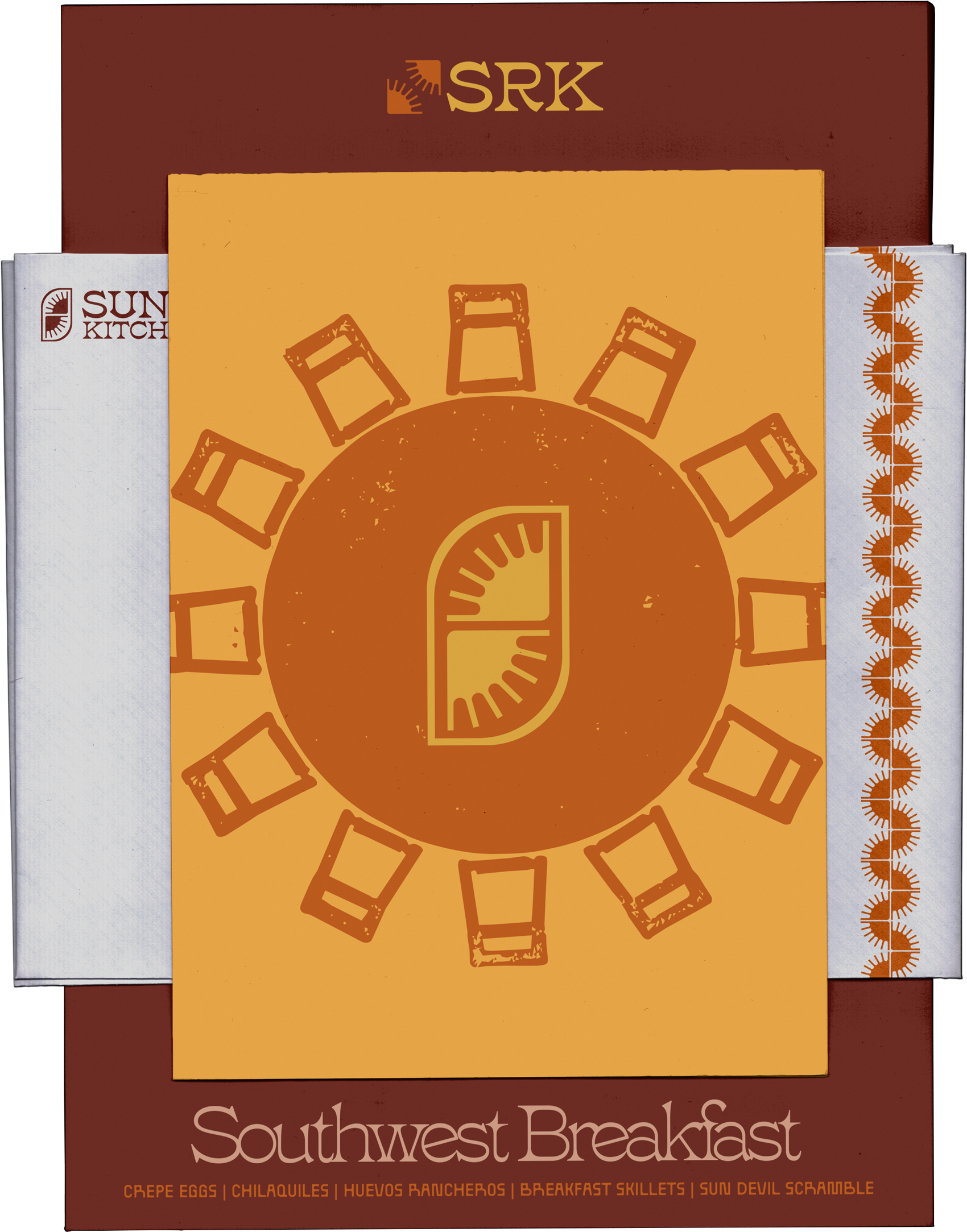
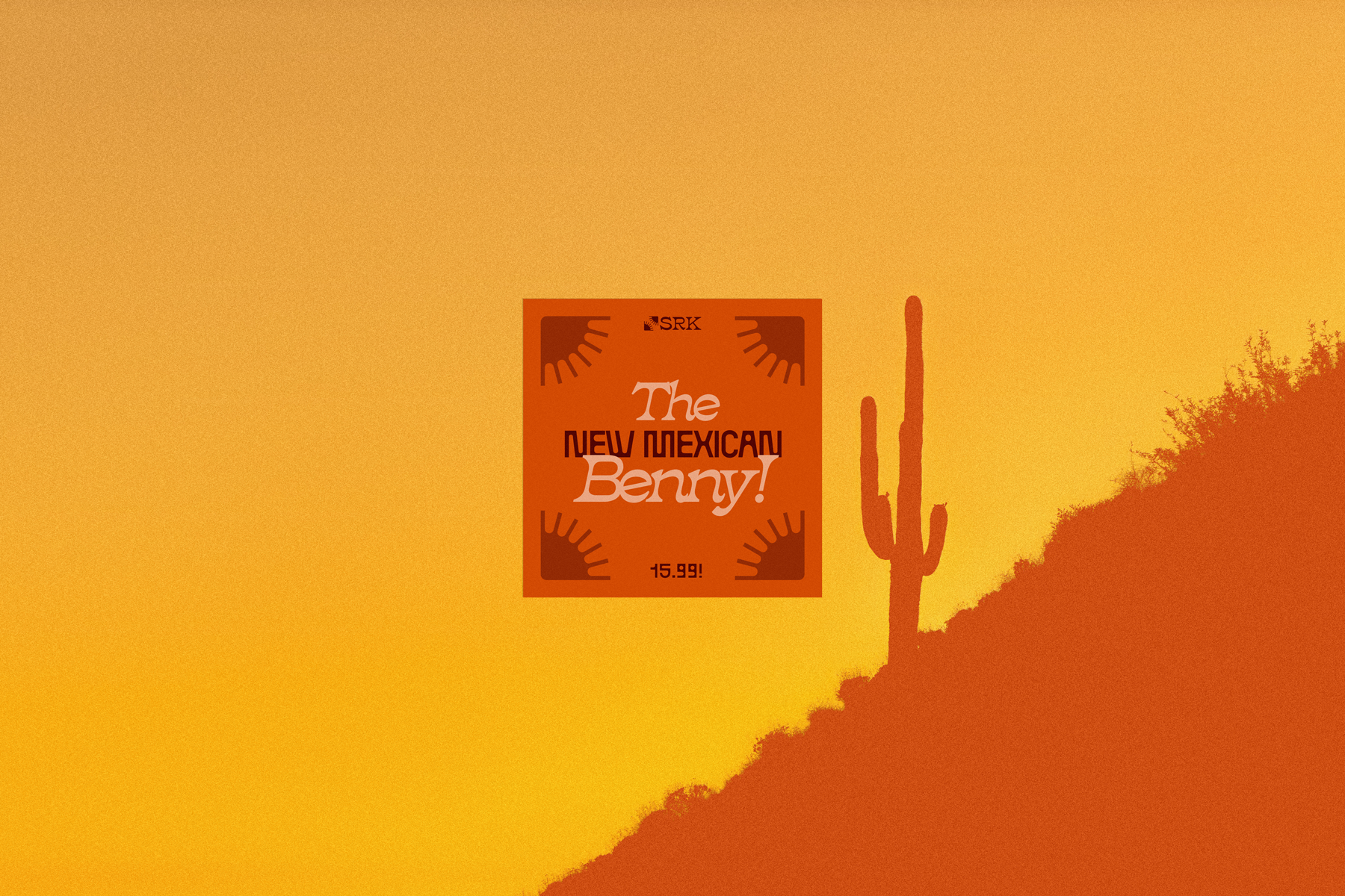
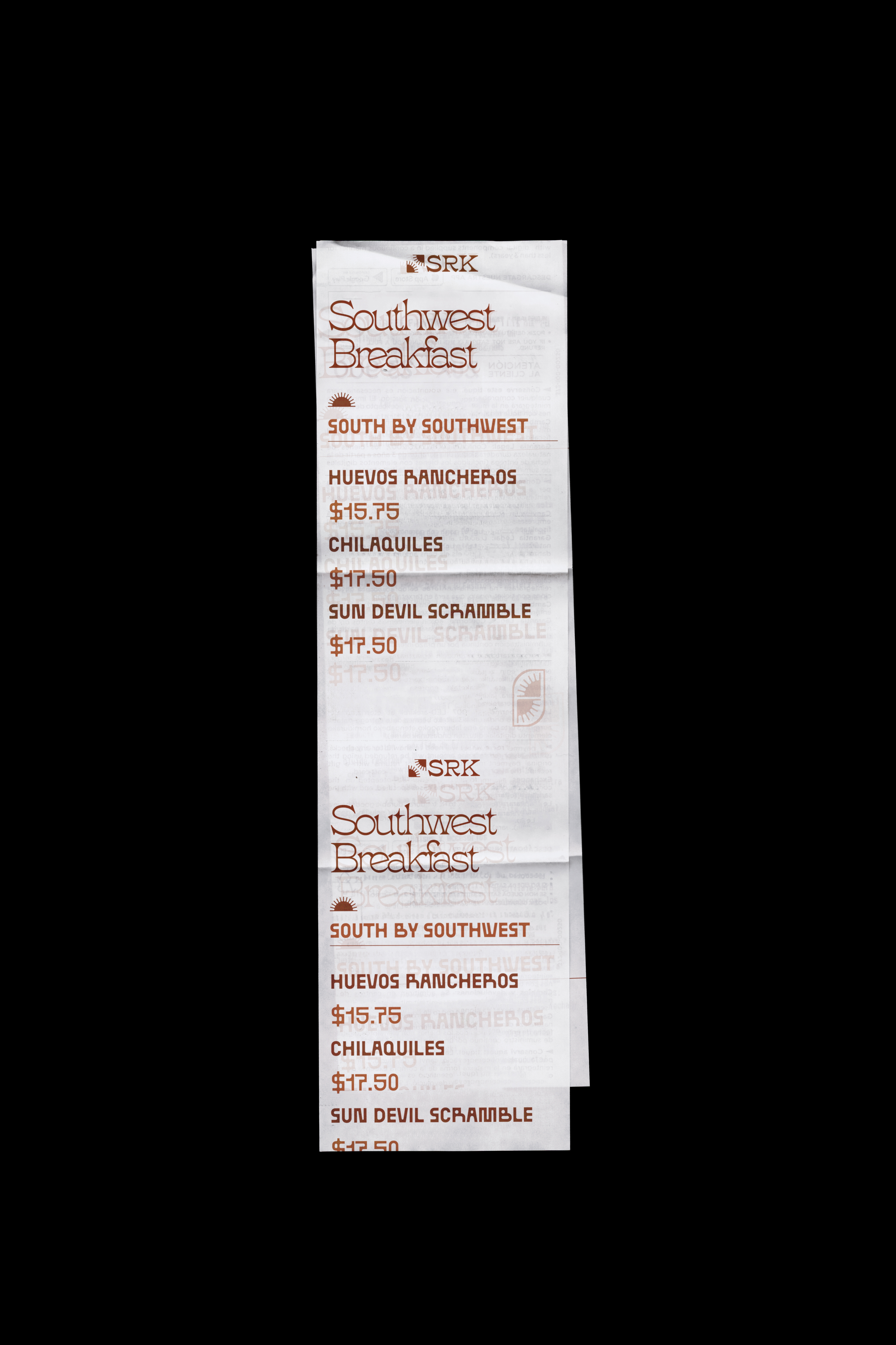
The Menu
A brand can look great on a coffee cup. The menu is the stress test. (not current menu, but a preview of what's to come)
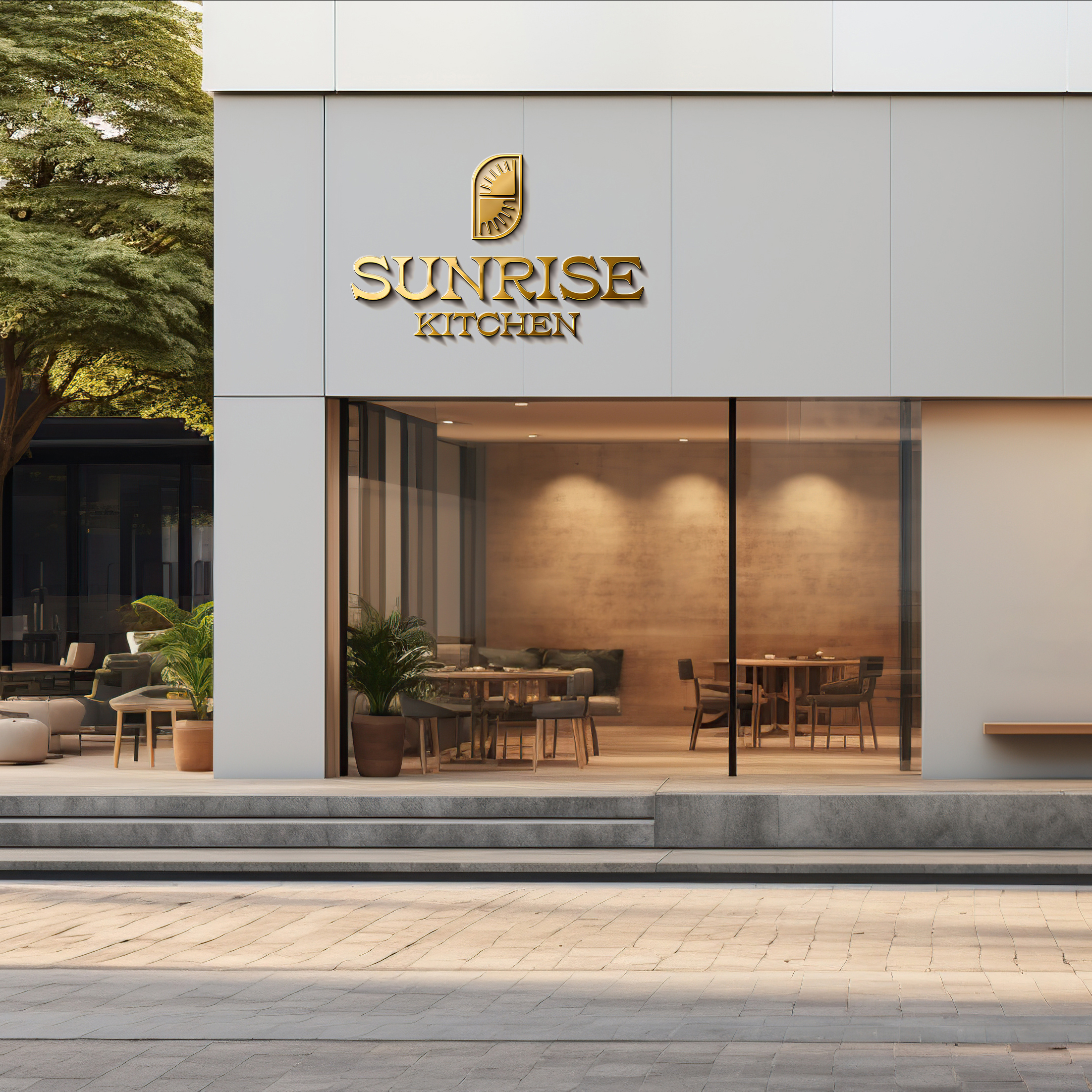
Gold signage
Sunlight is the most precious gold found on earth. For some the sunrise is the only gold they will ever possess, here we cherish each dawn.
Built to
Perform
The founders paid their full marketing contract the day after seeing the mark.
Operators who had already built and scaled a national breakfast brand committed the entire budget within 24 hours of the first presentation.
Delivered a complete identity system pre-opening.
Logo, palette, typography, menu, packaging, signage, and an 18-page guidelines document. Ready to execute across seven planned locations before the first one opened.
Built to outlive the first location.
The system was designed for a franchise team to apply without the original designer in the room.
Launching a luxury hospitality district in Old Town Scottsdale. With a guidelines PDF, a set of 3D renderings, and no photography of a place that hadn't been built
Client
Yari Group
Riot Hospitality Group
Role
Art Direction
Campaign Design
Scope
E-mail
Paid Advertising
SMS Design
Year
2025 2026
THE
Situation
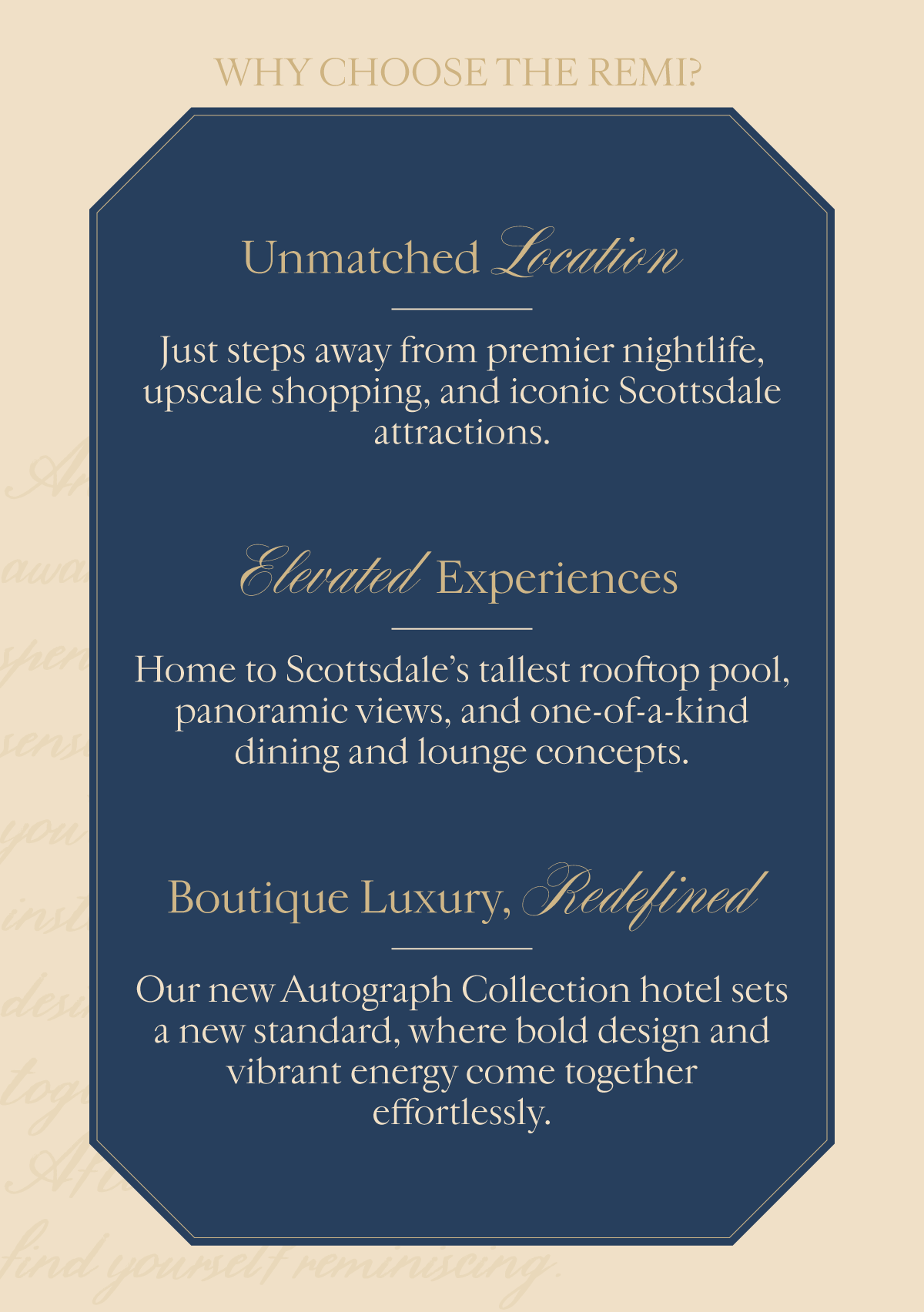
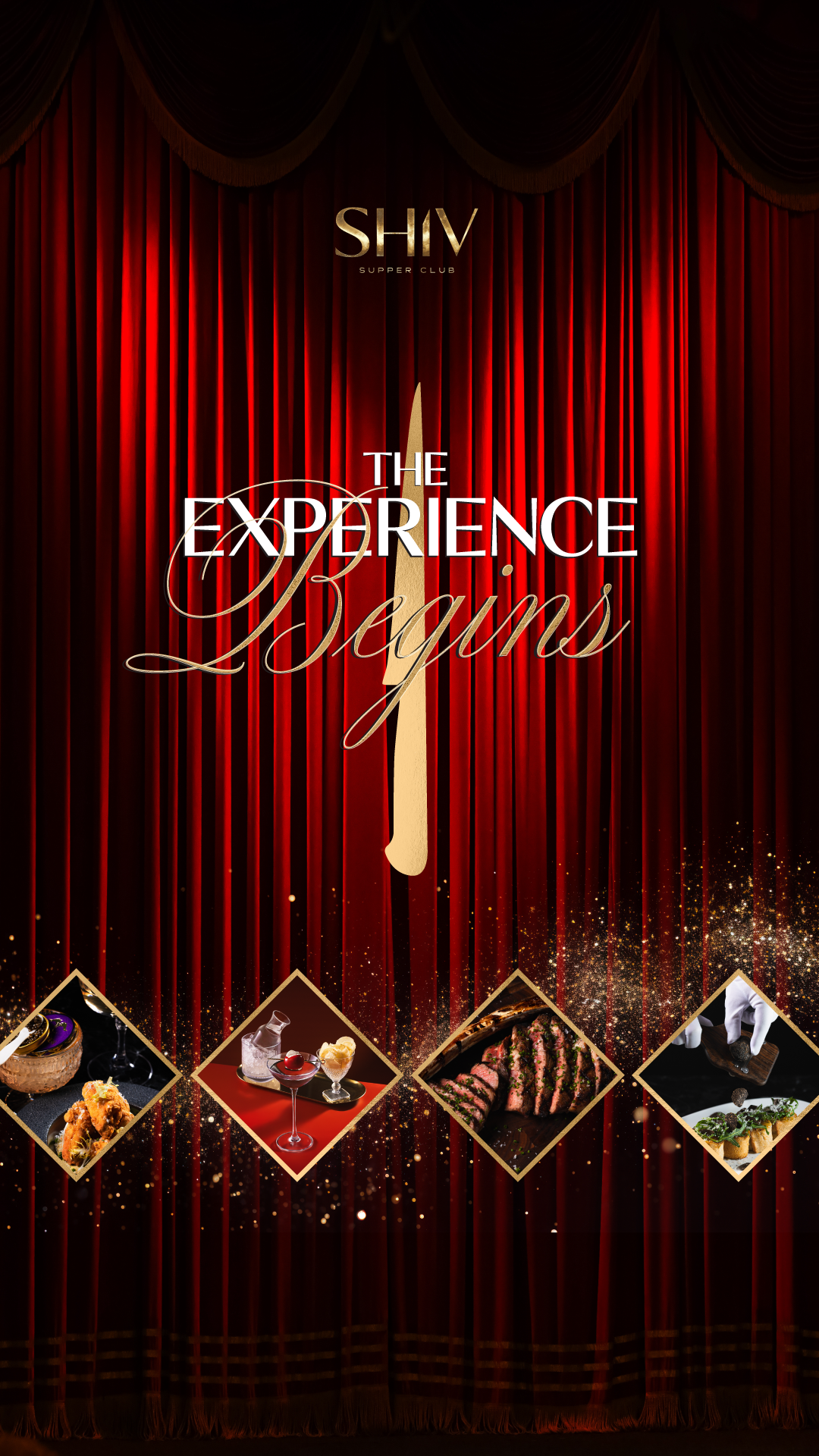
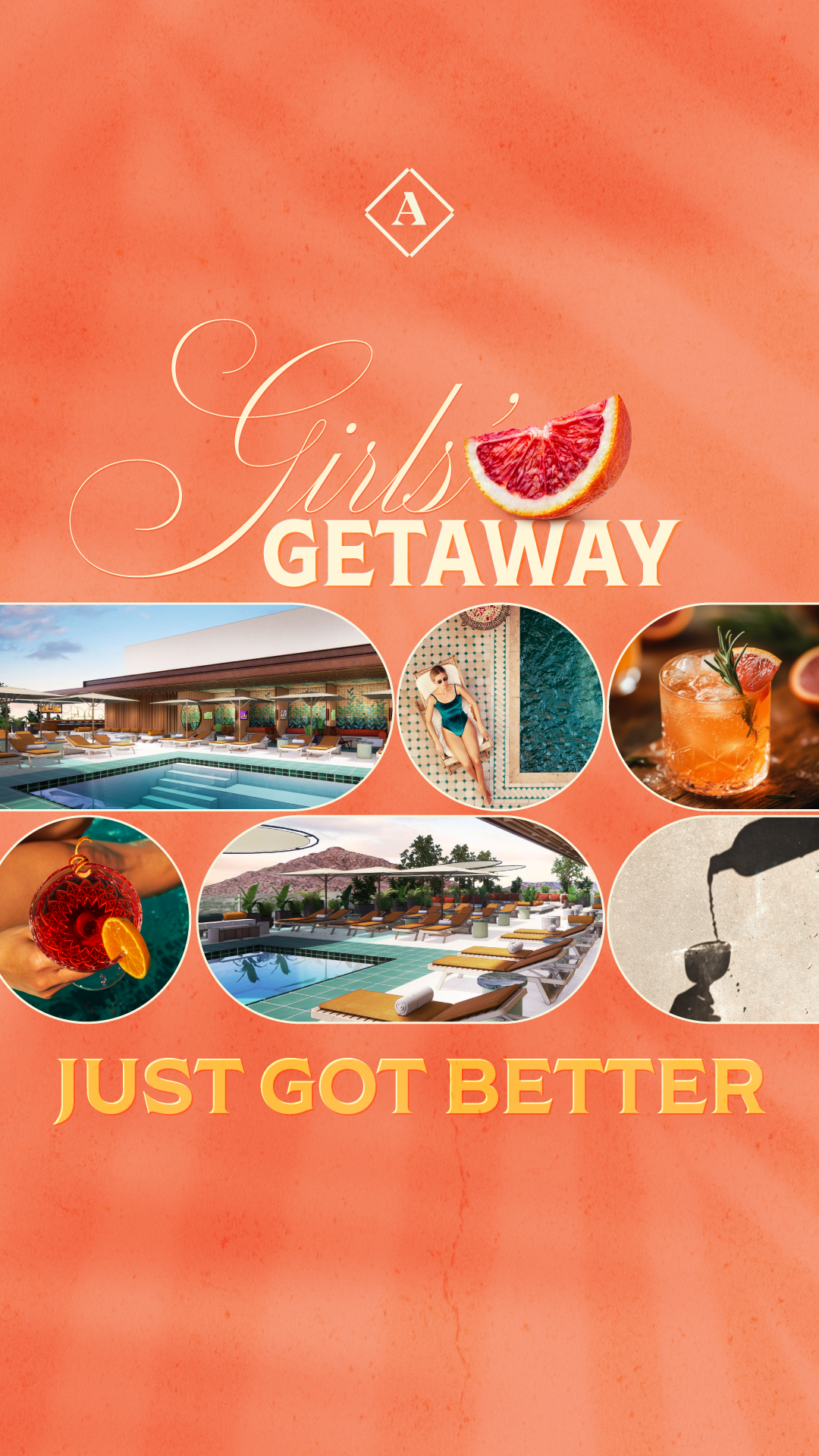
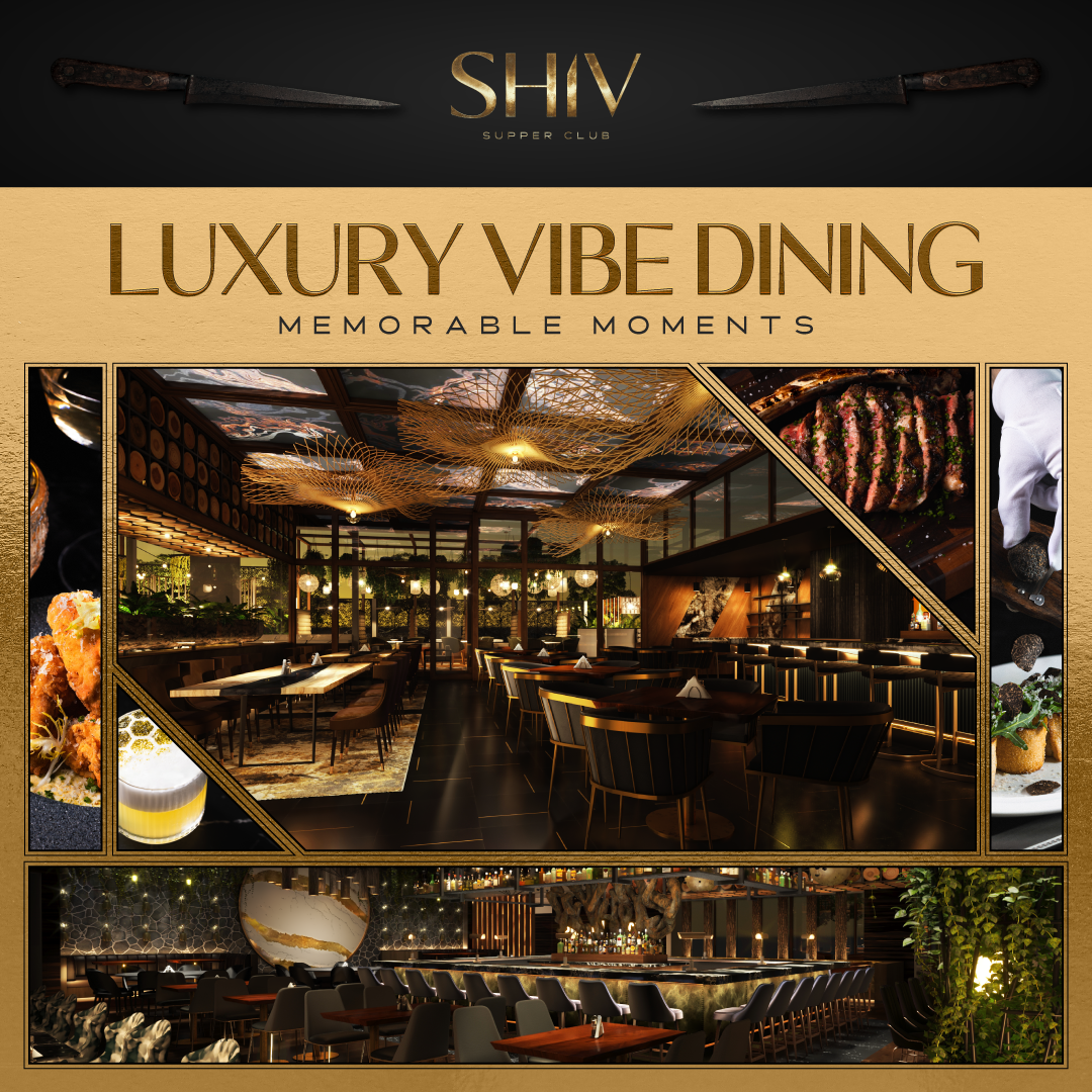
The Yari brothers opened an entertainment district in Old Town Scottsdale: a W Hotel, a boutique property called The Remi, a 13,869-square-foot fine-dining restaurant called SHIV, and Allegra a rooftop pool lounge on The Remi's 12th floor.
Marketing had to start filling reservations before two of those venues had interiors, staff, menus, or a single photograph.
the
Problem
W Hotels is a Marriott property. The parent brand arrives with a rigid identity system and very little tolerance for interpretation. SHIV and Allegra arrived with the opposite problem. Brand guideline documents describing a mood, and architectural renderings of rooms that didn't exist yet.
So the work split into two hard constraints pulling in opposite directions
Too much brand. W Scottsdale had to feel unmistakably W. Bold, music-driven, and design-forward while still selling a specific cabana on a specific weekend.
Not enough brand. SHIV and Allegra had a logo, a color story, and a vibe. Everything else: how the brand behaves in a 300×250 banner, what it sounds like in an SMS, what it looks like when it's cropped to a square — didn't exist. Someone had to decide.
That decision-making was the job. Not the asset production.
Approach
Build atmosphere, not architecture
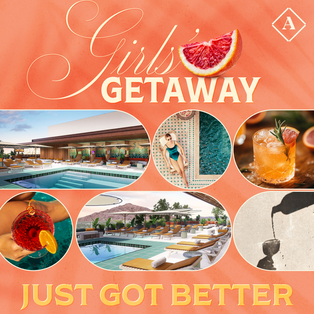
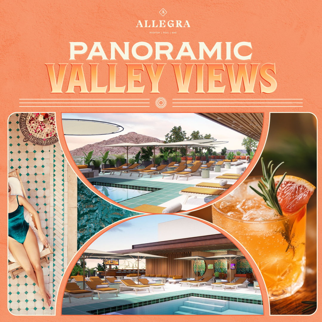
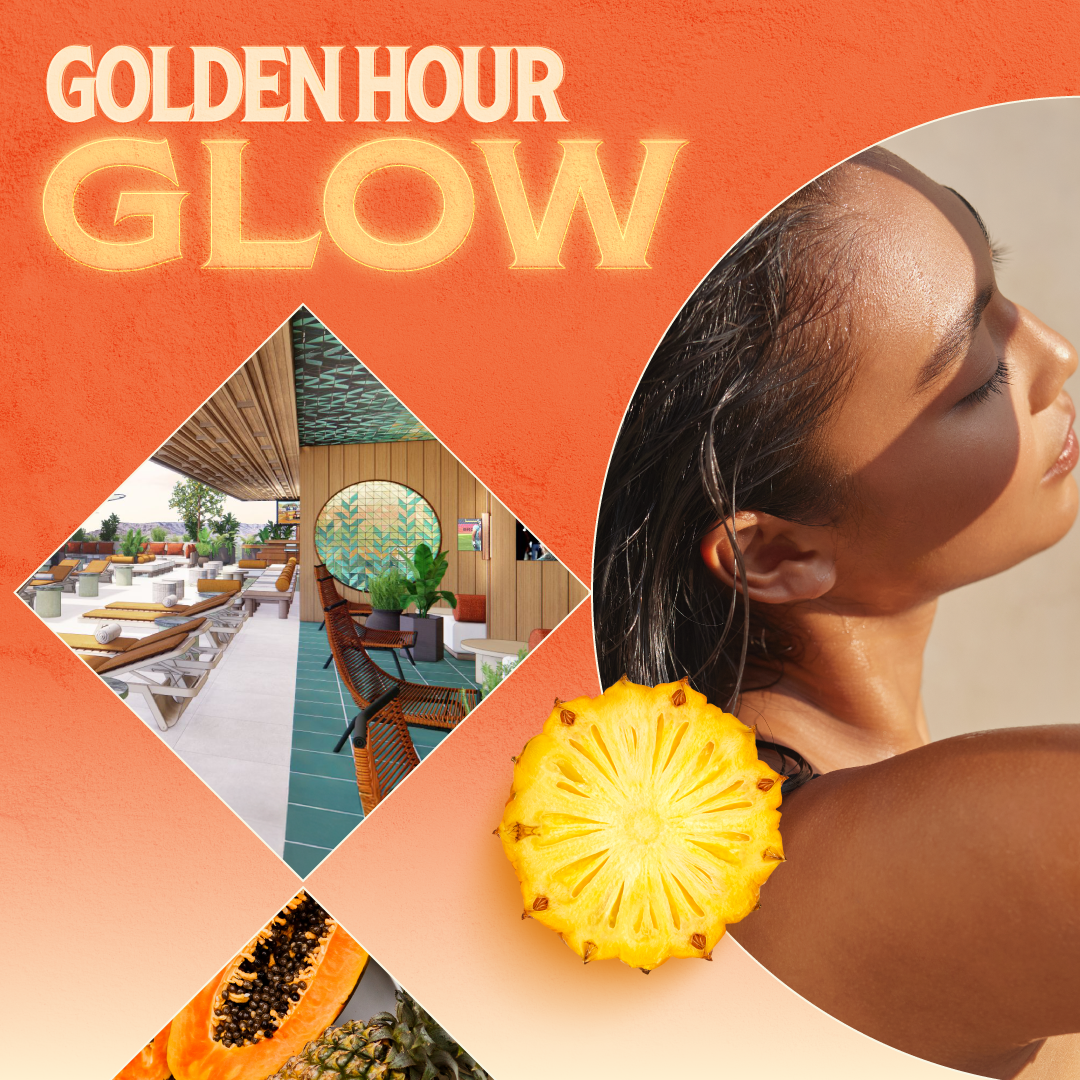
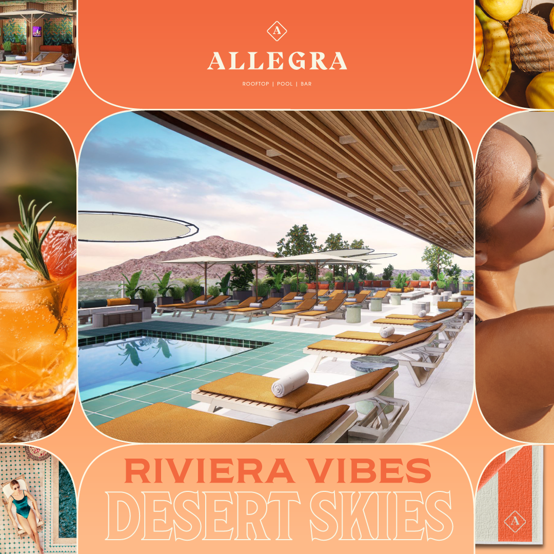
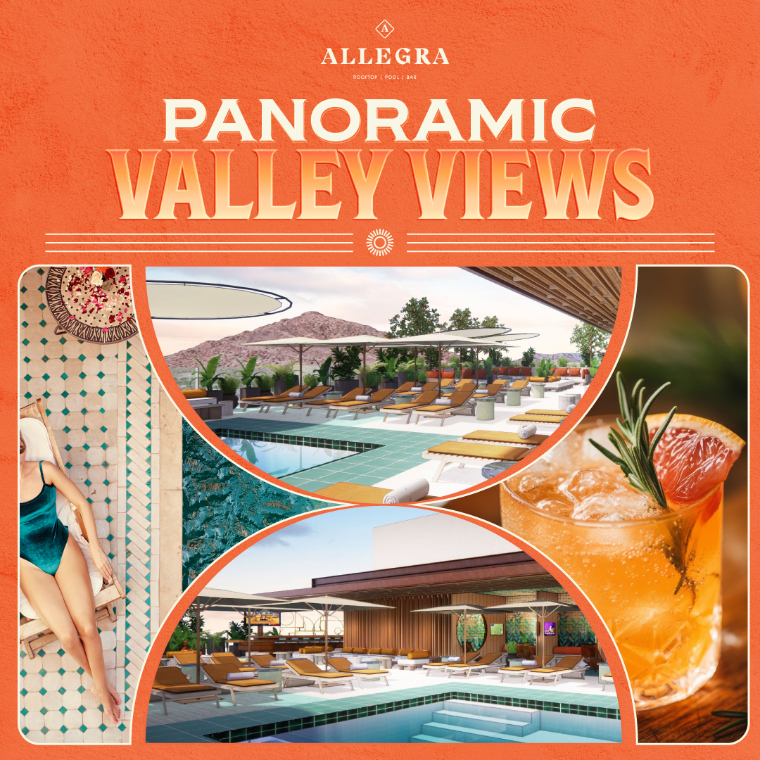
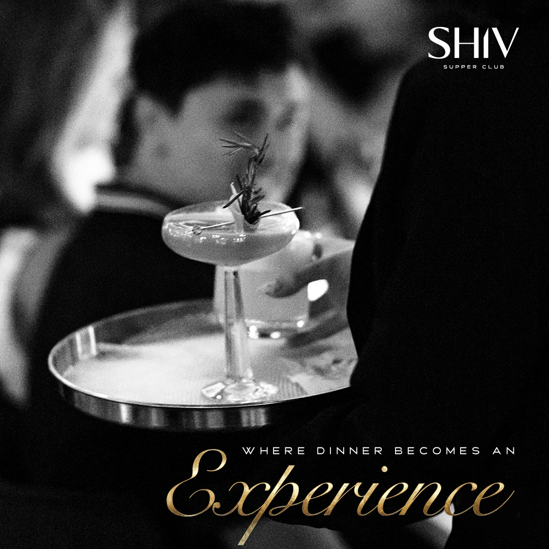
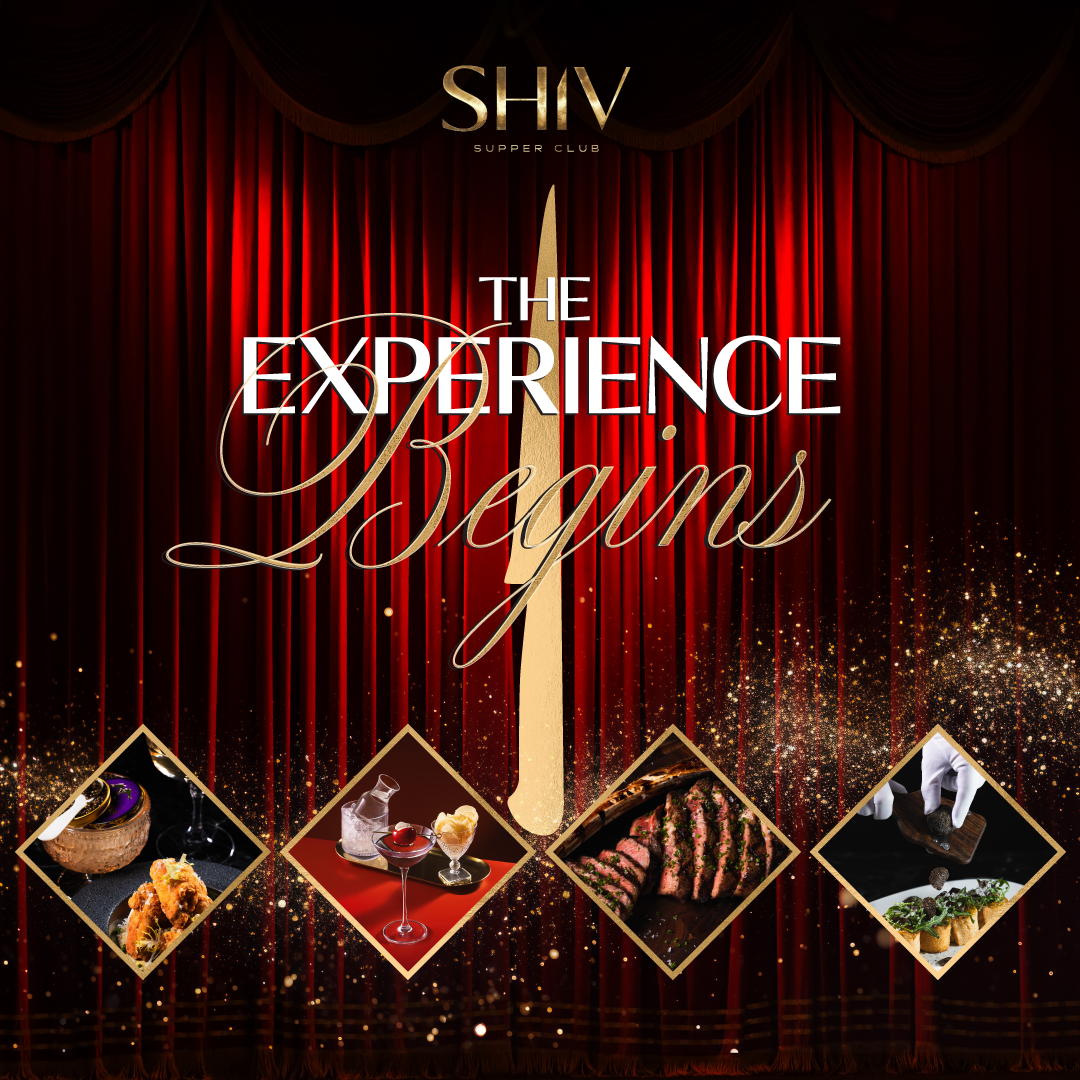
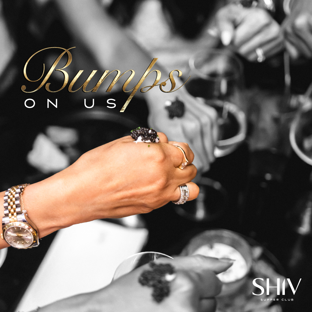
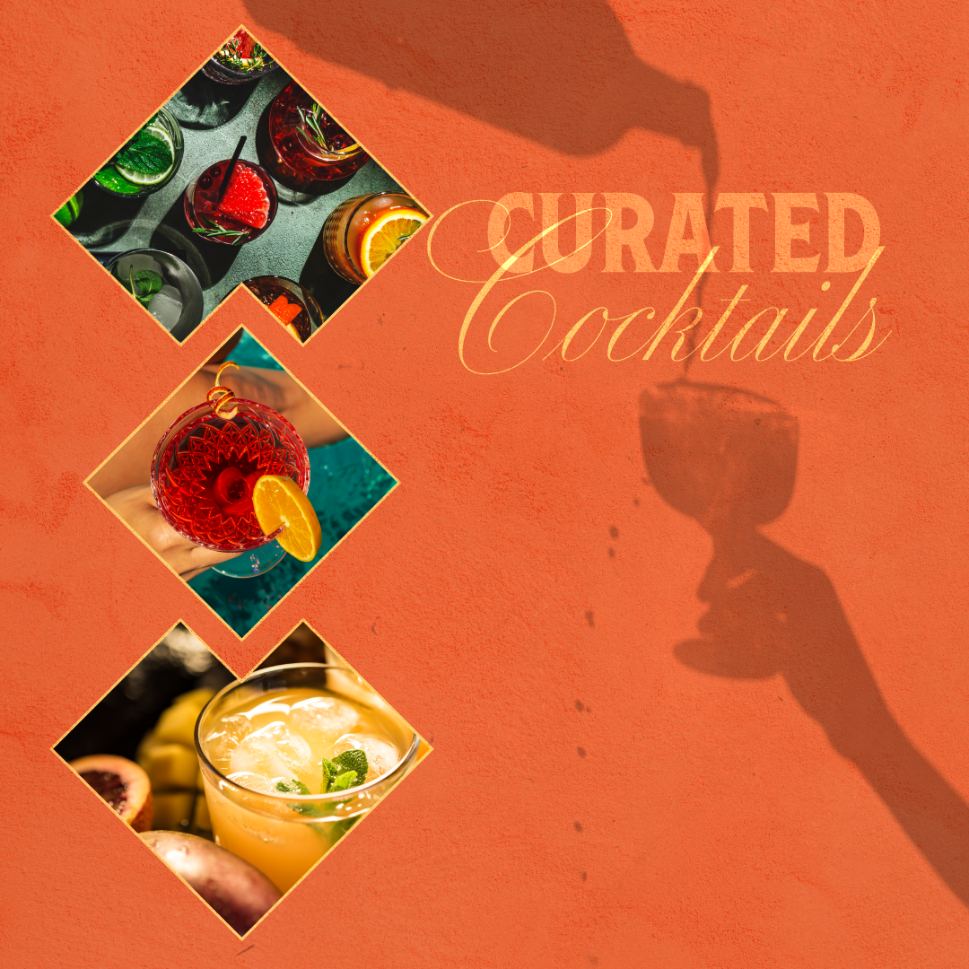
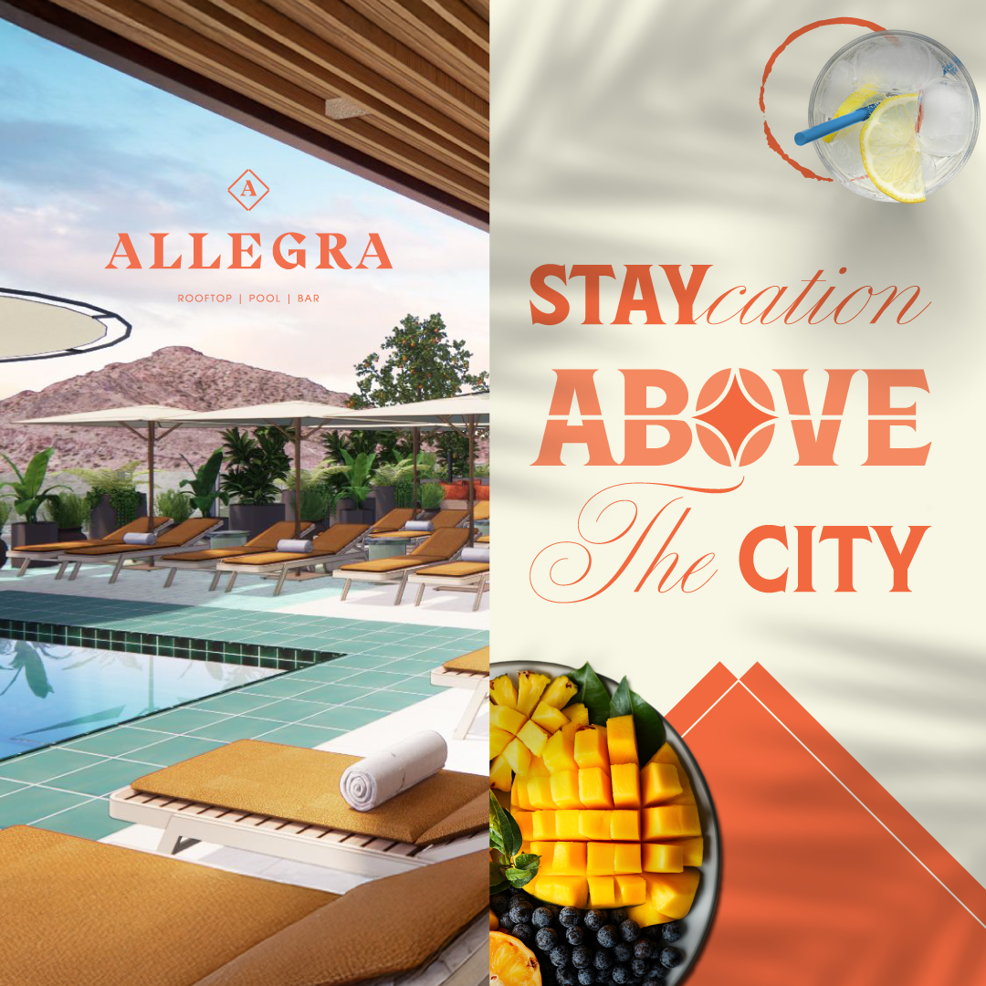
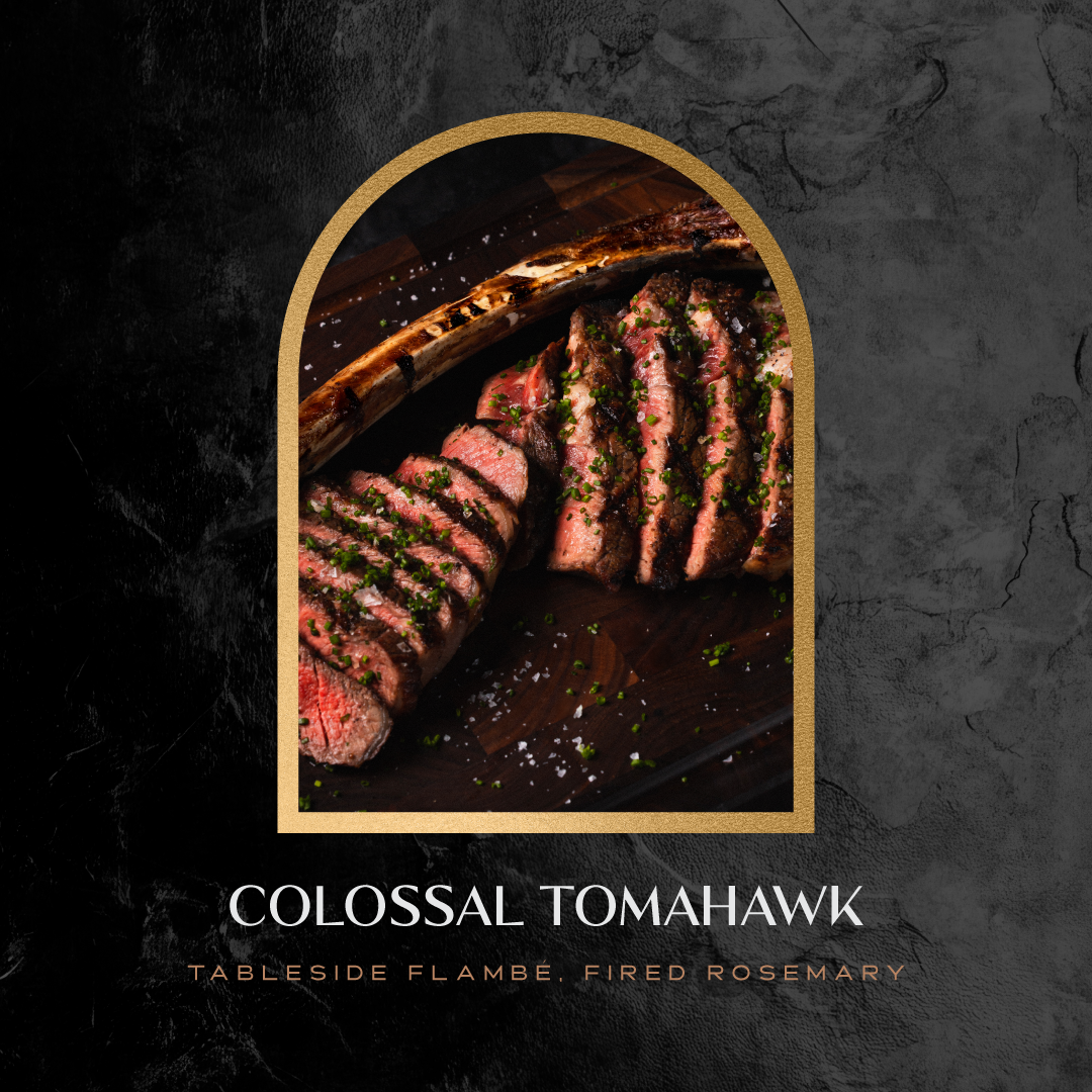
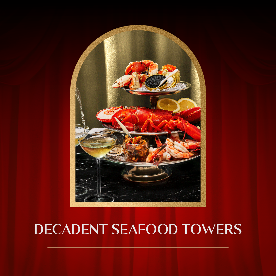
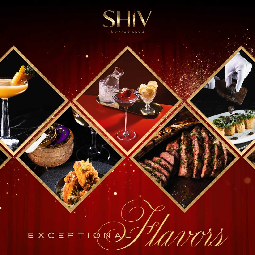
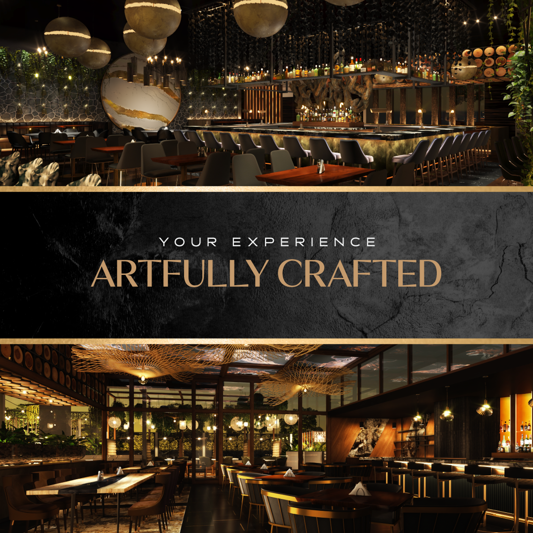
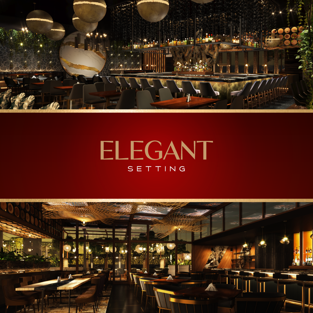
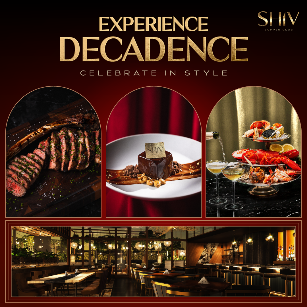
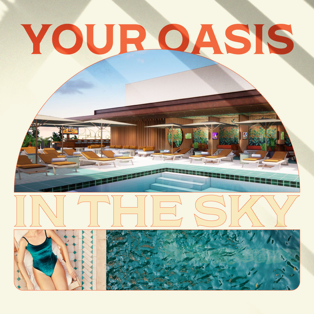
I couldn't show the room, so I sold the feeling of standing in it. For SHIV, that meant luxurious red curtains, black slates, black and white photography with slight grain,and gold text. For Allegra, stucco textures, palm & aethetic shadows, fruit and sandy images.
One system, many venues
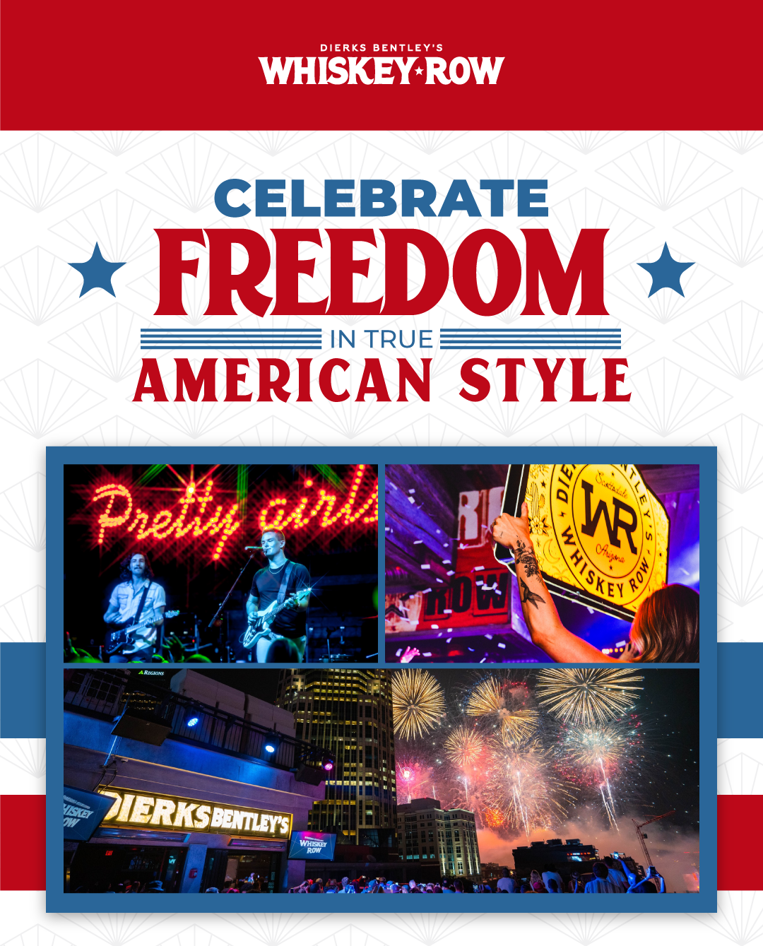
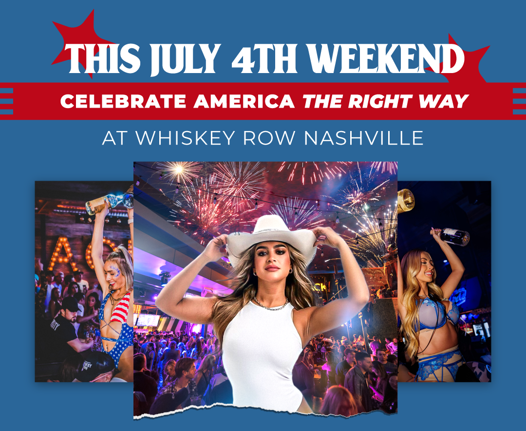
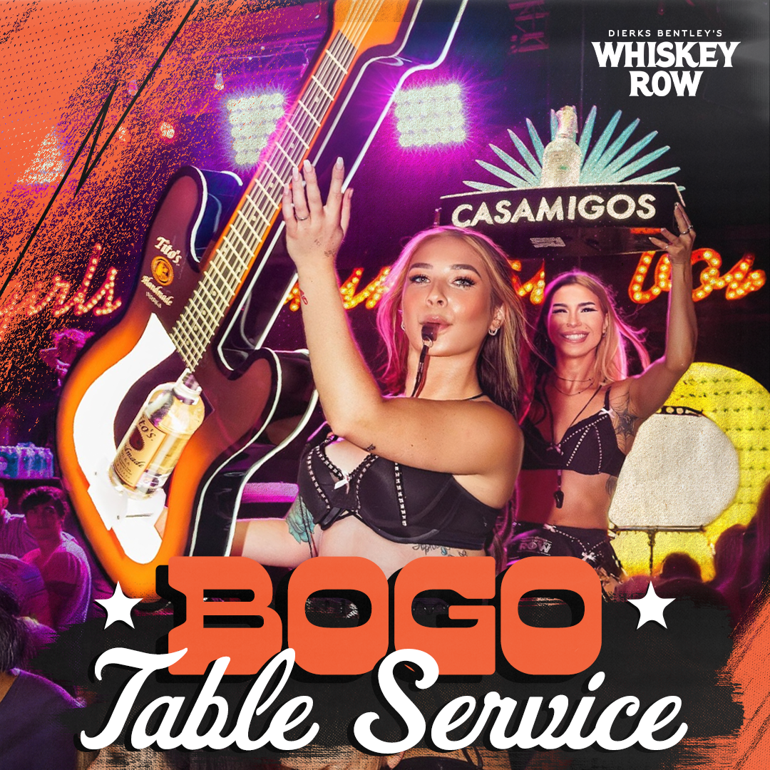
Whiskey Row runs four locations: Nashville, Scottsdale, Gilbert, & Denver. Each needed tailored imagery, copy, and logo lockups for the same promotion. Rather than designing four campaigns, I built one flexible template system with venue-specific slots, so a seasonal push could ship to all four markets without creating a tailor promotion for a specific location four times.
Selected
Work
preserving a rigid Marriott identity while selling local events
building luxury atmosphere from renderings and guidelines
translating an unopened rooftop venue into a campaignable visual world
systemizing multi-location promotional creative
Built to
Perform
Shipped two brand launches from zero visual reference.
SHIV and Allegra both went to market with a complete campaign system — paid, email, and SMS — before either venue opened its doors.
Built creative systems still in use across five brands and seven locations.
The templates handle seasonal campaigns, event pushes, and venue-specific promotions without redesign.
Became the client's default creative partner across the group.
What started as four venues for PPC grew into full marketing campaigns for twelve, on the strength of how the creative performed.
Directing creative for Sky Zone, DEFY, and Rockin Jump. Everything from in-park screens and painted walls to the operations manual nobody was supposed to notice.
Client
CircusTRIX
Skyzone
Role
Project Management
Creative Insight
Scope
In-Park Media
Mural Design
Campaign Systems
Year
2021 - 2026
THE
Situation
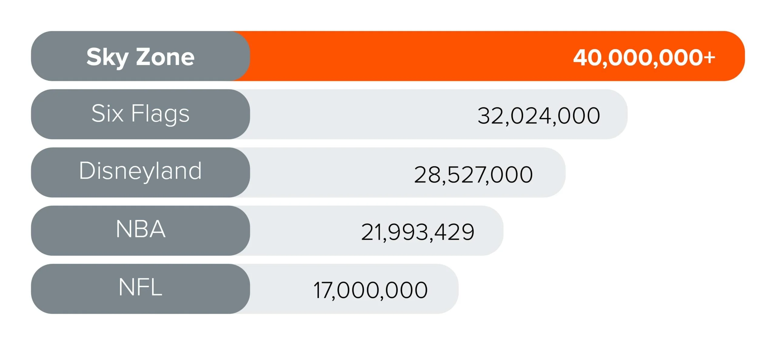
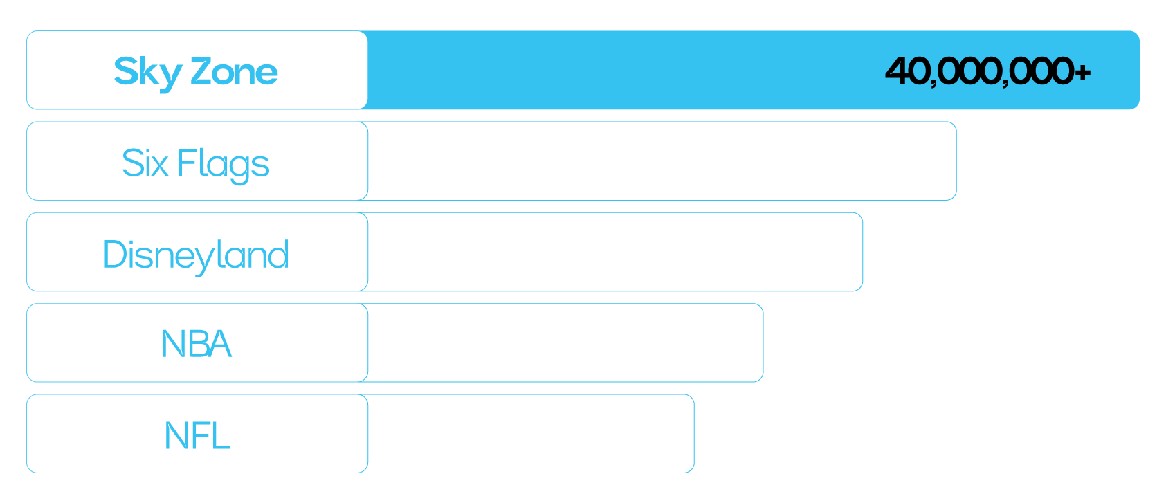
Sky Zone is the world's largest operator and franchisor of indoor active entertainment parks — over 300 locations globally, plus two sibling brands under the same umbrella in DEFY and Rockin Jump (now closed.)
I ran creative for all three, working directly with their executive team.
Guests Per Year
the
Problem
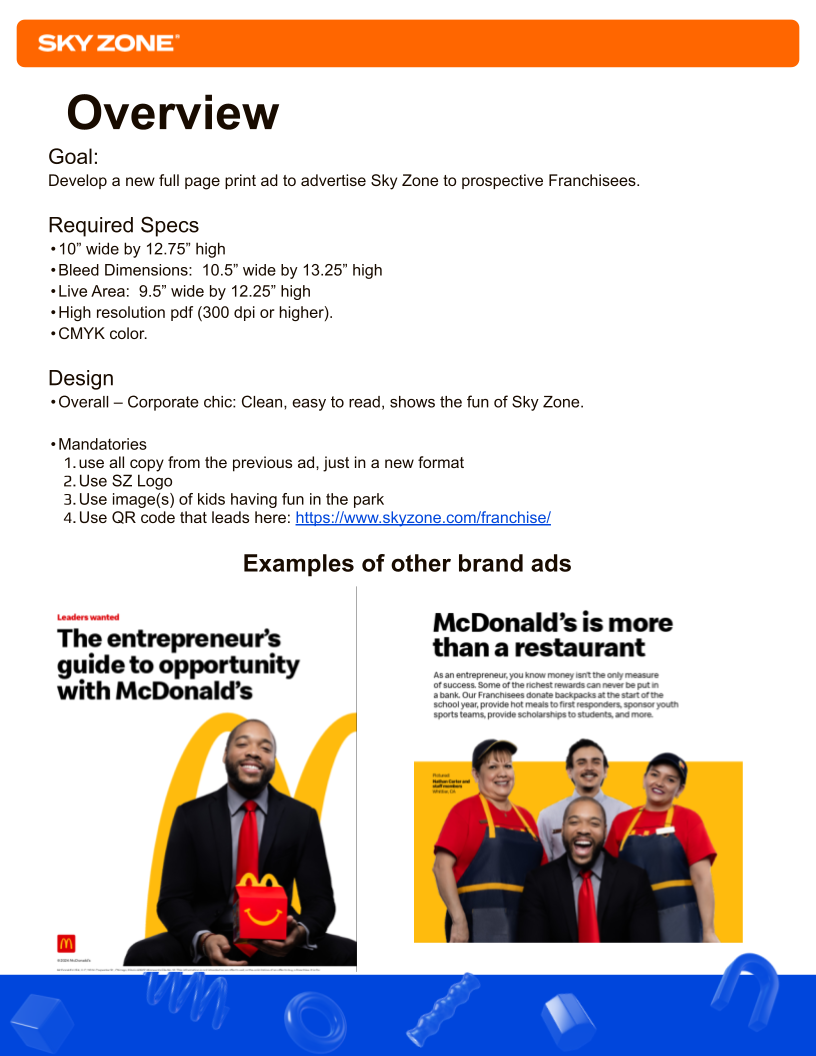
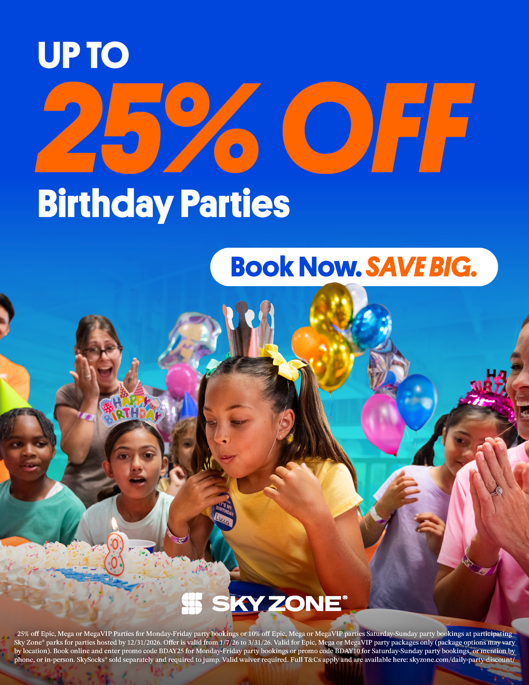
A 300-location franchise generates creative demand that never stops and never repeats. A local event promo, a membership push, a birthday campaign, a franchise development ad, an in-park TV animation, a wall mural, and a 70-page operations manual can all be moving on the same timeline.
Every one of those had to feel like the same brand. None of them looked anything alike.
And the five designers producing it didn't work for me. They were shared across the agency's entire client roster, with workloads that shifted daily. I couldn't assign work by authority — I had to plan capacity, make the case, and protect the standard while someone else's deadline was also on fire. Consistency at that scale isn't a design problem.It's a direction problem.
Approach
Triage before Design
Every request arrived as a PDF. The first creative decision was never "what should this look like" it was "who builds this, how long does it actually take, and what does it displace." I scoped and estimated every ask before it touched a designer, then delegated based on real capacity.
Two registers, one brand.
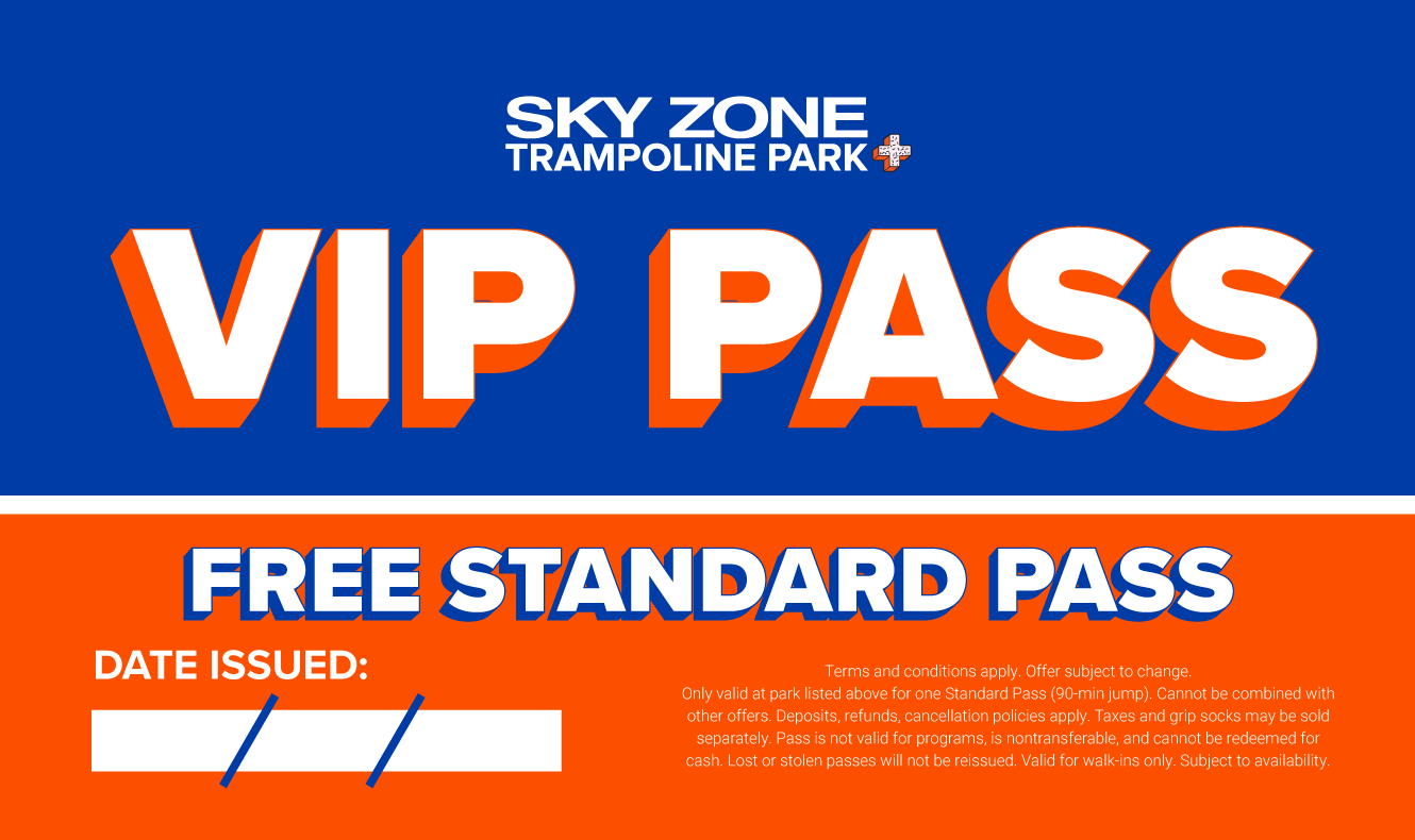
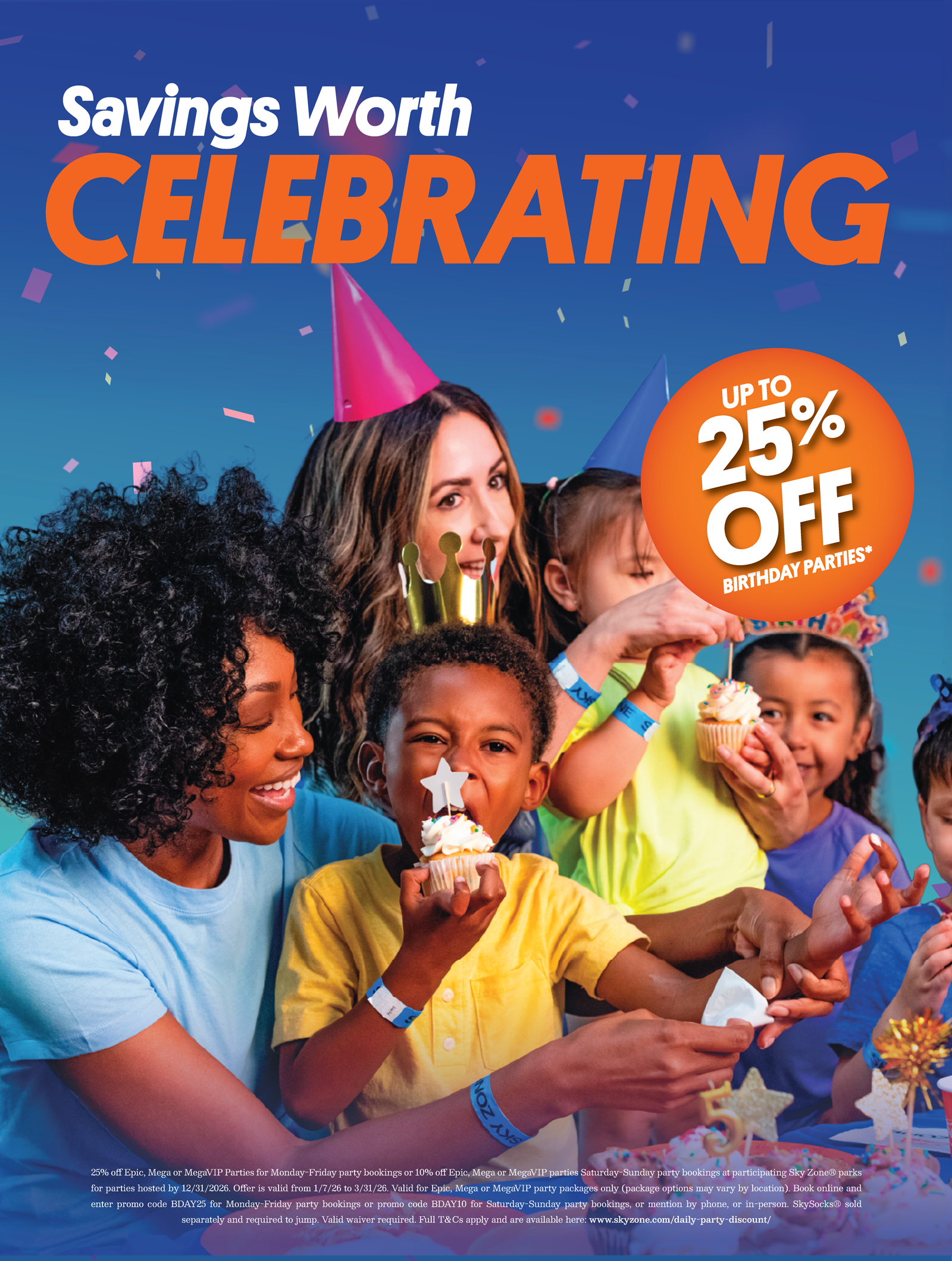
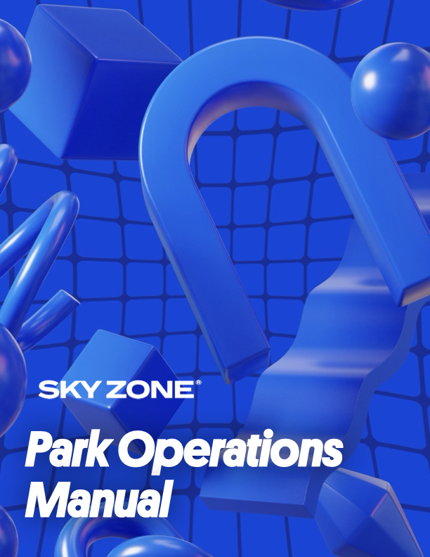
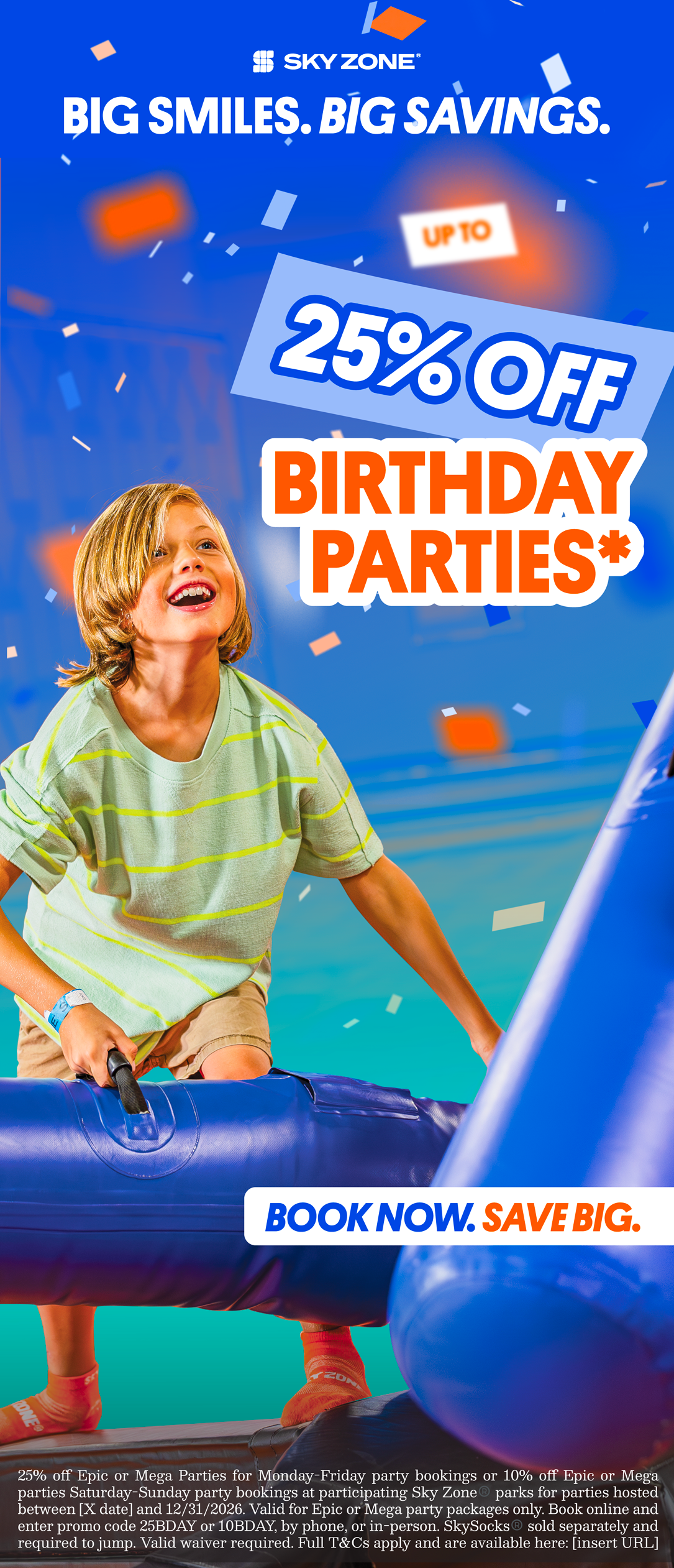
Guest-facing creative could lean into energy and movement, that's what sells a birthday party to a nine year old. Operational materials couldn't. The park operations manual, the VIP and hiring cards, the display pricing tiers: those had to prioritize clarity and usability first, and still read as unmistakably Sky Zone.
Selected
Work
In-Park Screens
brand at the point of experience
cozytv
cozytv
cozytv
Safety messaging still needs to feel designed. Requested a 2d impactful and fun animation for in-park tvs. I mocked up 1-4.
Enviromental
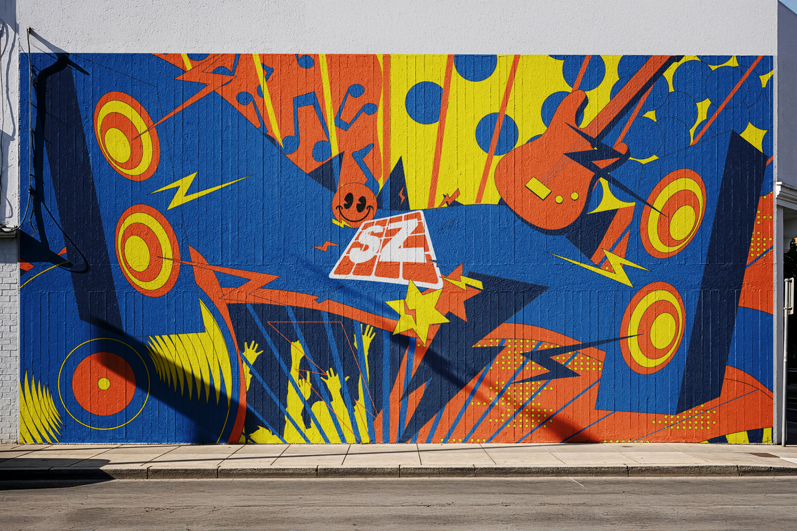
murals that brand at an architectural scale
skycon 24
the executive year-in-review
Operational
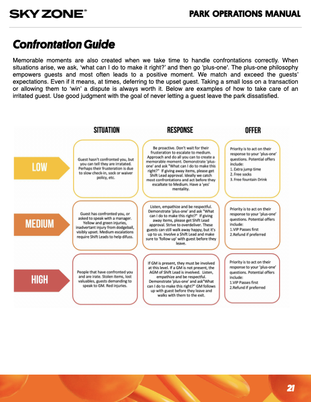
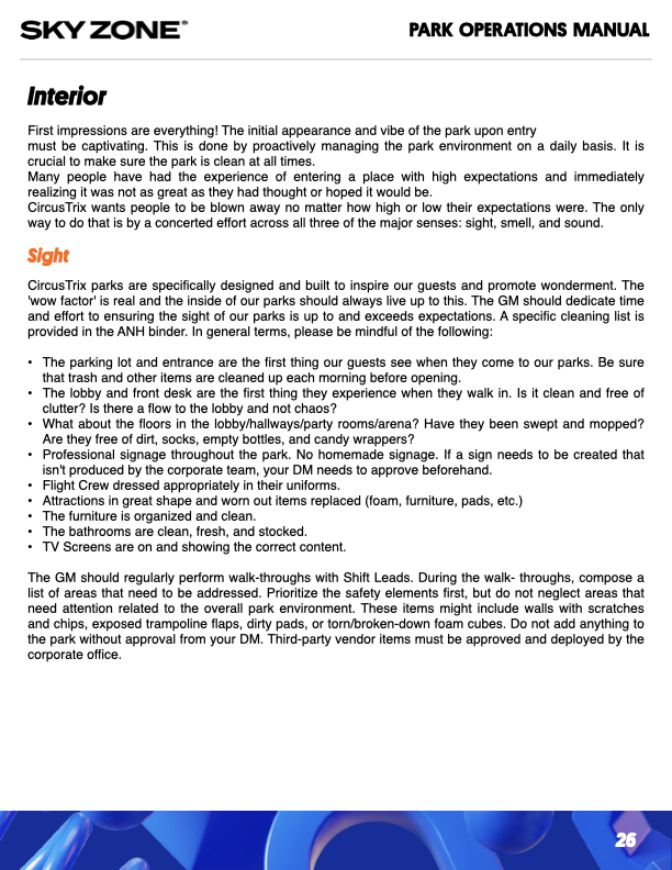
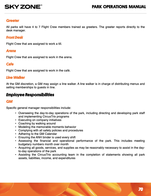
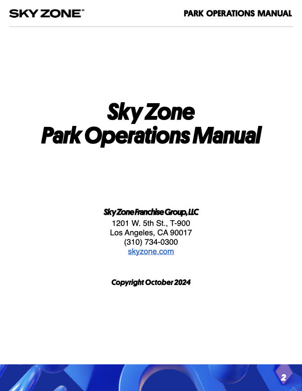
Park Operations Manual, VIP and hiring cards.
Built to
Perform
Four years. Three brands. One account.
Sky Zone stayed with us from 2022 to 2026 through a rebrand and a leadership change. Account longevity at that length is a referendum on the work.
Trusted with the room that mattered most.
The SKYCON year-in-review was presented by Sky Zone's executive team at their own conference.
Creative living in physical space
Murals, in-park screens, and signage is all work that stays up long after a campaign ends.
Creative Direction | Email Marketing | Campaign Creation
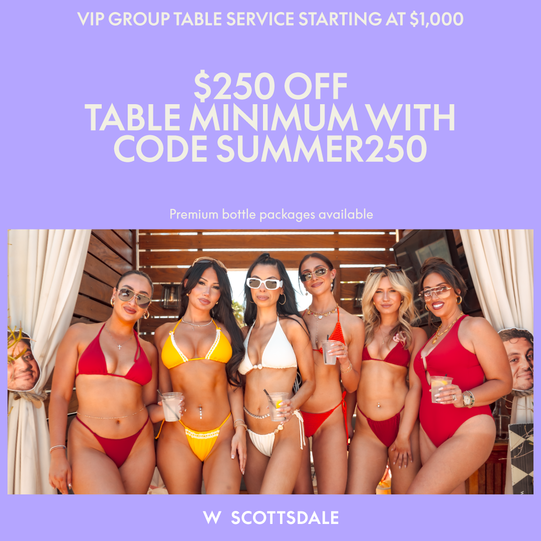
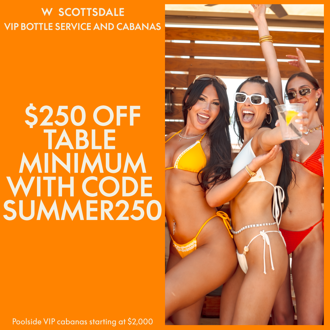
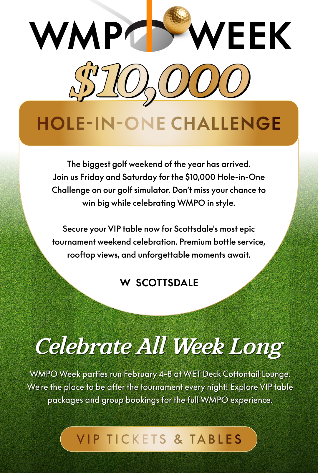
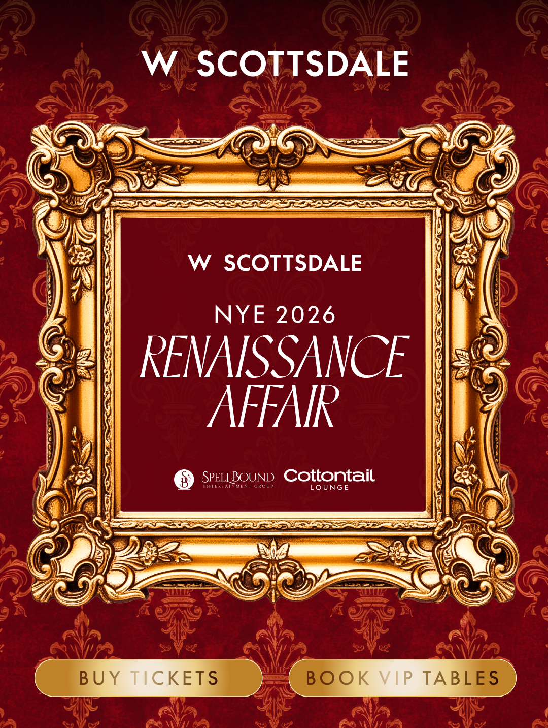
W Hotels is a contemporary, high-energy luxury lifestyle brand under Marriott International. Known for bold, design-forward aesthetics and music-centric atmospheres. While separate brands, the Yari brothers own both The Remi and the W Hotel in Scottsdale. Bringing non existant brands to life from only a set of provided guidelines, building promotional emails, and creating some other designs along the way.
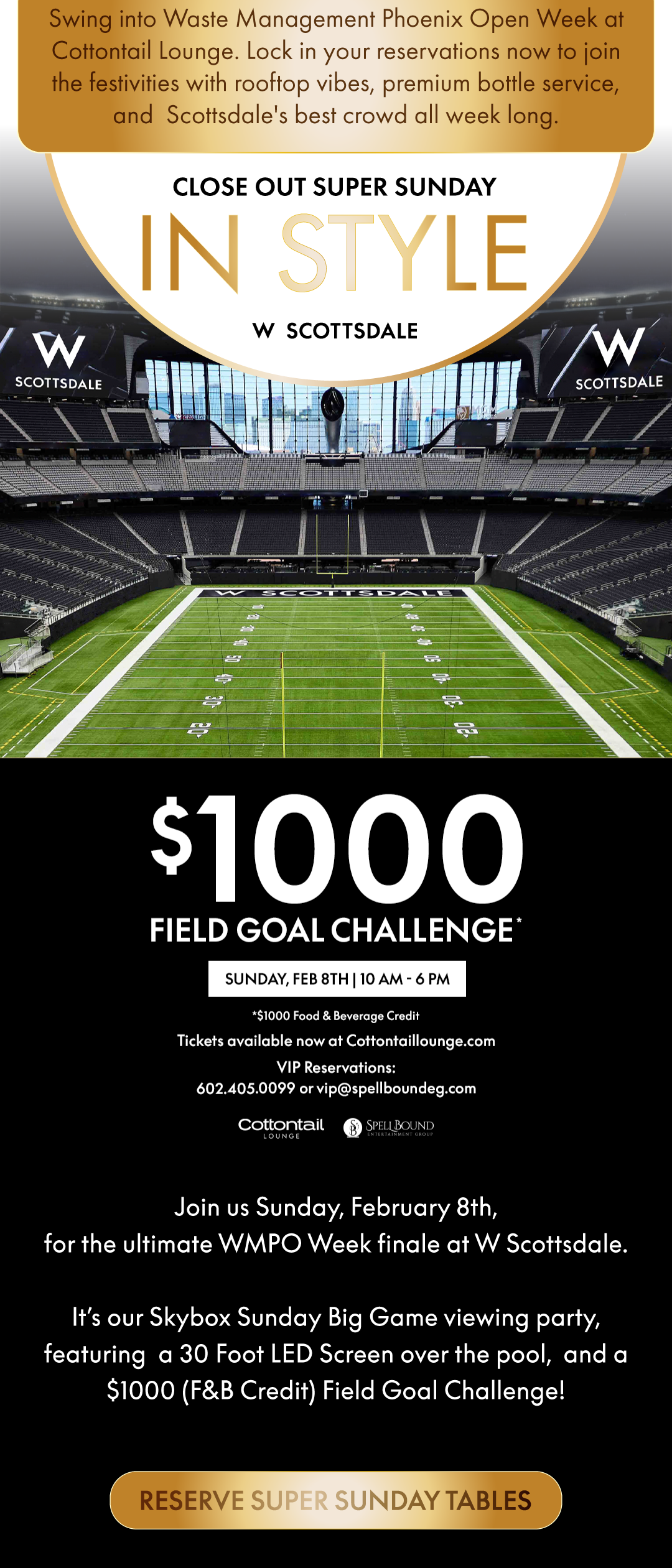
Event Email Marketing
PPC & SMS
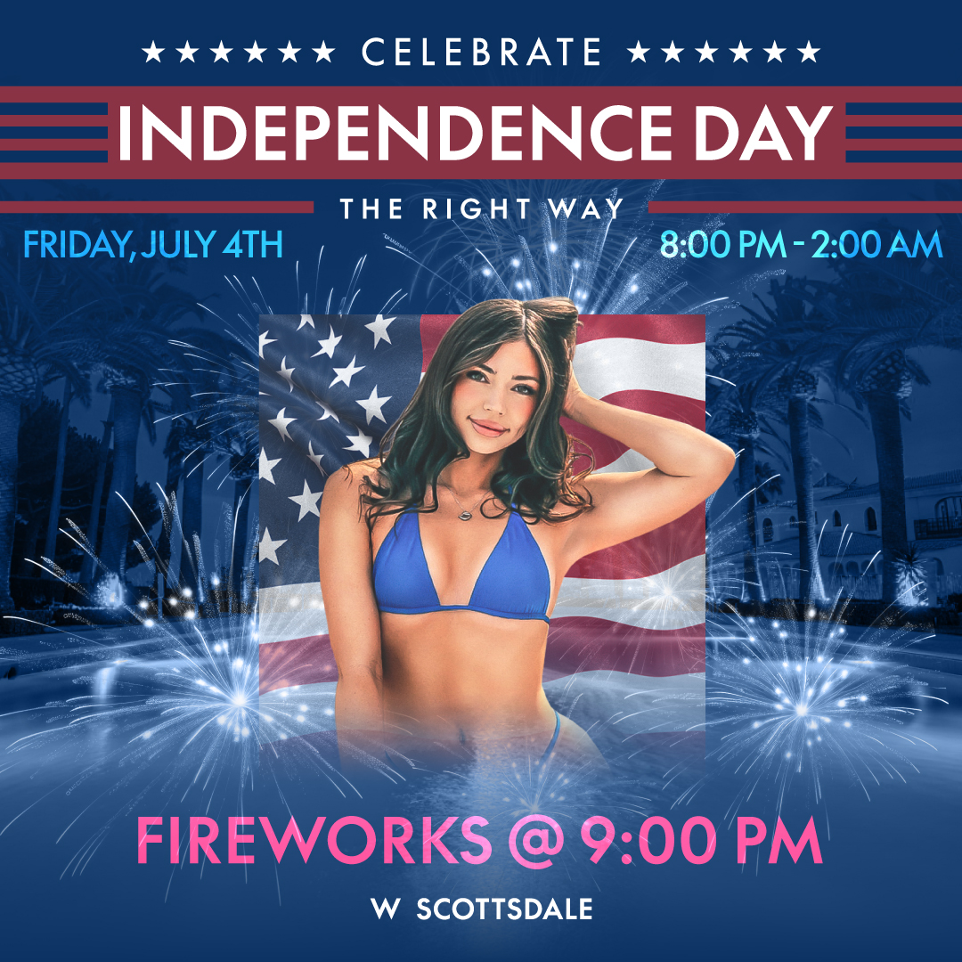
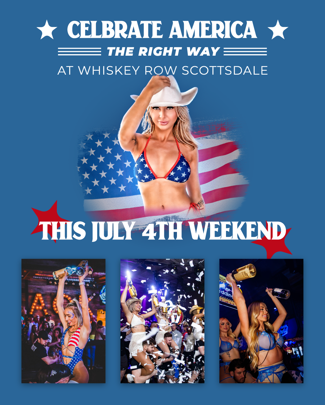
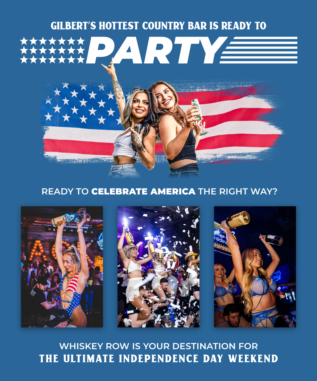
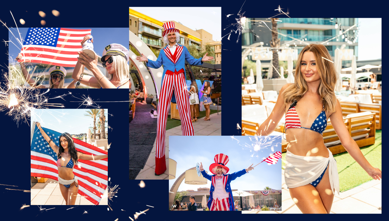
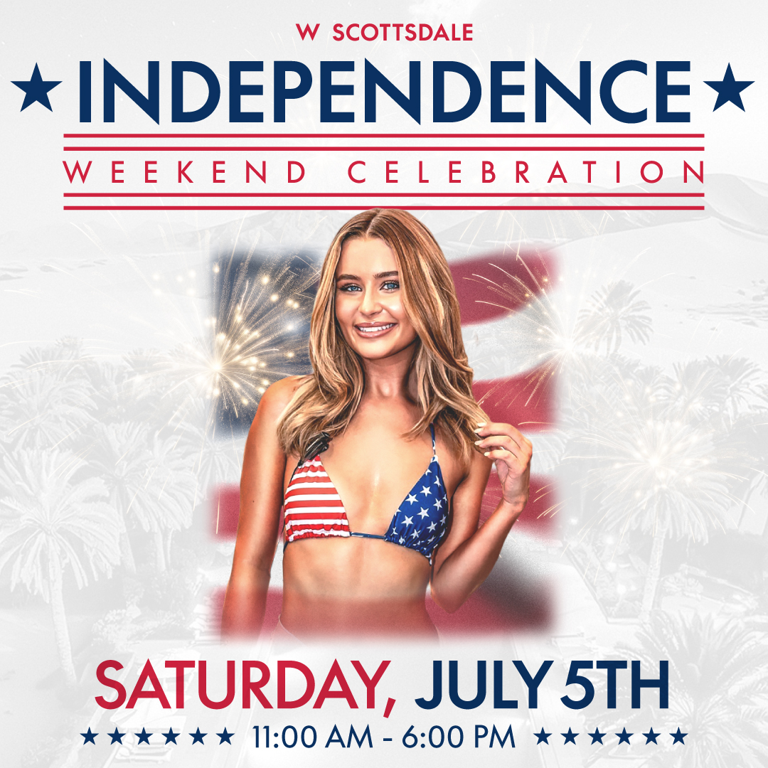
Independence Day Weekend
Created event advertising for Google PPC and sms images for text.
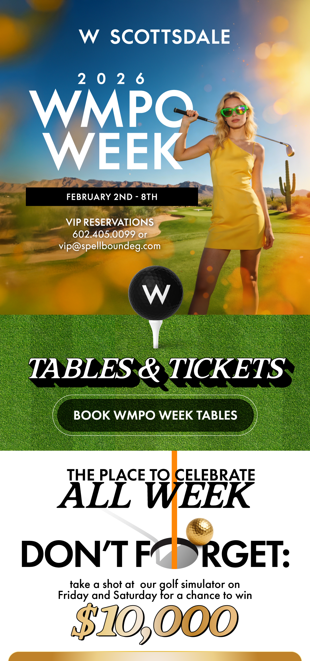
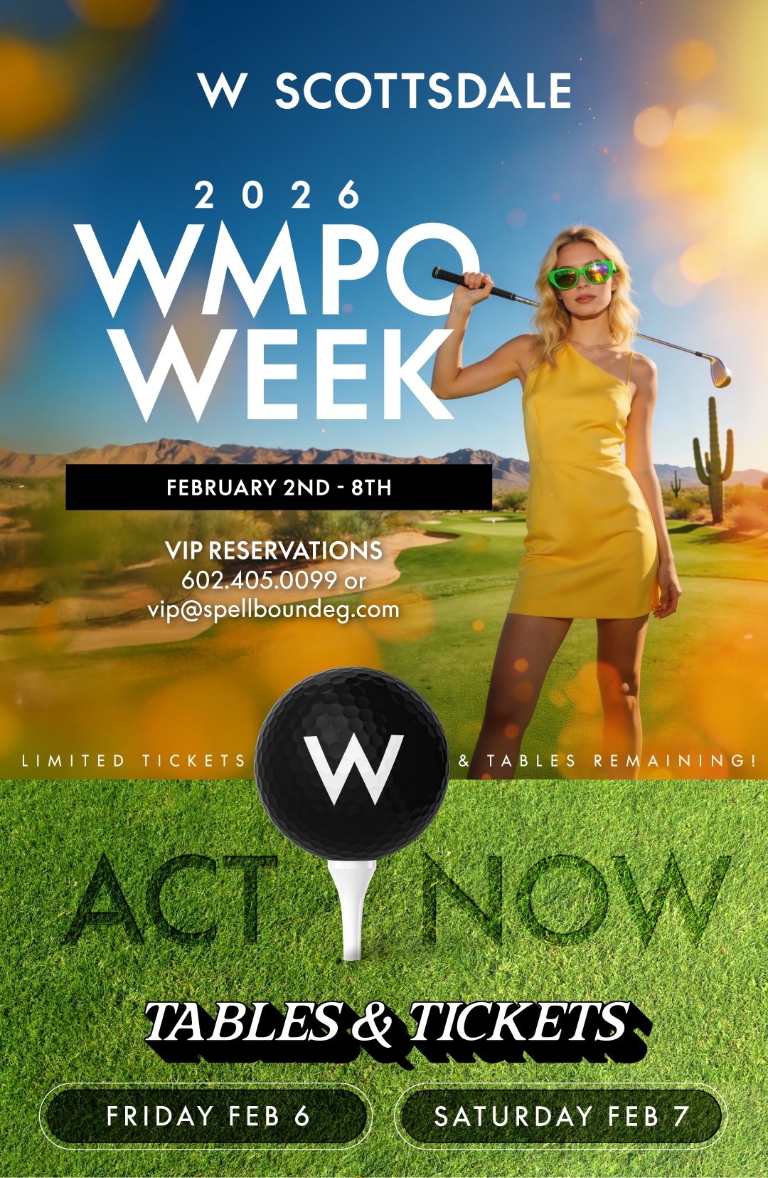
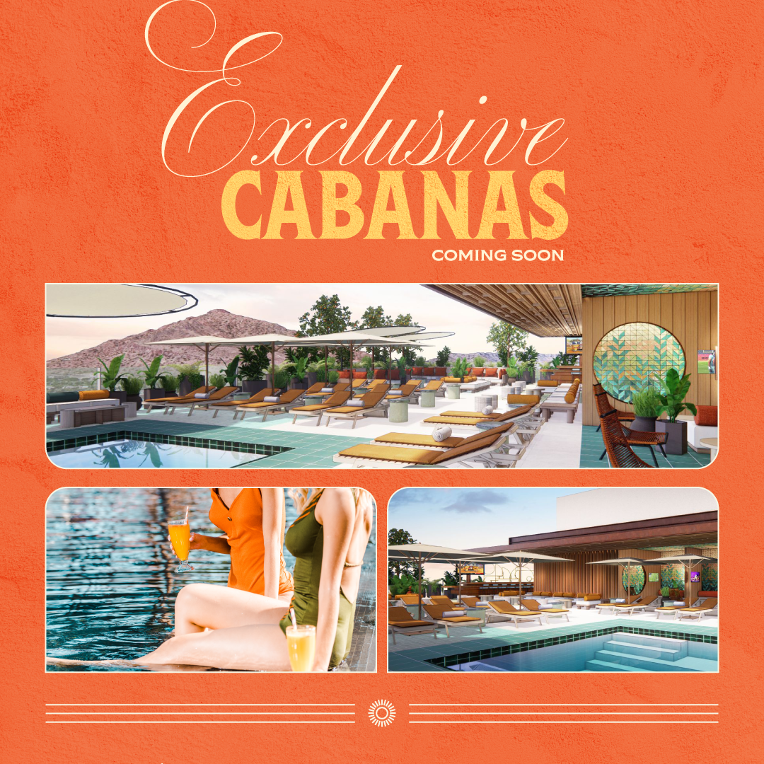
W Hotel Branded Google Ads For Cabana Bookings
W Hotel Branded Google Ads For Cabana Bookings
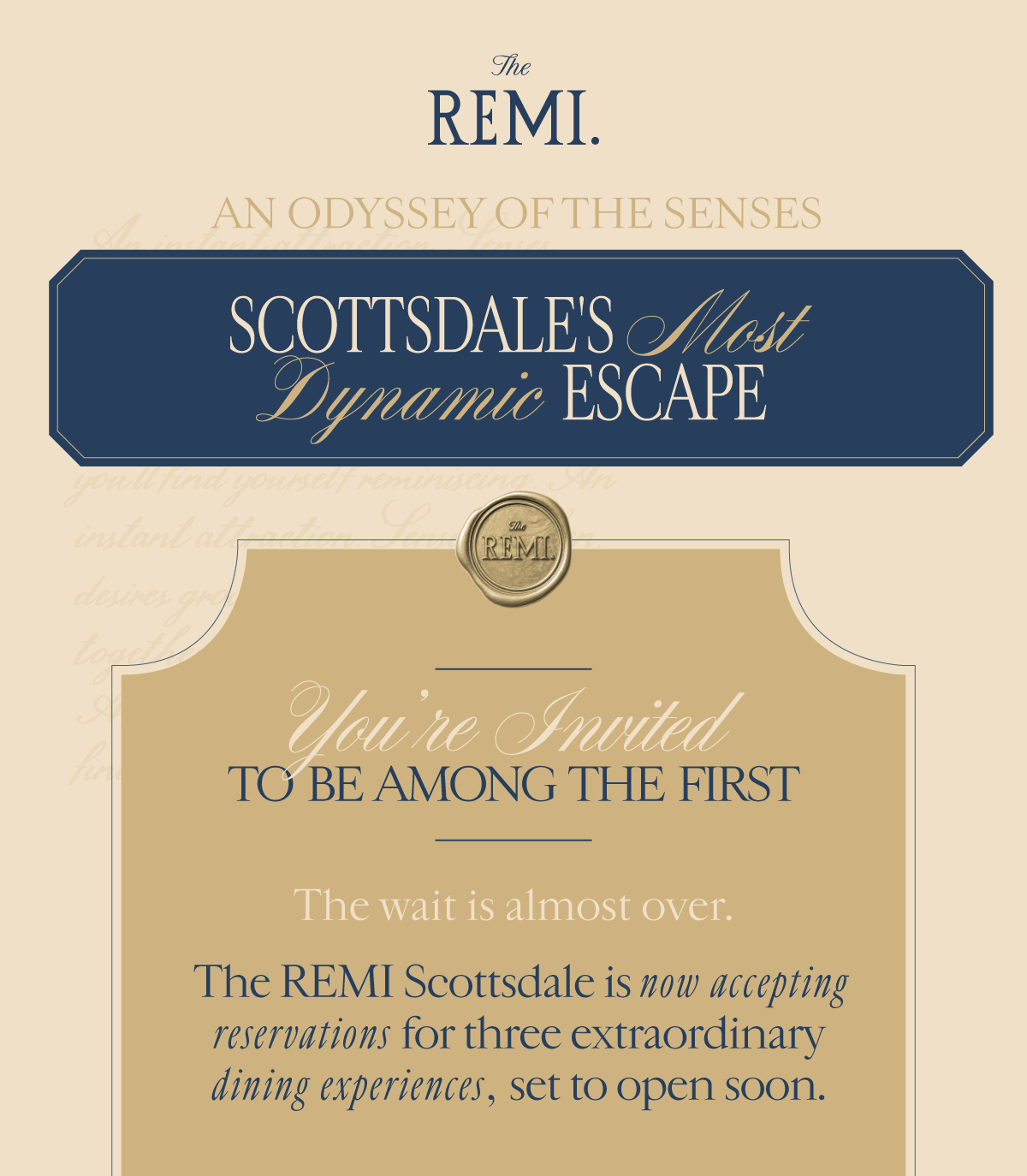
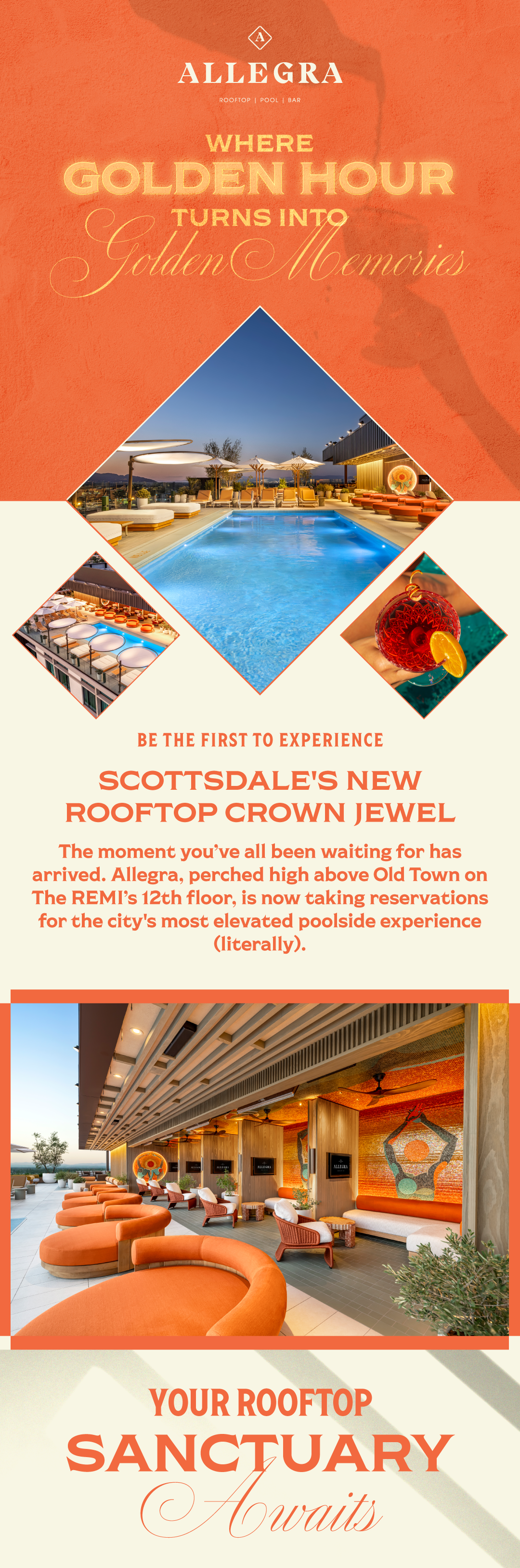
Remi's Welcome Email
An upscale, 13,869-square-foot fine-dining destination in Old Town Scottsdale. a friend of REmi.
When we recieved this client we only had a brand guideline document and some 3D rendering of what was to come. Graphic design for PPC and Google Ads.
An upscale, 13,869-square-foot fine-dining destination in Old Town Scottsdale. a friend of REmi.
When we received this client we only had a brand guideline document and some 3D rendering of what was to come. Graphic design for PPC.
SMS IMAGES
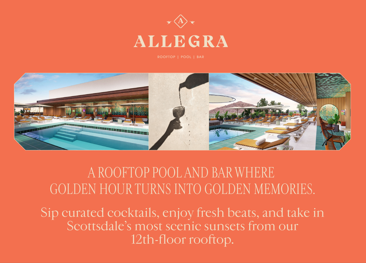
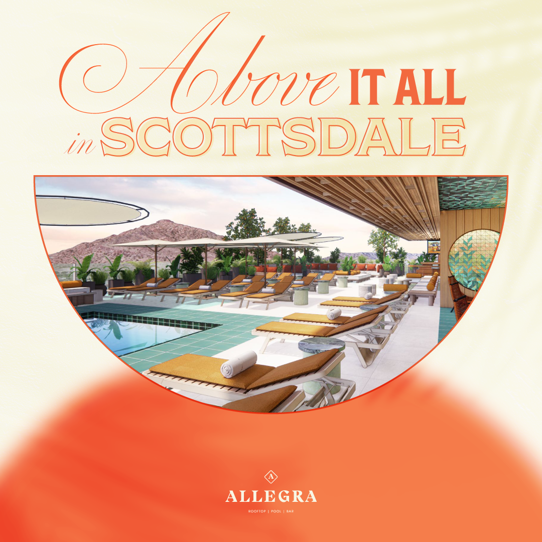
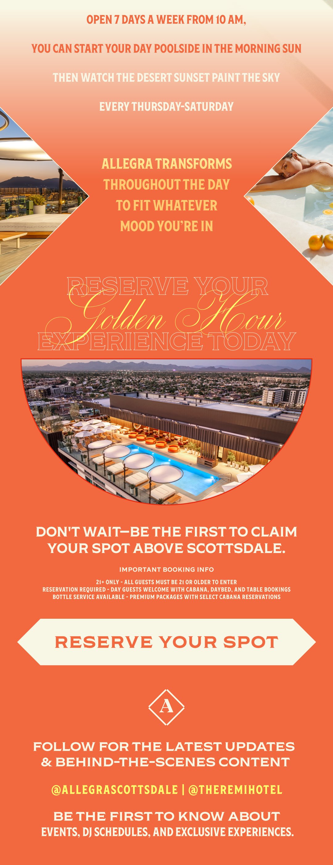
A premier, upscale rooftop pool bar and lounge located on the 12th floor of The REMI Scottsdale Hotel.
Allegra was not open when we received work to start creating PPC and Google Ads. Curated this brand with provided brand guidelines, research, & vibes.
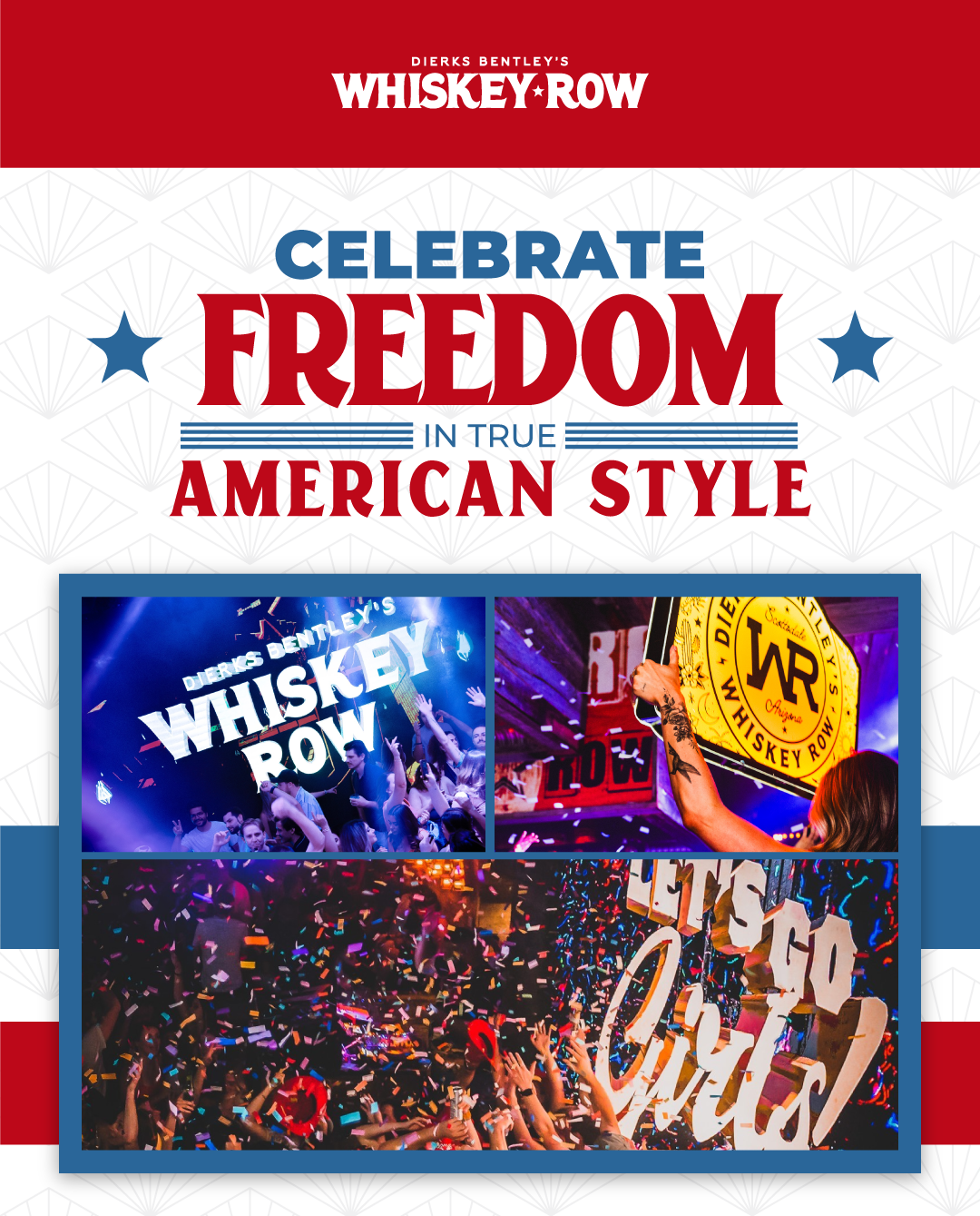
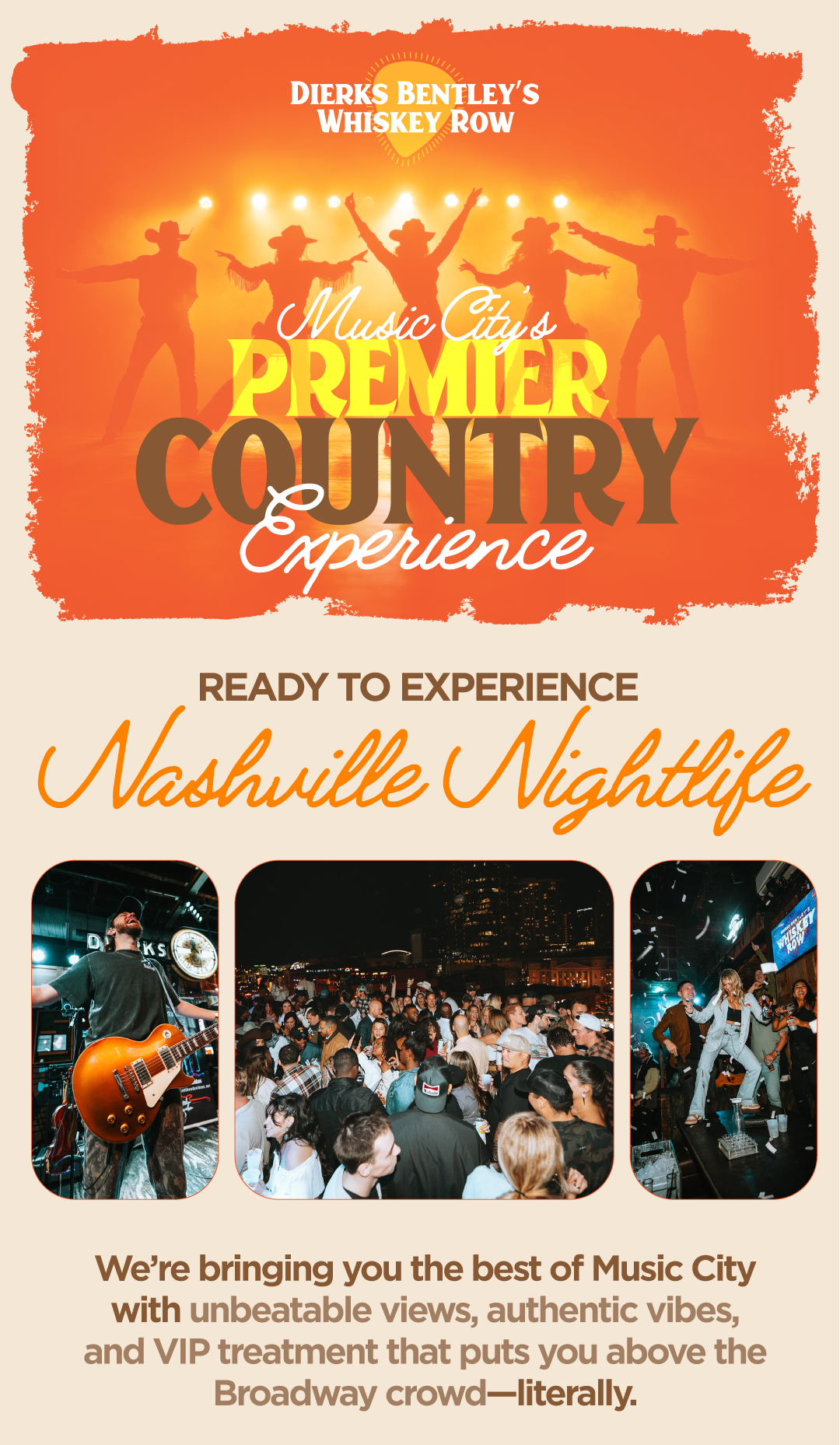
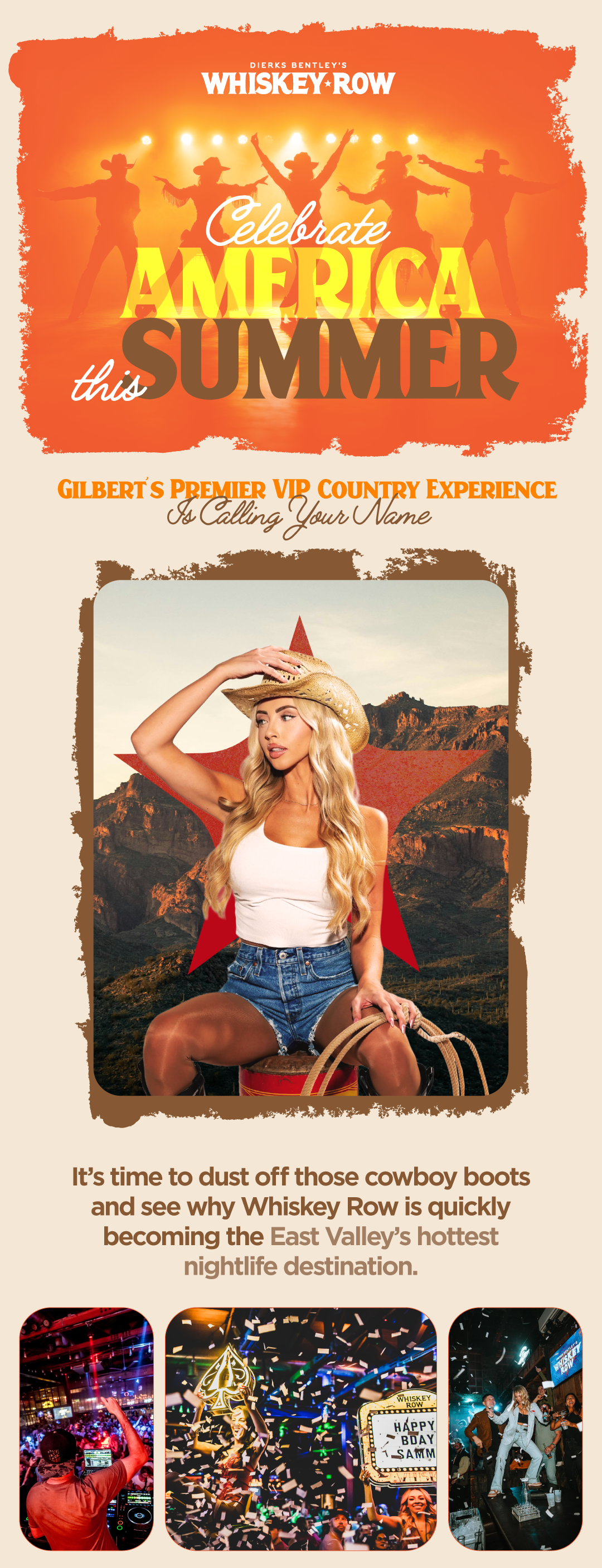
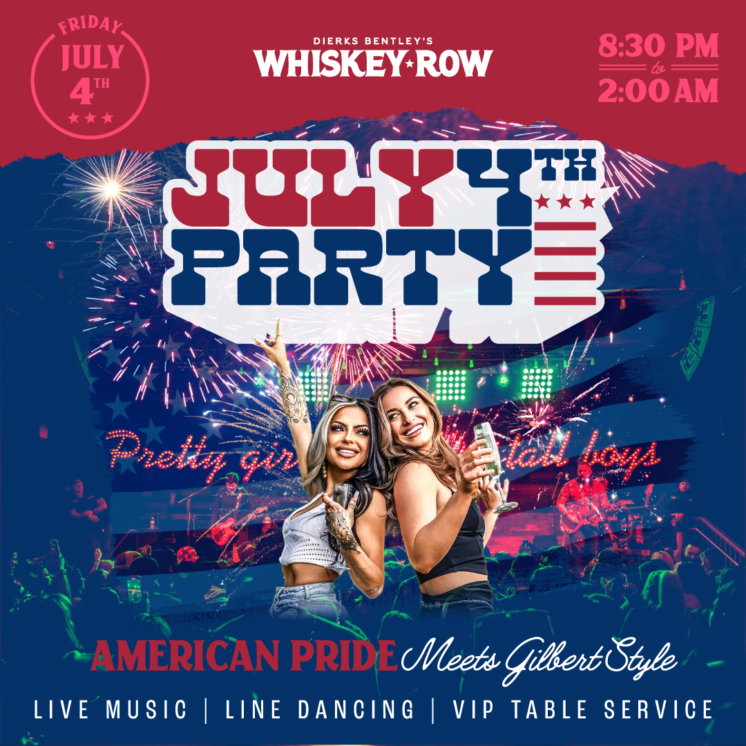
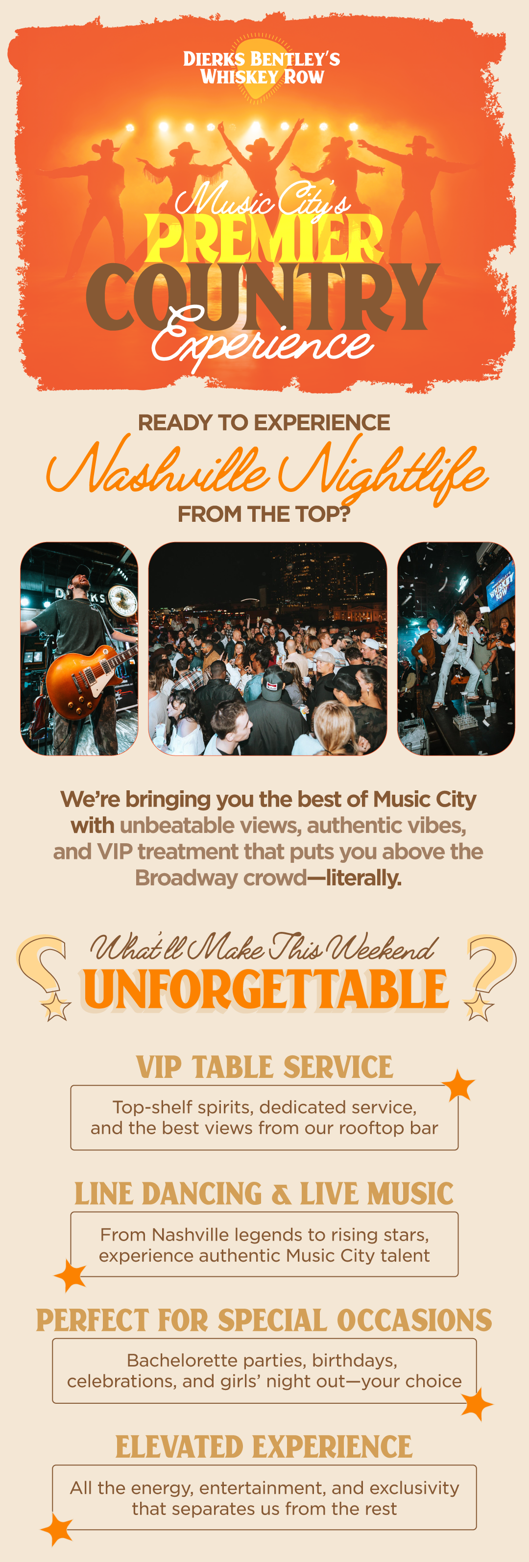
Worked with this well established brand to create email, sms, and ppc campaigns. Each location needed its own creative with tailored images, copy, and logo.
Owned by the country singer, this high-energy pub and music venue has locations in Nashville, Scottsdale, Gilbert, and Denver.
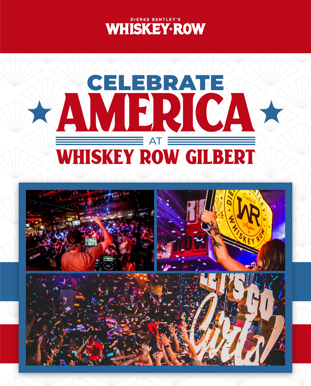
4th of July Email Marketing
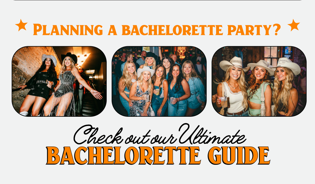
Summer Email Marketing. Family Friendly & Nightlife driven
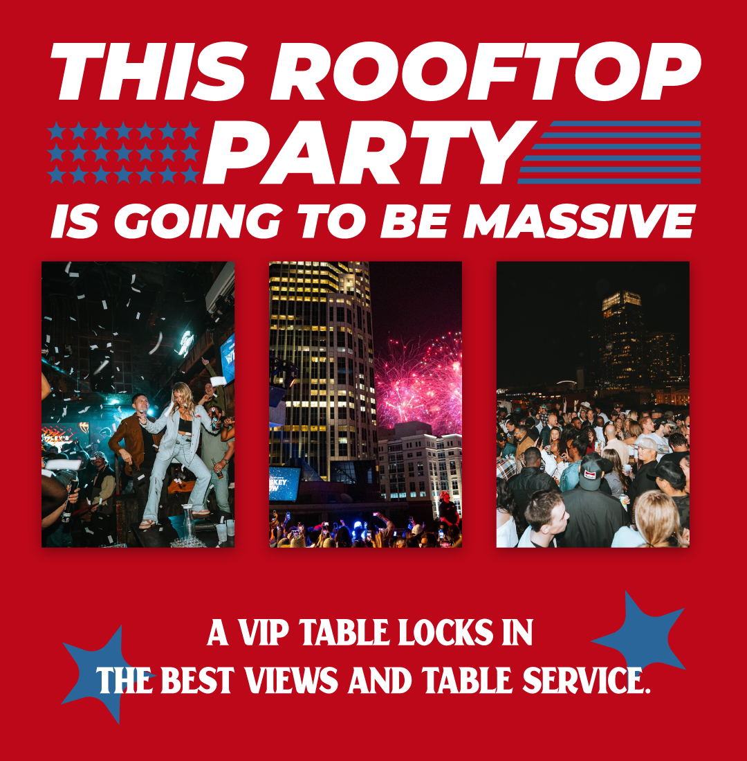
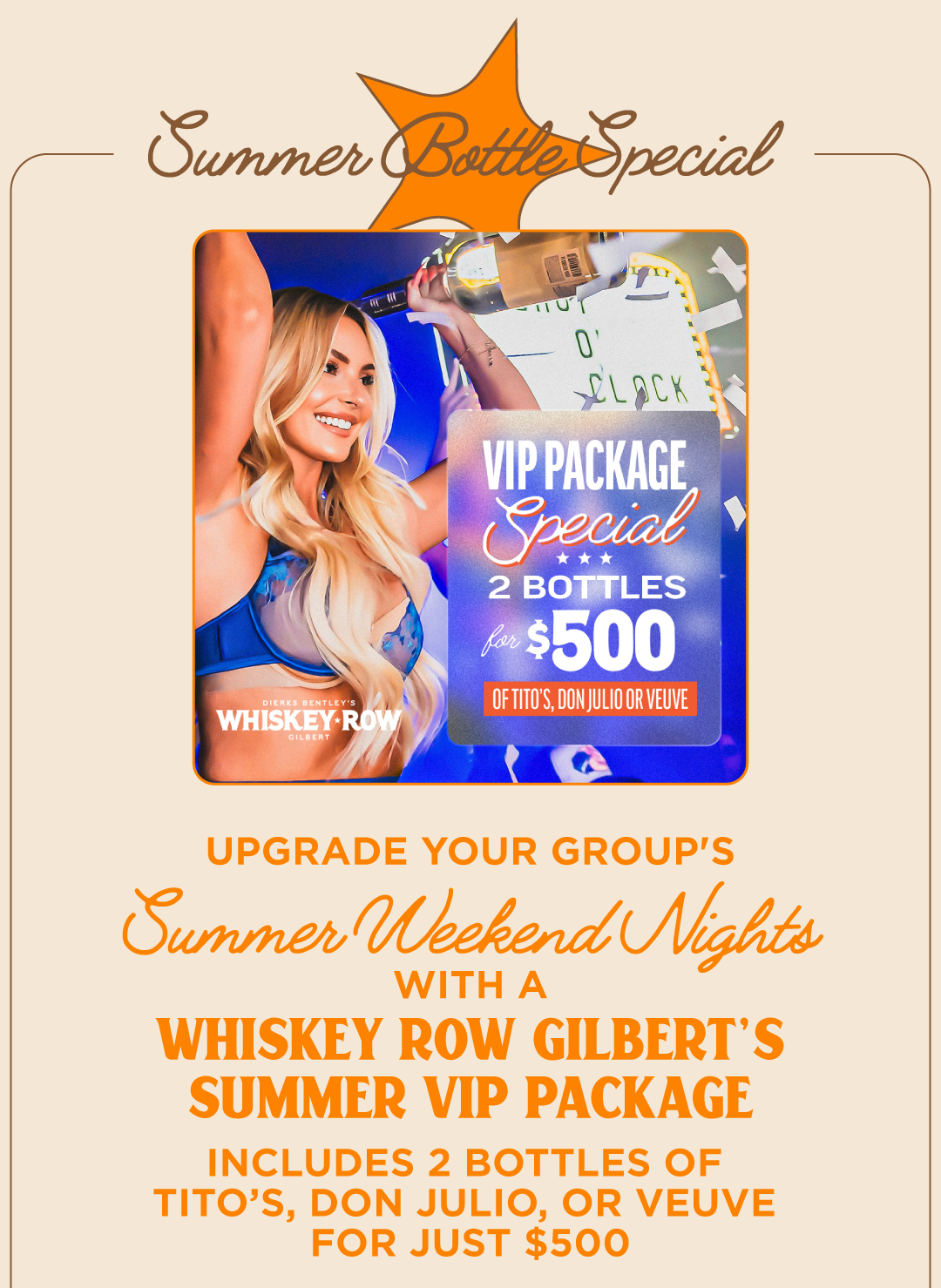
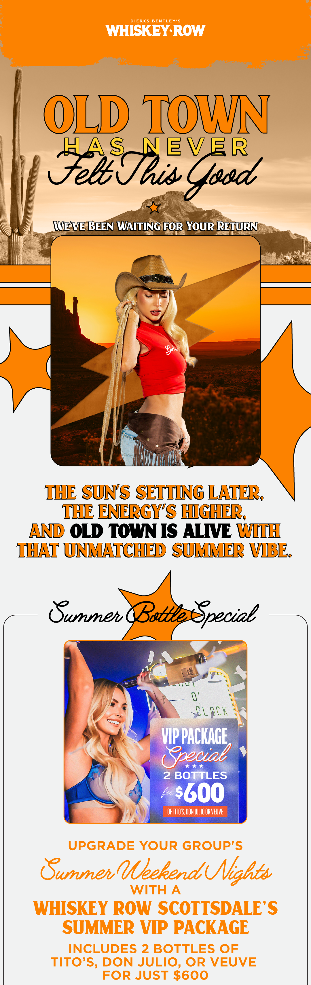
Summer vip booking email
Creative Project Management | Animation | Media Retouch
Sky Zone is the world's largest operator and franchisor of indoor active entertainment parks, operating over 300 locations globally. I had the pleasure of working closely with their executive team to manage all creative projects. Provided time estimates, delegated work to various designers, kept up with timelines, created monthly reports, and even designed assets.
Scaling Brand Creative Across a National Entertainment Brand
Sky Zone was one of the largest and most fast-moving client accounts I supported while working at Youtech. With locations across the country and a steady flow of design needs, the work required more than creating strong visuals. It required organization, consistency, communication, and the ability to move quickly while keeping every piece aligned with the brand.
I supported Sky Zone as both a designer and project lead, managing design requests from start to finish. This included communicating with the client, organizing timelines, assigning or delegating work when needed, reviewing proofs, and making sure final assets were delivered accurately.
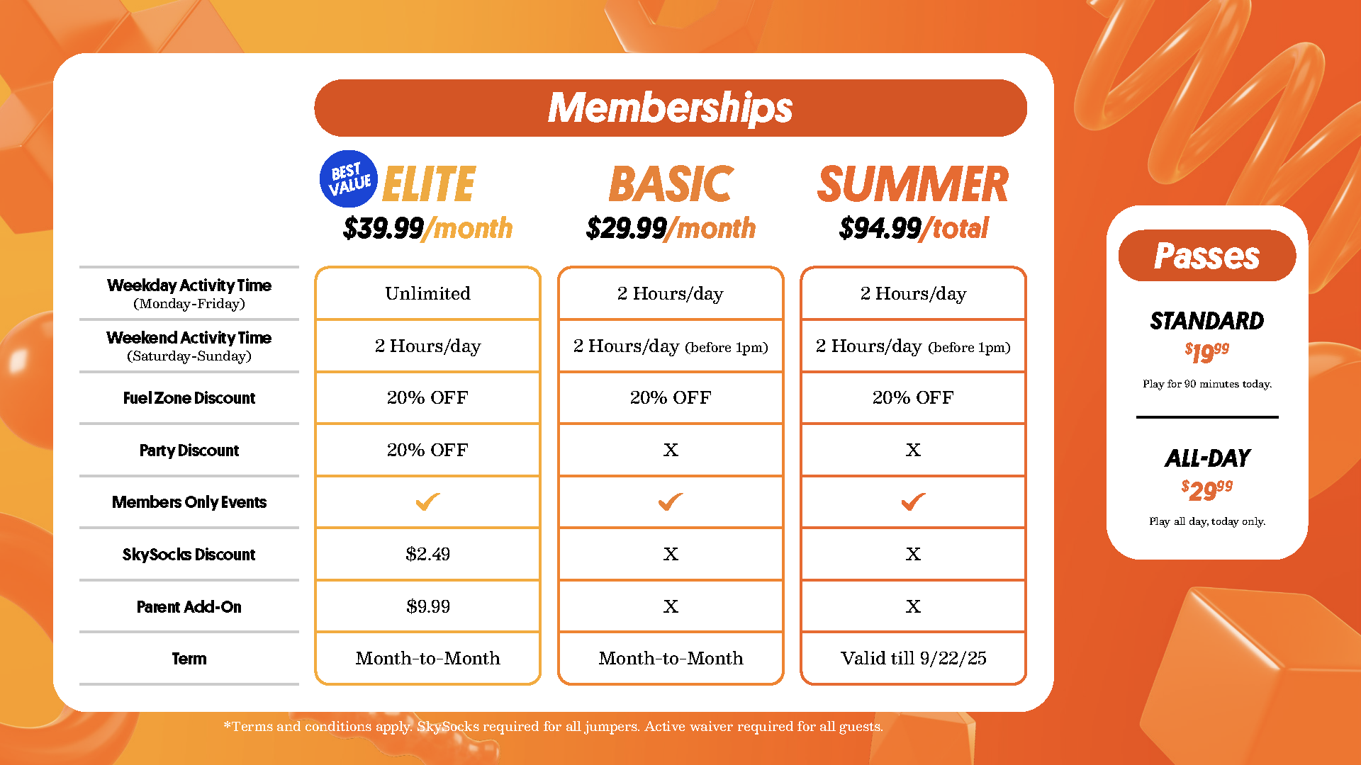
Sky Zone needed creative support that could keep up with the pace of a multi-location entertainment brand. Each request had to feel consistent with the larger Sky Zone identity while still serving a specific purpose. Whether promoting local events, seasonal offers, birthday parties, memberships, attractions, or campaign pushes.
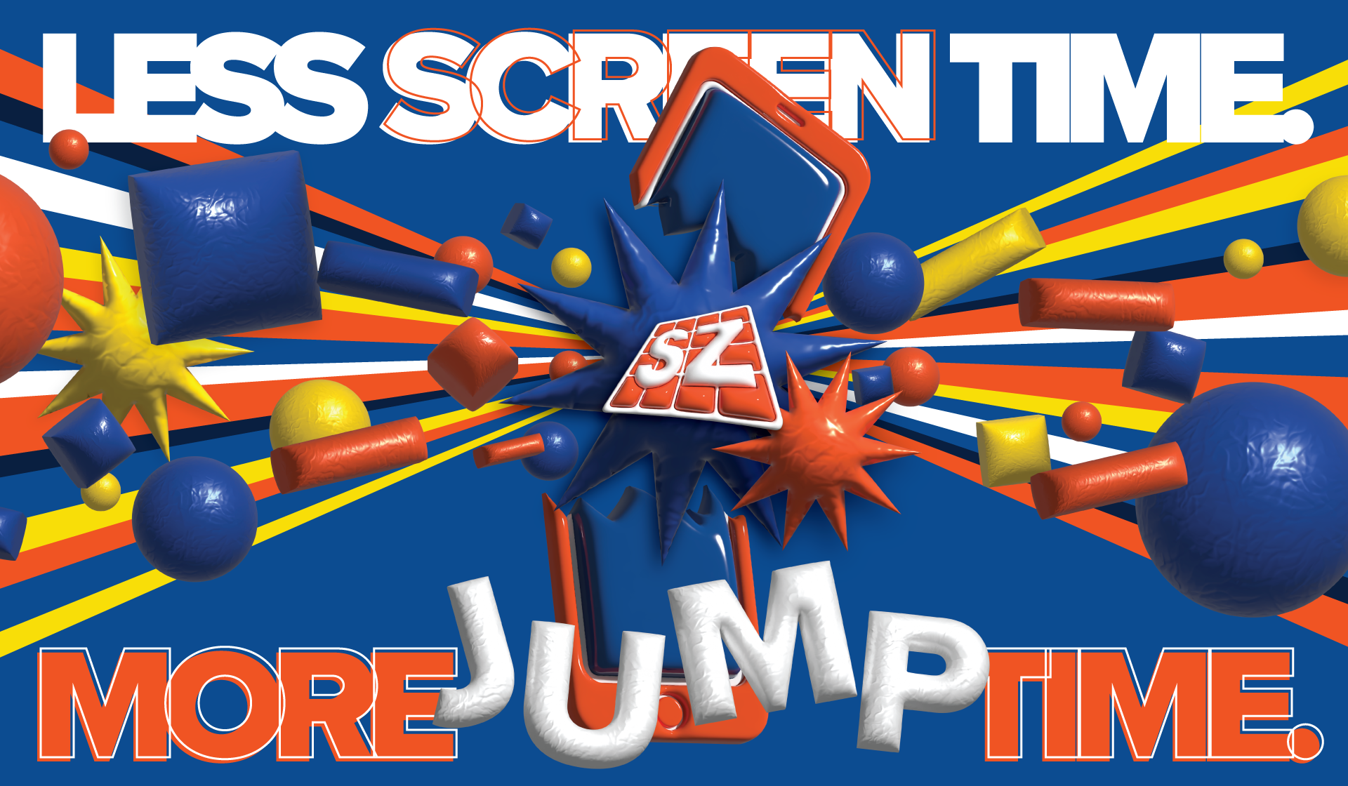
A major part of my work for Sky Zone involved designing in-park TV graphics used throughout their locations. These screens promoted memberships, events, birthday parties, seasonal offers, and park programming directly to guests inside the experience.
Safety messaging still needs to feel designed. The Rules Video turned required information into a clear, animated brand touchpoint that helped guide guests through the Sky Zone experience.
I also supported Sky Zone’s environmental creative through wall mural designs used inside and outside the park. These large-format graphics helped bring the brand into the physical space, adding energy, movement, and visual impact throughout the guest experience.
Operational & Brand Support Materials
These pieces required a more structured design approach. While the guest-facing creative could lean into energy and movement, the operational materials had to prioritize clarity, usability, and consistency. The goal was to make information easy to navigate while still keeping each piece connected to the Sky Zone brand.
SKYCON 24 Year-In-Review Presentation
The SKYCON 24 Year-In-Review Presentation was built to turn Sky Zone’s 2024 highlights into an animated, event-ready experience.
Rather than approaching it as a traditional slide deck, the presentation was designed with a Prezi-style flow, using motion, zooming transitions, and animated key points to guide the audience through the year’s biggest moments.
Featured in Sky Zone’s sticker pack, these three designs turned small-format graphics into fun, collectible brand pieces. 2022.
Creatives I planned, delegated and built during my time with Sky Zone:
I had the honor of editing raw images and footage from 2022-2026 Here are a few selects:
Logo Creation | Full Branding System | Menu Design
From the founders of First Watch, Sunrise Kitchen is currently building their first location in Arizona. Aspiring to build 7+ kitchens nationwide within the next 7 years. With a large fund and a team of well rounded individuals, branding this kitchen was an accomplishment. They were inspired so much by this mark they paid all marketing in full the day after seeing it.
Branding Sunrise Kitchen For National Recognition
Breakfast Restaurant
Sunrise Kitchen is an up and coming warm breakfast restaurant focusing on savory authentic southern dishes; from the founders of First Watch.
Sunrise Kitchen needed a warm, flexible identity system that could beam across every customer touch point while feeling authentic. Balancing neighborhood charm with a polished southwestern presence.
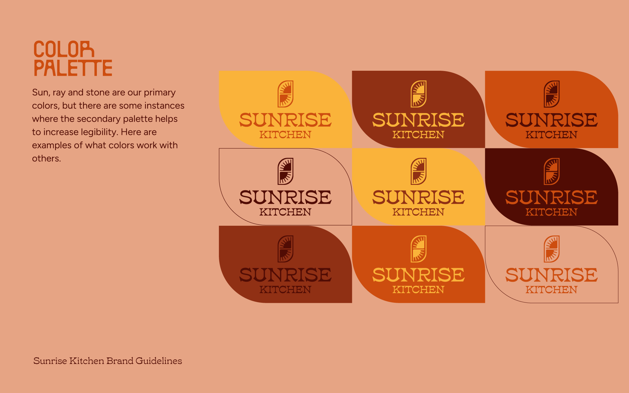
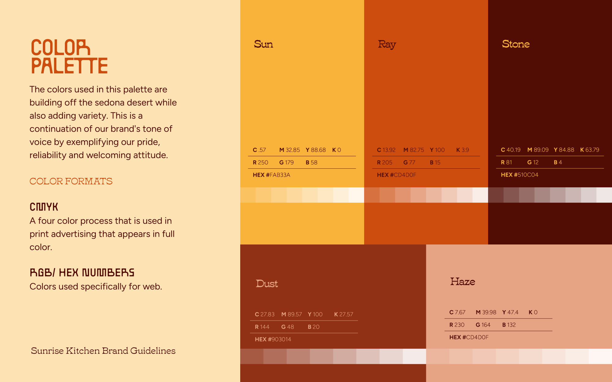
The color palette is an important element in capturing Sunrise Kitchen's southwest heritage and sunny appeal. By choosing rustic bright colors, we're able to add a sense of warm energy to the brand.
COLOR
Distinctive fonts for brand recognition. Strong focus on southwestern heritage. Variability for specific audiences.
The Sunrise Kitchen Menu
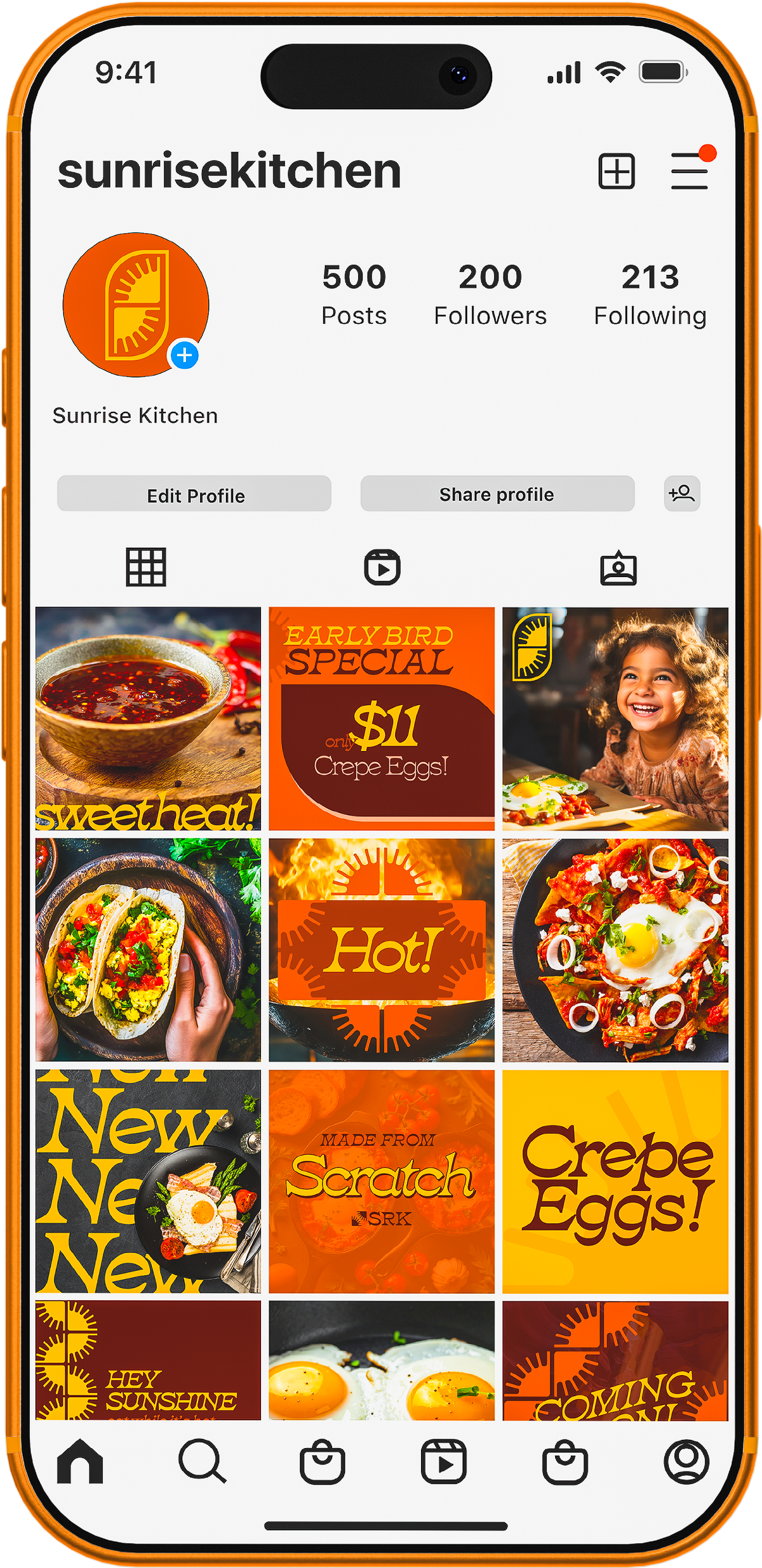
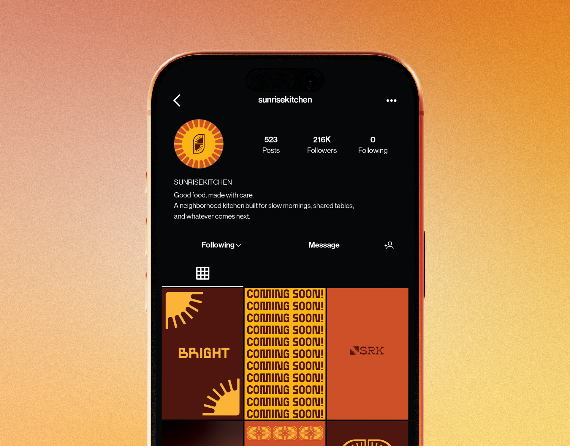
Building Signage & Social Proofing
Gold Signage. Sunlight is the most precious gold found on earth. For some the sunrise is the only gold they will ever possess, here we cherish each dawn.





















2.png)
.png)